the Creative Commons Attribution 4.0 License.
the Creative Commons Attribution 4.0 License.
 | 27 Apr 2022
Effective uncertainty visualization for aftershock forecast maps
Michelle McDowell
Peter Guttorp
E. Ashley Steel
Nadine Fleischhut
Earthquake models can produce aftershock forecasts, which have recently been released to lay audiences. While visualization literature suggests that displaying forecast uncertainty can improve how forecast maps are used, research on uncertainty visualization is missing from earthquake science. We designed a pre-registered online experiment to test the effectiveness of three visualization techniques for displaying aftershock forecast maps and their uncertainty. These maps showed the forecasted number of aftershocks at each location for a week following a hypothetical mainshock, along with the uncertainty around each location's forecast. Three different uncertainty visualizations were produced: (1) forecast and uncertainty maps adjacent to one another; (2) the forecast map depicted in a color scheme, with the uncertainty shown by the transparency of the color; and (3) two maps that showed the lower and upper bounds of the forecast distribution at each location. We compared the three uncertainty visualizations using tasks that were specifically designed to address broadly applicable and user-generated communication goals. We compared task responses between participants using uncertainty visualizations and using the forecast map shown without its uncertainty (the current practice). Participants completed two map-reading tasks that targeted several dimensions of the readability of uncertainty visualizations. Participants then performed a Comparative Judgment task, which demonstrated whether a visualization was successful in reaching two key communication goals: indicating where many aftershocks and no aftershocks are likely (sure bets) and where the forecast is low but the uncertainty is high enough to imply potential risk (surprises). All visualizations performed equally well in the goal of communicating sure bet situations. But the visualization with lower and upper bounds was substantially better than the other designs at communicating surprises. These results have implications for the visual communication of forecast uncertainty both within and beyond earthquake science.
- Article
(3504 KB) - Full-text XML
-
Supplement
(718 KB) - BibTeX
- EndNote


Clear communication of uncertainty in forecasts of natural hazards can save lives; likewise, when uncertainty is not communicated, consequences can be disastrous. On 6 April 2009, a magnitude 6.3 earthquake struck L'Aquila, Italy, and killed 309 people. The week prior, a senior official from Italy's Civil Protection Department had urged calm, mischaracterizing the potential for damaging aftershocks triggered by recent earthquakes near L'Aquila. He was later sentenced to 6 years in prison, along with six leading seismologists1, with the court concluding that they provided “inexact, incomplete and contradictory information” to the public – in particular, failing to account for the uncertainty in their seismic forecast (Imperiale and Vanclay, 2019).
1.1 Aftershock forecasts and their uncertainty
When a large earthquake occurs, more seismic activity is likely. Aftershocks are earthquakes triggered by an earlier earthquake (the mainshock) that can put people at additional risk of harm, for example, by destroying buildings already destabilized by the mainshock (Hough and Jones, 1997). Aftershocks can have a magnitude even larger than their mainshock and can also trigger their own sequences. The spatial rate of earthquakes (the number of earthquakes per unit area) during an aftershock sequence thus follows a highly skewed distribution (Saichev and Sornette, 2007), where many more earthquakes may occur if aftershocks trigger their own sequences of additional aftershocks. The scientific study of aftershock sequences has resulted in sophisticated statistical models (e.g., Ogata, 1998) that can probabilistically describe the expected numbers, locations, times and magnitudes of aftershocks following a mainshock. These models can provide a distribution for the number of aftershocks at each location in a region.
Forecasts built from these models are highly sought after by diverse user groups, such as emergency managers and the media (Gomberg and Jakobitz, 2013), in order to inform decisions about disaster declarations and crisis information delivery (Becker et al., 2020; McBride et al., 2020). Recently, several national scientific agencies, including New Zealand's GNS Science (Institute of Geological and Nuclear Sciences Limited; Becker et al., 2020) and the United States Geological Survey (Michael et al., 2020), also began releasing aftershock forecasts to the public. In these public communications, the forecast distribution has been represented in tables of either (1) the expected number of earthquakes above some magnitude for a fixed time period (e.g., 1 d or 1 week) after the mainshock or (2) the probability of an event above some magnitude occurring within a time period.
While state-of-the-art models can forecast aftershocks with some degree of accuracy (Schorlemmer et al., 2018), these forecasts also have substantial uncertainty. Aftershock models are built on datasets of observed earthquakes in a given seismic region; however, aftershock sequences can vary substantially even within a region, contributing to a large spread in the forecasted number of aftershocks following any mainshock. Forecast uncertainty can be communicated by directly giving this spread for the forecasted number of aftershocks. It can also be communicated implicitly by giving the probability that an aftershock above some magnitude may occur, where a very high or low probability can imply lower uncertainty and a middle probability (e.g., 50 %) can imply higher uncertainty. Uncertainty has already been communicated for tabular forecasts by providing these probabilities and ranges of the expected number of aftershocks across the entire forecast region (e.g., Becker et al., 2020).
Aftershock activity varies over space (Zhuang, 2011), and forecast maps are commonly requested by users (Michael et al., 2020). Figure 1 shows example maps following the L'Aquila earthquake and the magnitude 7.8 earthquake in 2016 in Kaikōura, New Zealand. Aftershock forecast models will be better calibrated in areas with frequent aftershock sequences than where aftershock activity is sparse (Harte, 2018), meaning that forecast uncertainty also varies over space. But the uncertainty of the forecast distribution is usually not communicated in aftershock forecast maps. For example, the map in Fig. 1a shows the expected number but not its spread; the probability map in Fig. 1b does not make uncertainty explicit. Specifically, the green zone in the center of the map, representing >30 % probability of a damaging aftershock, could be due to either a low forecast with high uncertainty or a higher forecast with low uncertainty.
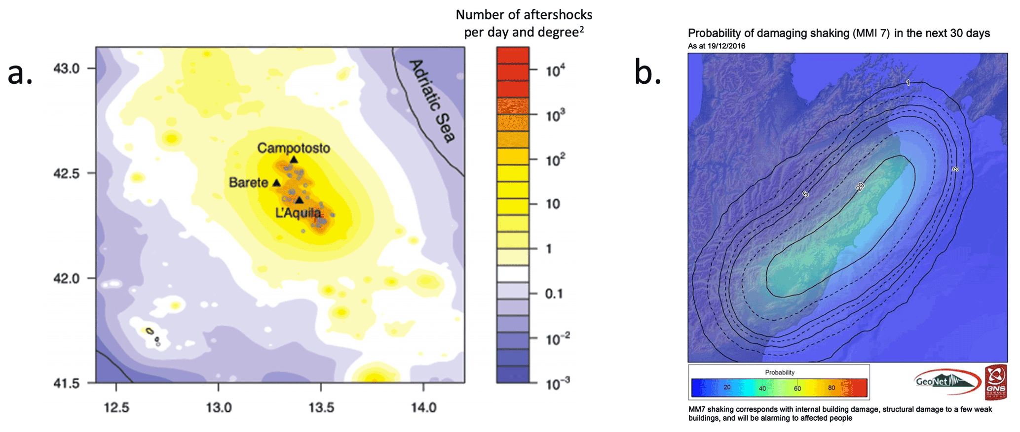
Figure 1Two examples of aftershock forecasts. (a) A map showing the expected daily number of aftershocks above magnitude 2.0 several weeks after the L'Aquila, Italy, earthquake of 2006 (reprinted from Murru et al., 2015). (b) A map showing the forecasted probability of a damaging aftershock (defined as having a Modified Mercalli Intensity – MMI – score above 7) in the month following the Kaikōura, New Zealand, earthquake of 2016, released to the public by New Zealand's GNS Science (reprinted from Becker et al., 2020). As damaging earthquakes are rare, even probabilities above 10 % may constitute a significant risk, though disentangling the uncertainty around this forecasted probability is not possible from this map.
As evident in the response to the L'Aquila earthquake, omitting uncertainty from forecasts can affect people's perceptions and responses to the associated risks. When uncertainty is not displayed, users tend to form their own understanding of where uncertainty is higher or lower, which may not coincide with its actual patterns (Ash et al., 2014; Mulder et al., 2017). Aftershock forecasts that do not communicate uncertainty may therefore result in users misunderstanding the forecast (Fleischhut et al., 2020; Spiegelhalter et al., 2011); for example, in previous studies in the weather domain, users incorrectly expected wind and snow to be lower than forecasted when these had high forecasts but not when the forecast was low (Joslyn and Savelli, 2010). Misinterpreting a forecast could become particularly problematic when, due to the skewed distributions of aftershock rates, high uncertainty means there is a greater chance that many more aftershocks will occur than forecasted; see Fig. S1 in the Supplement for example distributions that illustrate this point.
While studies across multiple domains have found that displaying uncertainty when communicating forecasts can improve responses related to judgment and decision-making (Kinkeldey et al., 2017; Joslyn and LeClerc, 2012; Nadav-Greenberg and Joslyn, 2009), there is a paucity of literature on uncertainty visualization for spatial aftershock forecasts or other seismic communications (Pang, 2008). Thus, despite recommendations to incorporate uncertainty into communications from earthquake models (Bostrom et al., 2008), there are currently no guidelines on how to do so or on what visualization techniques could help users to understand and incorporate uncertainty to inform their judgments (Doyle et al., 2019). The purpose of the present study is to develop and evaluate different approaches to visualizing uncertainty in the distribution of spatial aftershock forecasts. These approaches may also be useful for other natural hazards whose forecasts follow a similarly skewed distribution.
1.2 Visualizing uncertainty for natural hazards
Aftershock forecasts maps can show how many aftershocks are expected for some time period at different locations throughout a region (e.g., Fig. 1a). Uncertainty visualizations have already been designed for similar maps for other geohazards and evaluated using task-based experiments (Kinkeldey et al., 2014). These previous studies can serve as a natural starting point for visualizing uncertainty for aftershock forecast maps. We review the literature that evaluates uncertainty visualizations in geoscientific domains.
One approach to representing uncertainty in geospatial forecasts is by plotting the center of the forecast distribution (e.g., the median or mean) and uncertainty as the spread of the distribution (e.g., the standard deviation or margin of error). The uncertainty is typically represented either (1) in adjacent maps, where the center and uncertainty are displayed in separate maps, or (2) within the same map, using, for example, color, patterns, opacity or symbols to visualize the uncertainty (Pang, 2008). When the forecast and its uncertainty are represented within the same map, designs using color lightness or transparency (i.e., fading the color to a background color like white or gray) have been found to be effective. For instance, Retchless and Brewer (2016) evaluated nine designs for forecast maps of long-term temperature change. They tested an adjacent design against designs that varied color properties (hue, lightness and saturation) or used textured patterns to display the uncertainty together with the forecast in a single map. Participants had to rank several zones on the map(s), first by their forecasted temperature change and then by their uncertainty. Visualizations where the transparency of the color increased with uncertainty led to more accurate uncertainty rankings than other color-based designs, although the adjacent approach was most accurate.
When forecast uncertainty is represented using the probability of exceeding a threshold value (such as Fig. 1b), studies have also found visualizations using transparency to work well. For instance, Ash et al. (2014) found that a forecast map using red shades of decreasing lightness to depict the forecasted probabilities of a tornado's location were associated with a greater willingness to take protective action than forecast maps using rainbow hues or a deterministic map showing only the boundary of the zone of elevated tornado probability (which omitted uncertainty altogether). Similarly, Cheong et al. (2016) found that maps using color hue or lightness to represent the probability, in this case of a bushfire, led to better decisions about whether to evacuate from marked locations on a map (based on realizations of bushfires from a model), compared to a boundary design that omitted uncertainty. A review of dozens of geospatial uncertainty visualization evaluations has similarly concluded that color transparency or lightness can be effective in communicating uncertainty (Kinkeldey et al., 2017).
A third approach to communicating the uncertainty in a forecast distribution is by visualizing the bounds of an interval describing the distribution (e.g., a 95 % confidence interval). Although such interval-based maps have recently been used, for instance, to communicate public snowfall forecasts by the US National Oceanic and Atmospheric Administration (Waldstreicher and Radell, 2020), there are few studies evaluating the effectiveness of this approach. Nadav-Greenberg et al. (2008) tested uncertainty visualizations that paired a map of median wind speed forecasts with either an adjacent map of the forecast's margin of error, a “worst-case” map showing the 90th percentile of the forecast distribution or boxplots of the forecast distribution at multiple locations. Participants tended to predict higher wind speeds at a given location when using the worst-case map, relative to the other visualizations. We are not aware of any other studies that have investigated the effects of interval-based uncertainty visualizations for forecast maps.
In the present study, we evaluate three approaches to visualizing uncertainty in aftershock forecast maps. We focus on representing the distribution's spread rather than probability of exceedance because there has been less research on this way of communicating forecast uncertainty (Spiegelhalter et al., 2011) and it is of general interest to other natural hazard forecasts as well. Specifically, we compare a novel interval-based approach where uncertainty can be inferred from the bounds of a 95 % confidence interval, a commonly used approach that uses color transparency to display the uncertainty within the forecast map and the classic adjacent display. These uncertainty visualizations are compared against a forecast depicted without uncertainty, which is most common in practice and thus the natural baseline (see Fig. 1).
1.3 Evaluating the effectiveness of uncertainty visualizations
An effective uncertainty visualization should not only facilitate the reading of the forecast and uncertainty off of a map but also help users to apply this information appropriately. While designing map-reading tasks is more straightforward (e.g., asking users to read particular areas off a map), previous judgment or decision-making tasks have not been designed to systematically evaluate how users interpret uncertainty given different designs (Hullman et al., 2018; Kinkeldey et al., 2017). Further, without defining tasks in line with specific communication goals, it is not possible to identify what constitutes an effective uncertainty visualization.
First, tasks should be designed such that the effect of the uncertainty visualization can be disentangled from other features of the maps or the task. For instance, Viard et al. (2011) asked participants to rank the risk of overpressure based on adjacent or pattern-based uncertainty visualizations of the estimated pressure of oil reservoirs. Several locations were compared that varied both in mean pressure and uncertainty. While a difference in rankings was found between the visualization conditions, it was impossible to conclude whether either visualization led to more reasonable responses, as the selected locations did not vary systematically and as no normative ranking was specified. Other studies have implemented similar ranking tasks using locations that do not uncover how different designs affect how users understand forecast uncertainty (e.g., Deitrick and Edsall, 2006; Scholz and Lu, 2014). Additional issues include tasks that ask for forecast and uncertainty information to be used separately (Retchless and Brewer, 2016) or results that are aggregated across many trials without accounting for the locations' forecast/uncertainty levels (e.g., Cheong et al., 2016).
Second, evaluation tasks should be designed to link to specific communication goals relevant across user groups, in order to inform designs that could serve a wider audience. In Padilla et al. (2017), participants had to decide whether to move an oil rig in the face of an oncoming hurricane, receiving the hurricane track forecast with either a cone of uncertainty or an ensemble of possible hurricane track curves. By systematically moving the oil rig's location across trials, the authors found that decisions were influenced by whether the oil rig was inside the cone of uncertainty or directly on top of an ensemble hurricane track. But the generalizability of these results outside of this highly specific decision task is debatable. Other studies similarly evaluate uncertainty visualizations with well-designed decision tasks inspired by specialist use cases, but it is unclear what their results indicate for designing public forecast maps (Seipel and Lim, 2017; Correll et al., 2018). In contrast, other experimental literature on uncertainty communication (e.g., Burgeno and Joslyn, 2020; Joslyn and LeClerc, 2012; Van Der Bles et al., 2019) works with tasks that are relevant across user groups and designed to reveal how the communication was understood. Visualization scholars have also urged more generalizable tasks in evaluation experiments for uncertainty visualizations (Crisan and Elliott, 2018; Meyer and Dykes, 2019).
Building off this literature, we seek to improve how uncertainty visualizations are evaluated, using an experimental task framed around ubiquitous goals that an uncertainty visualization should ideally achieve. We frame our task around targeted needs that users have from aftershock forecast maps.
1.4 Communication needs for aftershock forecasts
To understand the informational needs of a common user group for aftershock forecasts, we interviewed five emergency management officials in the United States (see detailed summary in Supplement S1). The interviews focused on decision-making for crisis response during natural disasters and on how forecasts could help these decisions, even when this information is uncertain. After synthesizing the interviews, we isolated two commonly mentioned questions that an aftershock forecast should facilitate answering and posited that these communication needs would also be relevant to a general user audience:
-
Where is it likely that aftershocks will or will not take place (“sure bets”, i.e., areas with high/low forecasted aftershock rates and low uncertainty)?
-
Where is a bad surprise possible due to the high uncertainty of the forecast (“surprises”, i.e., areas with high uncertainty that could yield an aftershock rate higher than forecasted)?
Using these communication needs as a guide, we designed a Comparative Judgment task to evaluate how different visualization approaches can support these communication needs. Within this task (see Sect. 2.3), participants judged two locations with systematically varying forecasted aftershock rates and uncertainty levels.
Given locations with equally low uncertainty but different forecasted rates, users should be able to correctly identify that more aftershocks are expected at the location with the higher forecasted rate. We refer to this as a sure bet trial (addressing communication goal 1). Locations with high forecast uncertainty can result in both fewer or more aftershocks than forecasted. However, given locations with equal forecasted rates but different uncertainty, it is more likely that more aftershocks than forecasted will occur at the location with higher uncertainty, compared to the location with lower uncertainty. This is due to the skewness of the distribution of aftershocks (see Fig. S1). As this could lead to a bad surprise, we refer to this as a surprise trial (addressing communication goal 2).
For surprise trials, the forecast level determines whether a response exists that can be considered “correct”. When both locations have low forecasted rates, users should identify the location with low uncertainty (a sure bet to have few aftershocks) as having less potential for aftershocks compared to the location with high uncertainty. This is because high uncertainty means that in the long run, much higher aftershock rates are possible than what was forecasted. When both locations have higher forecasted aftershock rates, it is not possible to define a correct answer for where users should expect fewer or more aftershocks. In this case, comparing locations with lower uncertainty (where high rates are more certain) to locations with higher uncertainty (where even higher rates are possible) may be subjective to each user, for instance, based on their risk preferences. It is thus even more important to understand how different uncertainty visualizations affect user judgments within this situation and which visualizations lead users to recognize that forecasts with high uncertainty could result in more aftershocks than forecasts with low uncertainty.
Using the Comparative Judgment task, we methodically investigate how effectively different uncertainty visualizations fulfill both communication needs. Unlike previous tasks in the uncertainty visualization literature, our task allows for inferring which uncertainty visualizations produce responses about uncertainty that are consistent with the forecast distribution and for communication needs relevant across user groups.
1.5 Research aims and contributions
In the present experiment, we test three uncertainty visualizations for aftershock forecast maps to evaluate which visualization approach best serves the above communication goals. Specifically, we seek to answer the following research questions:
- 1.
How well can people read off the forecasted aftershock rate and its level of uncertainty from the different visualizations?
- 2.
How do the visualizations affect people's judgments about where to expect more aftershocks?
- a.
How accurate are people's expectations when comparing locations with varying forecasted rates but low uncertainty, and how does accuracy differ by visualization?
- b.
Where do people expect more aftershocks when comparing locations with the same forecasted rates but different uncertainty, and how does this differ by visualization?
- a.
We evaluate the aftershock forecast visualizations in an online experiment using a broad sample of participants from the United States. Our experiment allows for inferring how both classical and novel uncertainty visualizations affect potential lay users' perceptions of aftershock forecasts. Moreover, our work adds to the literature on visualizing uncertainty for natural hazards by using a systematic judgment task based on user needs which may be applicable across hazards.
2.1 Participants
Participants were recruited via Amazon Mechanical Turk (MTurk) to complete an online study about map reading and judgments about future aftershocks using different forecast visualizations. We restricted recruitment to the western US states of California, Oregon and Washington, as these states are seismically active and participants would likely have some earthquake awareness. While the MTurk population we sample does not match these states' populations, comparisons between MTurk-based and probability-based samples of the US population often yield similar results (Zack et al., 2019), and MTurk has been used to recruit participants in previous uncertainty visualization evaluations (Retchless and Brewer, 2016; Correll et al., 2018). MTurk workers were eligible to participate if they had an approval rating of ≥99 % and were using a computer screen ≥13 in. in diagonal. We also required participants to answer four multiple-choice control questions about the study, based on initial instructions. Participants were given two attempts to answer the questions.
Of the 1392 participants who consented to participate in the experiment, 941 passed the control questions, 908 completed one or multiple tasks and 893 completed the full experiment. Seven participants self-reported to have an age less than 18 and were excluded from analysis, and two participants were excluded because they took too many attempts at control questions, leaving a final sample of 884 participants (46.7 % female, median age of 32 years (range: 18–77 years)), split evenly across conditions. The sample size per condition was pre-specified by a power analysis, using effect sizes found in a pilot study.
The experiment was incentivized, and participants were informed of this before consenting to the experiment. To calculate incentive bonuses, we randomly drew two map-reading trials and three Comparative Judgment trials per participant (see Sect. 2.3). We gave a bonus USD 0.10 for each correct map-reading response and for each judgment response that matched the outcome of a hypothetical week of aftershock activity simulated from the presented forecast map. Including the baseline payout (USD 1.80), participants could earn over US minimum wage for just two correct trials (e.g., the map-reading trials), matching community standards (Paolacci et al., 2010).
We pre-registered the experiment and analysis plan in the Open Science Framework (https://osf.io/2svqk, last access: 11 April 2022). The study was approved by the Max Planck Institute for Human Development ethics committee.
2.2 Materials
2.2.1 Creating forecast maps from earthquake model output
Each uncertainty visualization (UV) showed a weekly forecast for the number of aftershocks following a major earthquake, together with its estimated model uncertainty. These hypothetical forecasts were created from the output of a spatially explicit seismicity model (Schneider and Guttorp, 2018), for a seismic zone in the United States. We cropped an area of roughly 2000 km2 from this model output (estimated seismicity rates) to represent a forecast for the number of aftershocks above magnitude 2.5. Though probabilistic aftershock forecasts would typically be computed from many simulations from a forecast model, our model output was based solely on one run, using the most likely parameter values; however, it still maintained characteristic spatial features of aftershock forecasts. In particular, it showed a rapid and isotropic spatial decay from higher to lower forecasted aftershock rates, fading into a low (but non-zero) background rate (e.g., Marzocchi et al., 2014; Zhuang, 2011; Fig. 1). We scaled the model output up to achieve aftershock rates similar to recent major sequences (e.g., 2018 Anchorage, Alaska, and 2019 Ridgecrest, California, which had 500–1000 aftershocks above magnitude 2.5 in similarly sized zones around the mainshock).
We cropped two distinct ∼ 2000 km2 areas of the map to represent forecasts with different spatial patterns (hereafter referred to as “forecast regions”). Maps were labeled with “longitude” and “latitude” along the axes, without tick marks. We randomized experimental trials between these forecast regions to avoid memory effects and allow for more trials, due to expected variability in task response within participants. As the focus of the study was on how to visualize a forecast and its uncertainty, geographical features (e.g., topography, cities and roads) were omitted in forecast maps to avoid these potentially confounding task responses (Nadav-Greenberg et al., 2008).
2.2.2 Visualization of forecasted rate
To visualize forecasted rates, the spatial rate distribution derived from the model was mapped onto a grid of 20×20 cells (each grid cell thus represented an area of approximately 2.8 km×1.8 km). We then binned the numeric rates into categories, as is commonly done for natural hazard forecasts and recommended by the visualization literature (Correll et al., 2018; Thompson et al., 2015). We binned rates into five categories to keep complexity manageable while maintaining sufficient information to display realistic trends. A sixth (uppermost) category was subsequently added that was solely used in the Bounds UV (see below). The category cutoffs came from quantiles of the scaled rate distribution. These cutoff values thus revealed the skewed and concentrated nature of aftershock rates. We refer to this map as the most likely forecast map and labeled it “forecasted number of aftershocks”. We interpreted each location's most likely forecasted aftershock rate as the center (i.e., the median) of that location's forecast distribution of aftershock rates (we hereafter abbreviate “most likely forecast of aftershock rate” simply to “rate”). Rates were visualized using a six-color palette with colors increasing uniformly from yellow to red and ending with brown (see Supplement S2 for additional detail on color selection).
Figure 2a shows the Rate Only condition, which omits forecast uncertainty. This is the current manner of displaying aftershock forecasts to public audiences, when maps are used (see Fig. 1).
2.2.3 Visualization of forecast uncertainty
To visualize forecast uncertainty, we created uncertainty maps that followed realistic patterns and would also have design features needed for experimental tasks. Uncertainty maps had the same dimensions as the rate maps. Uncertainty values were generated for each grid cell (location) using random number generators and interpreted as the standard deviation of that location's forecast distribution. These maps adhered to the smoothly varying patterns expected of forecast uncertainty, with higher uncertainties sometimes, but not always, corresponding to areas of a higher rate. These uncertainty values were then binned into three categories (“low”, “medium” and “high”) to allow for sufficient information to display the above-described patterns. In the present article, we present maps and describe experimental materials using an “uncertainty” framing for consistency with terminology used in the uncertainty visualization literature. However, in the experiment, the uncertainty information was presented under a “certainty” framing (e.g., “the forecast is more certain for some locations than for others”), based on feedback from participants during the extensive piloting of study materials.
The following three UVs were constructed using the rate and uncertainty maps.

Figure 2Adjacent uncertainty visualization: map of most likely forecasted aftershock rates (a) next to a map of its model uncertainty (b). Figures 2–4 show UVs for one of the two forecast regions. In the experiment, the color palette for the right map (showing certainty rather than uncertainty) proceeded from light to dark for areas of lower to higher certainty, matching the color direction of the rate map. (See experiment screenshots in Figs. S2–S4.)
2.2.4 Adjacent uncertainty visualization
Uncertainty was presented in a separate map adjacent to the rate map (Fig. 2b). To display uncertainty, we used the hue–saturation–lightness color model to select three perceptually uniform shades of gray, with constant hue and uniformly increasing lightness.
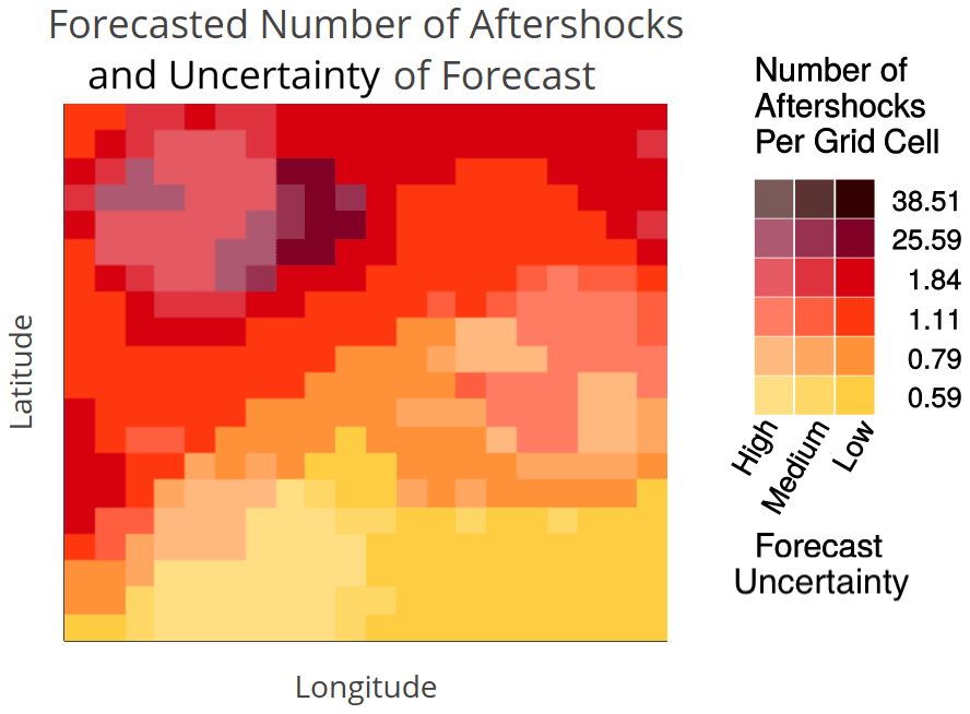
Figure 3Transparency uncertainty visualization: most likely forecasted aftershock rate in color and uncertainty levels shown by transparency (alpha level) of rate color.
2.2.5 Transparency uncertainty visualization
The Transparency UV (Fig. 3) was developed from the rate map by changing the alpha levels of grid cells' rate colors based on their uncertainty level. Alpha is a graphical parameter that alters color lightness by fading to white at minimal alpha levels. As described in Sect. 1.3, many previous UV evaluations for natural hazards have found this aspect of color to be an effective visual metaphor for uncertainty. We chose the three alpha levels visually to maximize discriminability of the transparency levels across all colors. We included these in the legend by adding columns of colors with corresponding alpha values for each uncertainty level.
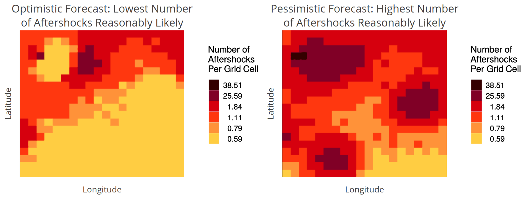
Figure 4Bounds uncertainty visualization: lower- and upper-bound maps of a 95 % confidence interval around the most likely forecasted aftershock rate. The forecast uncertainty at each location can be inferred through its difference in colors between the maps. Locations with high uncertainty have a difference of four to five colors, regardless of their most likely forecasted rate (e.g., lower-left and middle-right zones). We designed another scenario for when both the most likely forecasted rate and forecast uncertainty are high: the lower and upper bounds showed red and brown, respectively (e.g., several grid cells in the upper left zone). This scenario represents a case where the forecast's lower bound is very high but, due to high uncertainty, the upper bound is extremely high.
2.2.6 Bounds uncertainty visualization
To create the Bounds UV (Fig. 4), we developed two maps: one for the lower bound (most likely forecast minus 2 standard deviations) and one for the upper bound (most likely forecast plus 2 standard deviations) of an approximately 95 % confidence interval for each location's forecasted aftershock rate. While this assumes the forecast distribution is symmetric rather than skewed, it was the most reasonable approximation available to us without a complete forecast distribution to draw percentiles over. The lower- and upper-bound maps were labeled “optimistic forecast: lowest number of aftershocks reasonably likely” and “pessimistic forecast: highest number of aftershocks reasonably likely”, respectively. In this visualization, uncertainty is not conveyed explicitly but can be inferred from the color differences between the lower- and upper-bound maps (i.e., a large color difference at a given location represents greater uncertainty about its forecast). Participants were informed of this interpretation of large color differences in a short tutorial preceding the study (see Sect. 2.3). A location with high uncertainty corresponded to a color difference of at least four to five colors between the lower- and upper-bound maps, regardless of its rate level in the most likely forecast. That is, for areas of high uncertainty, the pessimistic forecasted rate was much higher than the optimistic forecasted rate. The exception was in areas where both the most likely forecast and uncertainty is high (see caption of Fig. 4).
2.3 Design and procedure
Following consent, participants were randomly assigned to one of the four visualization conditions in a between-participants design (Rate Only: n=217, Adjacent: n=221, Transparency: n=221 and Bounds: n=225). Participants were presented with some basic introductory information about aftershocks, how they are forecasted and why forecasts can be uncertain. In particular, participants were informed that, in areas where forecast uncertainty is high, many more aftershocks than forecasted could actually occur. This aligns with the skewed nature of the distribution of aftershock rates for spatial grid cells. To ensure they understood this introduction, participants had to correctly answer four multiple-choice questions about the information provided. One of these questions related to this interpretation of high uncertainty.
Participants then received a visual tutorial explaining how to read the visualization that they were randomly assigned to. We explained the maps as displaying a forecast of how aftershocks will be distributed across a region in the week following a major earthquake. We used arrows and highlighting to sequentially introduce the elements of the visualization (rate levels, uncertainty levels and legend) in a standardized way across all conditions.
Following this introduction, participants completed three tasks (see Table 1). Two map-reading tasks evaluated how well participants could retrieve and integrate the rate and uncertainty levels from the map(s). A Comparative Judgment task then tested how participants utilized the depicted forecast, together with its uncertainty, to make judgments about future aftershock activity.
Table 1Tasks to evaluate effects of UVs on map reading (tasks 1 and 2 for research question 1) and judgment (task 3 for research question 2) with aftershock forecast maps.
Within each participant, we randomized forecast region across the two map-reading tasks to counter-balance any potential effects of forecast region on reading the visualizations. For the Comparative Judgment task, forecast region was randomized across trials within participants. To isolate the effect of the rate level on judgment, we repeated trials for low, medium and high rate levels (across both forecast regions), which we set at 0.59, 1.11 and 25.59 aftershocks per grid cell in the most likely forecast map, respectively. To reduce the number of trials, we only focused on low and high uncertainty levels. The rate and uncertainty levels were also randomized across trials within participants.
2.3.1 Read Off task
The first map-reading task required participants to provide the rate level or uncertainty level of a marked location. For the Bounds UV, we asked participants to provide the rate level for the marked location on the upper-bound map. Each participant provided the rate level for three trials (low, medium and high rates for low-uncertainty locations) and uncertainty levels for six trials (full factorial; see Table 1). Participants in the Rate Only condition were not asked to provide the uncertainty level, as this was not depicted in their map. To increase difficulty, we used locations that bordered other rate or uncertainty levels.
Participants answered using multiple-choice response options, and responses were scored against the correct answer. Each participant's accuracy (calculated separately for the three rate and six uncertainty level responses) was averaged within the visualization condition.
2.3.2 Read Between task
The second map-reading task required participants to integrate over both rate and uncertainty levels. In this task, participants were asked to click on a location that matched specific rate and uncertainty combinations. Participants in the Bounds condition were asked for a specific lower-bound2–uncertainty combination, and participants in the Rate Only condition were asked only for a specific rate level. We asked for six locations (full factorial; see Table 1) and switched the forecast region from the one randomly assigned for the Read Off task.
We scored participants' responses on whether the clicked location's rate and uncertainty levels matched what was requested. We again averaged participant accuracy within the visualization condition, separately for rate and uncertainty levels.
2.3.3 Comparative Judgment task
In the final experimental task, two marked locations were shown, and participants were asked to select in which one they would expect more aftershocks to occur in the following week. Specifically, we asked the following question. “Where will there be more aftershocks next week: Location 1 or Location 2? Please make a prediction.” We further asked participants to rate their confidence in each judgment, using a six-point scale with the following equidistantly spaced verbal labels: “completely guessing”, “mostly guessing”, “more guessing than sure”, “more sure than guessing”, “mostly sure” and “completely sure” (coded as 1–6, respectively).
We varied the rate and uncertainty levels of locations across trials to evaluate three distinct types of judgment. Baseline trials assessed how map features determined judgments. In these trials, participants chose between two low-uncertainty locations with identical rate levels (see Fig. S2 in the Supplement for an experiment screenshot of an example baseline trial). While we do not analyze these to answer our research questions, they provide a control against which to understand the next trials.
Surprise trials tested how a change in uncertainty led to a change in judgment. For these trials, we moved one of the baseline trial locations from low to high uncertainty but kept the same rate (Fig. S3). Thus, each baseline trial yielded two distinct repetitions for each surprise trial (see Table 2), where one of the baseline locations remained constant and the other moved to a high-uncertainty zone. Lastly, sure bet trials were used to test how a change in rate level led to a change in judgment. Participants compared two locations with low uncertainty, where the rate is higher for one and lower for the other (Fig. S4). Thus, sure bet and surprise judgments correspond directly to communication needs 1 and 2, respectively (see Table 2).
Table 2Trials in the Comparative Judgment task by type. Two trial types correspond to UV communication goals. Participants had to judge which of the two locations will have more aftershocks in the next week, given the forecast map(s). For each rate level, locations marked with an asterisk/plus sign were identical between the baseline and surprise trials, meaning that only the other location was moved to create a surprise trial.
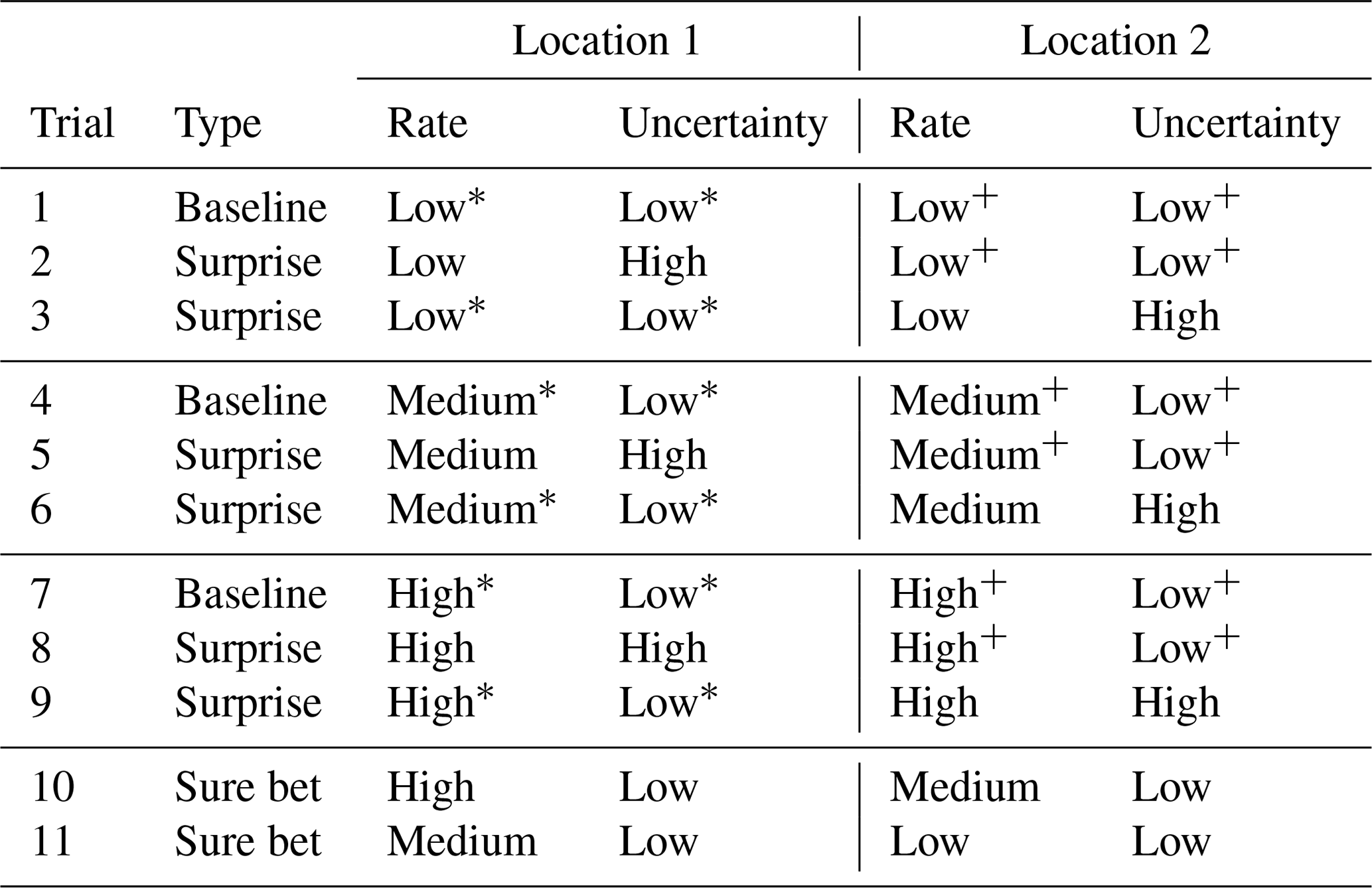
Each trial type had multiple trials, where we varied the locations' rate levels to assess how this affects the perception of their uncertainty (e.g., surprise trials 2 and 5 in Table 2). This also allowed for multiple trials within a rate level (e.g., surprise trials 2 and 3 in Table 2, with low rates). We also repeated each trial in Table 2 across both forecast regions to manage expected within-participant variability in task response. There were thus (3×2) baseline trial repetitions, () surprise trial repetitions and (2×2) sure bet trial repetitions. These 22 total trial repetitions were randomized within participant, and the location labels (1 and 2) were also assigned randomly (though recoded in our analysis as described in Table 2).
For baseline and surprise judgments, we attempted to select location pairs with balanced distances to, as well as symmetry around, the map center and zones of high uncertainty or high rate. For their trial repetitions, we sought to keep distance between location pairs constant while covering different parts of the map. For sure bet judgments, we again selected locations bordering other rate/uncertainty levels to increase difficulty.
2.3.4 Response time and covariates
Since it may be faster to read and use forecast and uncertainty information from particular designs, previous UV evaluations have measured participant response times (Kinkeldey et al., 2017). To explore UV effects in response time, we recorded response times for each trial across all tasks to compare the response times of participants in the UV conditions relative to those in the Rate Only condition.
Following the judgment task, participants were asked several demographic questions (age, gender, education level and state of residence). We also asked participants how many earthquakes they previously experienced, as past experience has been shown to affect earthquake forecast perception (Becker et al., 2019).
2.4 Statistical analysis plan
We performed confirmatory analysis using confidence intervals to answer our research questions about how UVs affected map-reading accuracy and comparative judgment. In the Read Off task, we aggregated average participant accuracy in responses about locations' rate levels within each condition. We calculated the 95 % simultaneous confidence interval for the mean difference between each UV condition and Rate Only. We used Bonferroni-corrected standard errors and compared confidence intervals to zero to infer differences between groups. We conducted the same confidence interval analysis for responses about locations' uncertainty levels, comparing across the three UV conditions only. We repeated this confirmatory analysis on rate and uncertainty accuracies in the Read Between task. Across all analyses, we used a 5 % significance level to determine statistically significant differences between conditions.
We evaluated comparative judgments by calculating the percentage of trials where the participant selects the location with the higher rate or uncertainty (see Table 2), which we then averaged across participants and conditions. We computed differences between these percentages for UV and Rate Only conditions separately for sure bet and surprise judgments. We again inferred differences between groups using 95 % simultaneous confidence intervals. For surprise judgments, we computed differences between UVs and Rate Only specifically for each rate level. This tests whether UV effects on judgments of high-uncertainty locations are consistent when the forecasted rate is low, medium or high.
As an exploratory analysis, we explored whether individual differences affected responses to forecast uncertainty. We built multilevel logistic regression models of participant judgments at the trial level, with the visualization condition and rate level as fixed effects and a random intercept for the participant. Model selection using model performance metrics determined other needed explanatory variables (see detailed explanation in Supplement S5). We specifically investigated how participant covariates and characteristics of the locations used for judgment trials (distance from map center and from high rate or uncertainty zones; see detailed explanations in Supplement S3) influenced judgment pattern.
Finally, ordinal confidence ratings were analyzed in exploratory fashion across sure bet and surprise judgments and other trial subsets, comparing each UV group to the Rate Only baseline. We also compared how patterns in response times differ by condition and between judgment and map-reading tasks.
3.1 Map-reading tasks
3.1.1 Read Off task
Accuracy in reading rate levels was high across all conditions in both map-reading tasks; however, accuracy differed across conditions in reading the uncertainty level (see Table 3 and Fig. 5).
Table 3Percentage of trials answered correctly by condition for both map-reading tasks, separately for rate and uncertainty levels. Participants in the Rate Only condition were not asked to read uncertainty in either task.
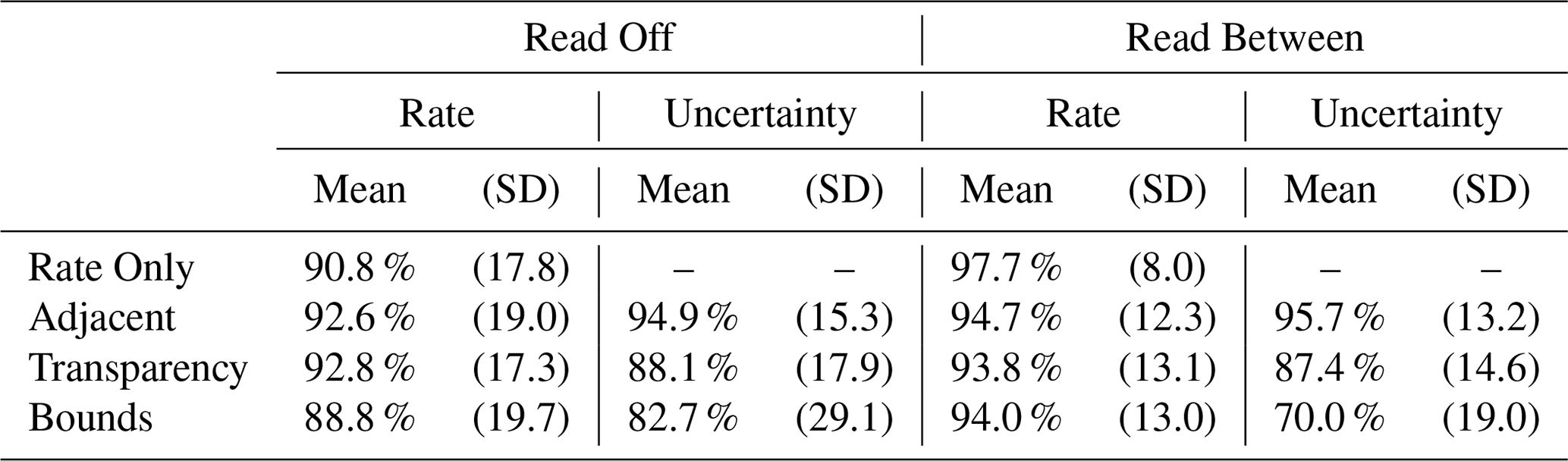
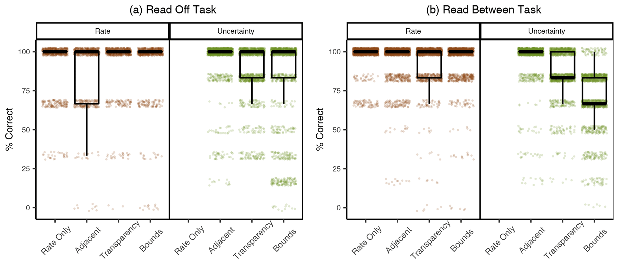
Figure 5Accuracy in the Read Off (a) and Read Between (b) tasks. Boxplots are over the percentage of trials answered correctly by participants, grouped by condition. Each dot represents the percentage correct of one participant, slightly jittered to increase visibility (as such, some jittered dots lie above 100 and below 0). We show results for reading rate and uncertainty separately for both tasks. Participants in the Rate Only condition were not asked to read uncertainty in either task.
In the Read Off task, participants had a high accuracy in reading off the rate in all conditions, giving correct responses in between 88.8 %–92.8 % of trials. Accuracy for participants in the UV conditions was thus statistically indistinguishable from Rate Only, with differences of less than 2.0 percentage points, on average (see Table 3).
Accuracy in reading off the uncertainty level was lower in the Transparency and Bounds conditions, relative to the Adjacent condition. Participants gave correct uncertainty responses in 82.7 %–94.9 % of trials, across all conditions. Compared to the Adjacent condition, which was most accurate, participants were on average 6.8 percentage points less accurate (95 % confidence interval (CI) of 3.4–10.2) in the Transparency condition and 12.2 percentage points less accurate (95 % CI of 7.5–16.9) in the Bounds condition. Across all conditions, the majority of inaccurate responses came from misreading the location's uncertainty level as medium, rather than high or low. This was the case for 57.6 % to 80.9 % of inaccurate responses, when averaged separately within the three UV conditions.
3.1.2 Read Between task
Results were similar for the Read Between task. Participants identified locations with the correct rate across all conditions. Participants in the Rate Only condition were most accurate for the rate level, and accuracy in UV conditions was no more than 3.9 percentage points lower, on average.
Just as in the Read Off task, fewer participants identified locations with the correct uncertainty levels in the Transparency and Bounds conditions than in the Adjacent condition. There was a wider range in accuracy across conditions for the Read Between task, with participants giving correct uncertainty responses in 70.0 %–95.7 % of trials. Compared to the Adjacent condition, participants were 8.3 percentage points less accurate (95 % CI of 5.5–11.1) in the Transparency condition and 25.7 percentage points less accurate in the Bounds condition (95 % CI of 22.4–29.0). The majority of inaccurate responses were again caused by identifying a location with medium uncertainty, across all conditions.
3.2 Comparative Judgment task
In the Comparative Judgment task, participants compared two locations that differed systematically in either rate or uncertainty levels and judged where they would expect more aftershocks. For locations with different rates but low uncertainty (sure bet trials), almost all participants in all conditions correctly selected the higher-rate locations (participants selected the higher-rate location in 92.2 %–97.8 % of trials). Yet for locations with differing uncertainty levels but identical rates (surprise trials), participants in the Bounds condition were more likely than participants in the other two UV conditions to select the higher-uncertainty location (Table 4 and Fig. 6).
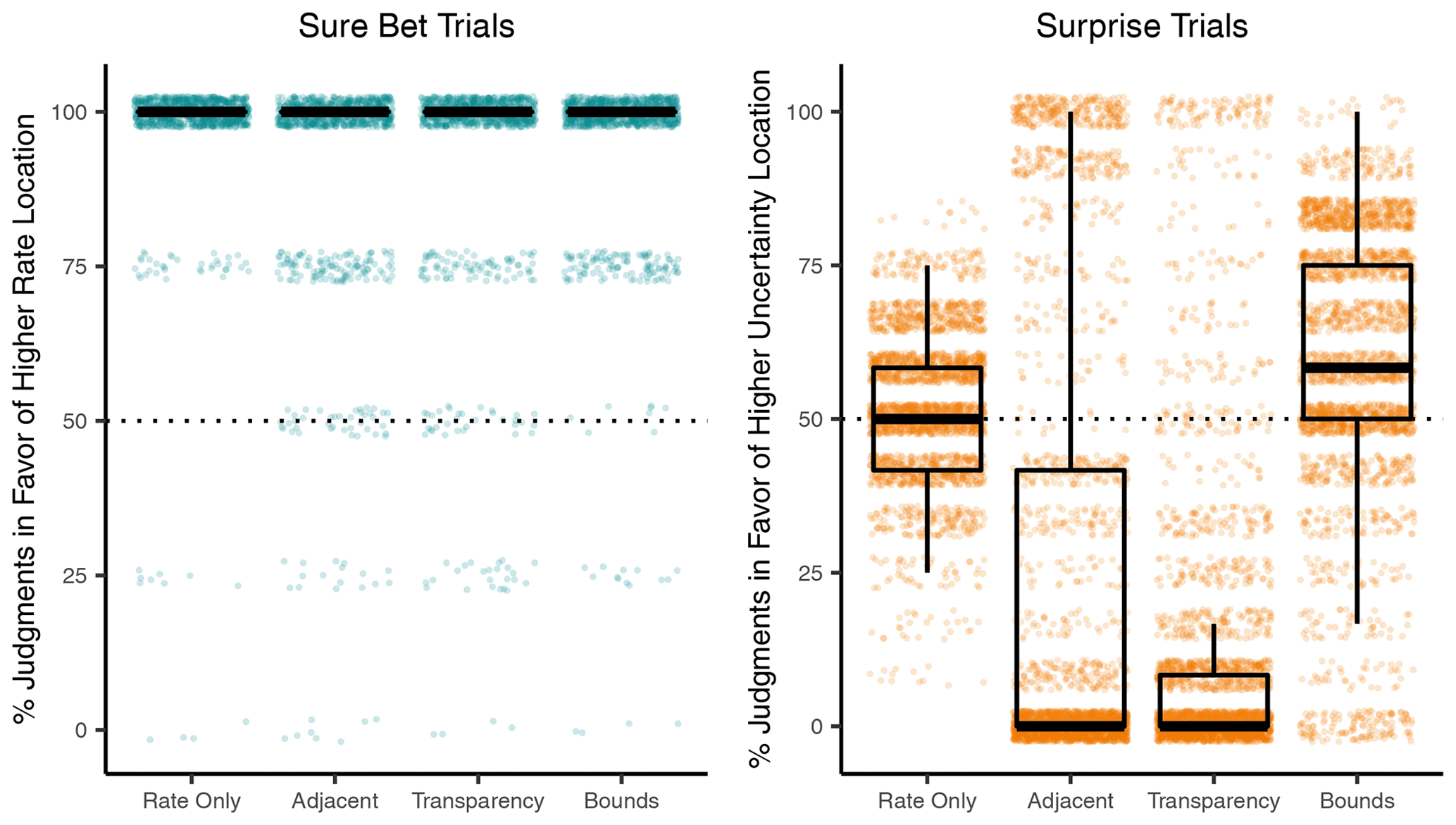
Figure 6Percentage of trials where the location of a higher rate (sure bet trials, turquoise) or higher uncertainty (surprise trials, orange) was selected in the Comparative Judgment task. See example screenshots of sure bet and surprise trials in Figs. S4 and S3, respectively. Boxplots are over mean percentages across participants, by condition. Each dot represents the mean percentage of one participant, slightly jittered to increase visibility.
Table 4Comparative Judgment task: percentage of trials where participants judged the higher-rate location (sure bet trials) or higher-uncertainty location (surprise trials) to have more aftershocks, per condition.

In surprise trials, participants compared two locations with different uncertainty but identical rate levels. In the Rate Only condition, participants selected the location of higher uncertainty in 52.0 % of the trials, on average. Note that uncertainty was not visualized in this condition, so participants saw two locations of equal rate level but may nevertheless infer differences between them based on other information (Morss et al., 2010). Participants in the Bounds condition selected the higher-uncertainty location 6.9 percentage points more often (95 % CI of 3.2–10.5). In contrast, participants in the Adjacent and Transparency condition selected this location 29.3 (95 % CI of 23.8–34.7) and 39.2 (95 % CI of 35.3–43.1) percentage points less than Rate Only, respectively.
Moreover, 68.0 % of the participants in the Adjacent and 75.7 % in the Transparency condition selected the lower-uncertainty location in at least 11 of 12 surprise trials. In contrast, participants' judgments in the Bounds and Rate Only conditions were more variable, with at least 89.0 % of these participants selecting both locations multiple times across the 12 trials.
Looking at the surprise trials separately for each of the three rate levels (low, medium and high), the difference between Bounds and the other UV conditions was found for each rate level but was considerably stronger for trials with low rates and varying uncertainty (see Fig. 7). Participants in the Rate Only condition selected the higher-uncertainty location in 85.9 % of the low-rate trials and those in the Bounds condition selected it 1.7 percentage points more often, on average (95 % CI of (-3.3)–7.2). In contrast, participants in the Adjacent and Transparency conditions selected the higher-uncertainty location 59.2 percentage points (95 % CI of 52.6-65.9) and 72.1 percentage points (95 % CI of 66.7-77.5) less often, respectively.

Figure 7Percentage of trials where the higher-uncertainty location was selected between two locations of equal rate level (surprise trials), grouped by condition and rate level. Boxplots are over mean percentages across participants, by condition. Each dot represents the mean percentage of one participant, slightly jittered to increase visibility.
The surprise trials with high rates and varying uncertainty contained cases where the higher-uncertainty location had a possible extreme outcome (high lower bound and extremely high upper bound), which was only visible in the Bounds condition (see caption of Fig. 4). Participants using bounds tended to select this higher-uncertainty location for extreme cases (at least 79.0 % of participants selected it in these trials) but not for the other high-rate trials (7.0 % or fewer selected it in these trials), resulting in their average percentage for all high-rate trials to be near 50 % (Fig. 7, right).
3.3 Multilevel modeling of judgments
3.3.1 Accounting for variability within participants
The effect of visualization on judgments also held after we accounted for variation in judgments on an individual level. We built a multilevel logistic model for judgments in situations with varying uncertainty and identical rates (surprise trials), with fixed effects for the visualization condition, rate level and their interaction and a random intercept per participant (see Supplement S5 for details on the model). Because the confirmatory analysis found no evidence of an effect by condition for sure bet trials, we report exploratory analysis on models for judgments in surprise trials only.3
While using the Bounds UV slightly raised the probability of selecting the higher-uncertainty location compared to Rate Only, the opposite was true for Transparency and Adjacent. These conditions had significantly negative estimated coefficients (see Table S2 in the Supplement), suggesting, as in Fig. 6, that participants in these conditions were much less likely to select the higher-uncertainty location. This location was more likely to be selected for trials with low rate over medium rate (highly positive estimated coefficient) and high rate, but this effect was dampened by the interaction terms of low rate with Adjacent and Transparency visualizations (highly negative estimated coefficients). These results match those from the confirmatory analyses in the previous section.
3.3.2 Effect of trial characteristics on judgments
Next, we explored whether the spatial patterns of the forecast region and characteristics of the trial locations, such as their distances to important map features, also influenced forecast judgment. These trial-level features did have a measurable effect on participants' judgments, better explaining the variation in judgments than visualization and rate level alone.
To assess the importance of these variables, we included the forecast region of each trial, the locations' rate level, and their distances to the map center and zones of high uncertainty or rate as fixed effects into the model. We performed a stepwise model comparison between the baseline model and models with these additional fixed effects (see Supplement S3 and S5 for details on the distance measures and the model selection procedure and Table S3 for model selection results). We again report results for surprise trials only, as results for models including both trial types were qualitatively similar. The best-fitting model across all four metrics included rate level and visualization, as well as having a location which was closer to the map center or to a high-rate zone (Table 5).
Table 5Most likely estimates and 95 % confidence intervals using Wald standard errors for fixed effects in the best-fitting multilevel model. The intercept is the logistic of the probability of selecting the higher-uncertainty location for the Rate Only condition and medium-rate trials, with both locations being equidistant from map features (reference level for visualization, rate level and the map feature variables). Each fixed effect gives the change in probability of selecting this location from Rate Only to UV conditions, from medium rate to other rate levels or from equidistant locations to one location being closer to the map feature (all else being held equal).
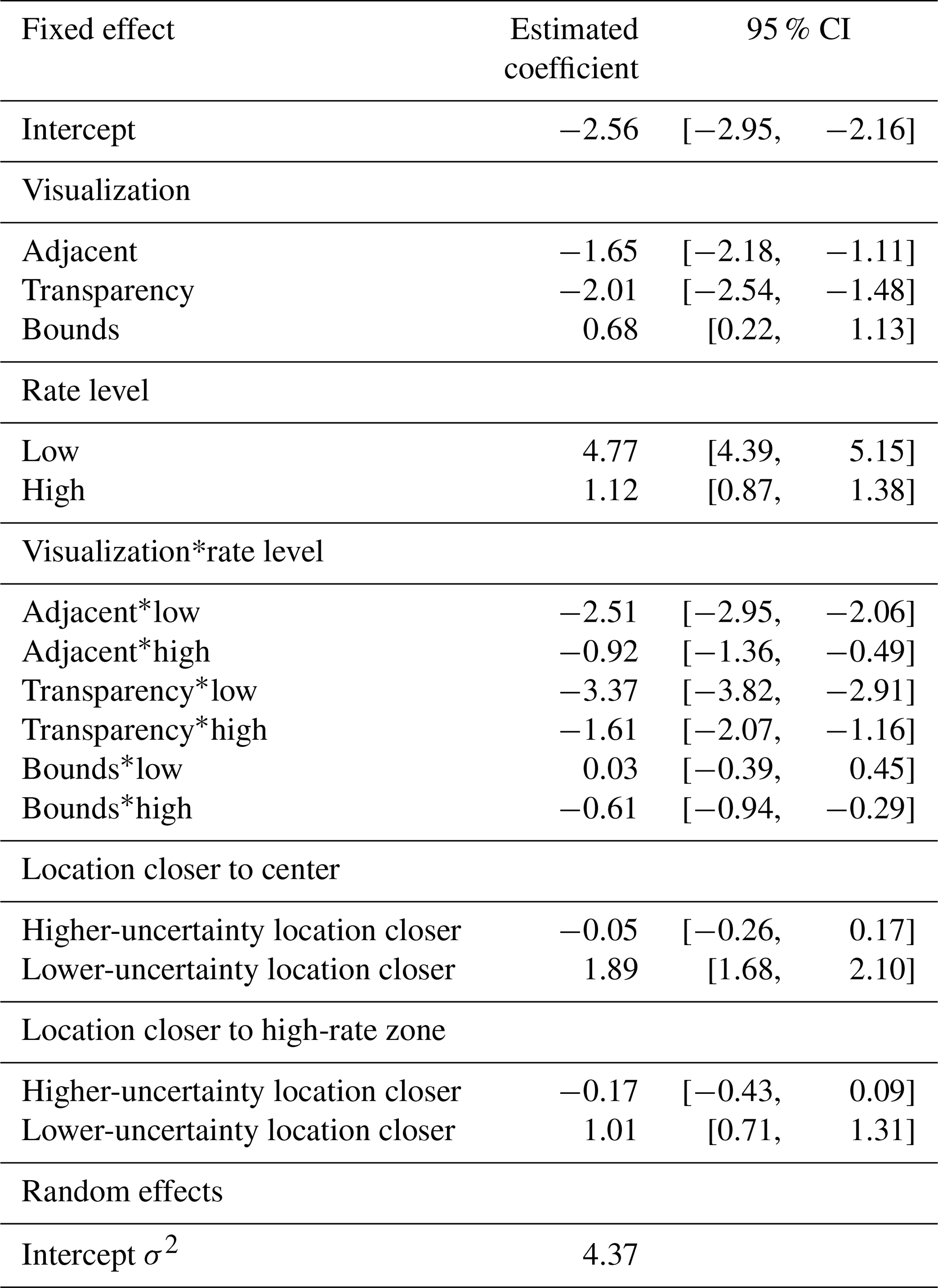
The UV effects on judgment did not change even when considering the other important variables in this optimal model. The estimated coefficients for visualizations were similar to the baseline model (compare Table S2 to Table 5). Similarly, the coefficients for rate level and its interaction with UV group were equivalent to the baseline model, reflecting the findings in Fig. 7. The best-fitting model also found that in trials where the lower-uncertainty location was closer to the center or to a high-rate zone, participants tended to select the higher-uncertainty location (highly positive estimated coefficients), though these variables only minorly improved model performance (see Table S3).
Participants also seemed to use features of the map to make consistent judgments between two locations of the same rate and uncertainty levels (baseline trials). Figure S6 in the Supplement shows that even though these locations have the same characteristics, participants tended to select one or the other for some trials, sometimes differently across conditions. Judgments in these trials had no consistent pattern based on forecast region or locations' distances to map features.
3.3.3 Individual differences between participants' judgments
To explore whether the participant-level variables we measured could account for differences in surprise judgments, we considered additional fixed effects for the number of earthquakes participants previously experienced, education, age, gender and state of residence, performing the same model comparison as described above. None of these individual differences improved the model fit across multiple metrics (see model comparison in Table S4 in the Supplement). Thus, differences in visualization and rate level explain participants' judgments better than any of these participant-level variables.
We also found no systematic differences in these variables between participants who consistently selected either location in 11 out of 12 trials and those with more variation in judgments.
3.4 Confidence and response time
3.4.1 Confidence ratings
We asked participants to rate their confidence after each judgment, and we investigated these by visualization condition and between sure bet and surprise judgments.
We calculated median confidence ratings for each participant within each trial type. Confidence did not differ by condition for the sure bet judgments, with identical medians and equivalent distributions. For the surprise judgments, participants in the Rate Only condition (who did not see the difference in uncertainty between the two locations) were generally less confident than participants in the three UV conditions. The median confidence rating was two points lower for Rate Only compared to all UVs.
We also investigated whether surprise judgments were made more confidently in favor of higher- or lower-uncertainty locations, as suggested in Hullman et al. (2018). Again, we calculated median confidence ratings per participant for those trial subsets. Participants using Rate Only and Bounds had similar confidence regardless of their judgment; however, confidence appeared to differ by judgment for participants using Adjacent and Transparency (see Fig. S7 in the Supplement). When they selected the higher-uncertainty location, participants in these two conditions had median confidence ratings that were at least one point lower than when they selected the lower-uncertainty location. The spread of their confidence ratings was also lower (shorter boxplots) in the trials where they selected the lower-uncertainty location.
3.4.2 Response times
We also investigated trial response times by calculating medians within participants across trials, separately for each of the three tasks. There was no meaningful difference across the UV conditions in the Comparative Judgment and Read Off tasks, with differences in median response times to Rate Only of less than 1.5 s, across all trial types (figure omitted). In the Read Between task, response times were slightly shorter for participants in the Rate Only condition (who were only asked to identify a particular rate level) than participants in the UV conditions (who were asked to identify a particular rate and uncertainty level).
Uncertainty visualization is critical for forecast communication, as studies have shown that communicating uncertainty improves user decision-making and prevents users from building their own representation of where uncertainty is high or low (Joslyn and LeClerc, 2012; Ash et al., 2014). We compared three visualizations of uncertainty for aftershock forecast maps against a visualization of the forecast without uncertainty. The experimental tasks were designed to systematically evaluate how well users could read off the forecasts and how effectively the visualizations served two user-generated communication needs. In particular, aftershock forecast maps should communicate where the certainty is high that aftershocks will or will not occur, as well as where outcomes worse than forecasted are possible, due to high uncertainty.
The results show that all three uncertainty visualizations led to correct judgments about where to expect more aftershocks when both locations had low uncertainty and a difference in forecasted aftershock rate. However, the uncertainty visualizations resulted in significantly different judgments when the locations had forecasts where the uncertainty varied. Although users of the visualization showing the bounds of a forecast interval (Bounds UV) could read off the uncertainty less accurately than the other visualizations, it was the only one where users demonstrated an understanding that forecasts with high uncertainty could have outcomes worse than forecasted.
4.1 Effects of visualization
While there was no difference in how well participants could read the rate information from the different visualizations, accuracy in reading the uncertainty information differed depending on the visualization participants saw. Consistent with previous research, the adjacent design was associated with greater accuracy compared to the transparency-based design (Retchless and Brewer, 2016) and the interval-based design (Nadav-Greenberg et al., 2008). These differences held across both map-reading tasks. The majority of inaccurate responses in these tasks, across all visualizations, were in misreading the uncertainty level as being medium rather than high or low. For the Transparency UV, participants may have had difficulty distinguishing between the non-transparent version of one color (low uncertainty) and the more transparent version of the next darker color (one transparency level lighter, i.e., medium uncertainty). For the Bounds UV, since uncertainty was not depicted explicitly in the legend, participants may have had trouble classifying a location into the correct uncertainty category. As shown in past research, aftershock forecast users were most accurate reading uncertainty information off adjacent displays compared to those that used transparency or represented uncertainty implicitly through a forecast interval.
In the judgment task, there were differences by visualization in how participants judged higher-uncertainty locations compared to lower-uncertainty locations. Most users of the adjacent and transparency visualizations expected the lower-uncertainty location to have more aftershocks than the higher-uncertainty location. This judgment pattern was so consistent that the majority of these participants selected the lower-uncertainty location in at least 11 of the 12 trials. In contrast, users of the Bounds UV were more likely to expect that the higher-uncertainty location would have more aftershocks, relative to the Adjacent and Transparency UVs.
Users of the Bounds visualization may have had judgment patterns that differed from users of the other visualizations because Bounds explicitly displays the extremes of the forecast distribution rather than its spread; the spread must be inferred by comparing the lower- and upper-bound maps. The word uncertainty was also not used in the legend in the Bounds visualization, and we instructed participants that locations with higher uncertainty can only be identified by their large color differences between the two maps. In contrast, the other uncertainty visualizations explicitly depicted the uncertainty and required users to infer where high uncertainty could yield extreme outcomes.
There are three potential explanations for why explicitly depicting the extremes rather than the uncertainty could account for our results. First, consistent with the findings of Nadav-Greenberg et al. (2008), the upper-bound map may have served as an anchor point that biased users' perceptions towards higher values. Users of the Bounds visualization may have expected more aftershocks in higher-uncertainty locations because they focused on the worst-case scenario map (the upper bound) and did not even pay attention to differences in color to infer the spread.
Second, the explicit depiction of uncertainty in the adjacent and transparency designs may have led users to associate high uncertainty with low forecast quality. That is, despite the study instructions explaining that locations with high uncertainty could have worse outcomes due to the skewed distribution of aftershock rates (which participants had to answer correctly before continuing to the study), participants may have nevertheless interpreted lower-uncertainty locations as being more reliable. Furthermore, uncertainty may have been interpreted differently based on whether the visualization presented it with words or numbers. Consistent with previous research (e.g., Retchless and Brewer, 2016), we used an ordinal uncertainty scale with verbal labels (low, medium and high) in the adjacent and transparency designs. In contrast, the interval-based Bounds design used numeric legends in both lower- and upper-bound maps. Previous experiments in non-spatial uncertainty communication have found that verbal labels can lower perceptions of forecast reliability compared to numeric ranges (Van Der Bles et al., 2019), which might explain the difference in judgments between the uncertainty visualizations.
Third, differences in judgment patterns between the visualizations may have resulted from differences in how the uncertainty visualizations used color to signify uncertainty. Higher-uncertainty areas are always marked by darker colors in the upper-bound map than lower-uncertainty areas of the same rate level. In contrast, higher uncertainty is marked by lighter colors in both the adjacent and transparency visualizations. These differences in color lightness may have affected how participants interpreted higher uncertainty in the visualizations. Previous studies have reported a dark-is-more bias in how people interpret color scales (Silverman et al., 2016; Schloss et al., 2018). Users of the adjacent and transparency visualizations may have thus perceived the lighter-colored zones of high uncertainty as having a lower potential of aftershocks.
4.2 Effects of rate level
While users of the adjacent and transparency visualizations had the same patterns of selecting the higher-uncertainty location regardless of its most likely aftershock rate (rate level), judgment differed by rate level for the Bounds visualization. When the compared locations had low rate levels (most likely aftershock rate of 0.59 aftershocks per grid cell; yellow color), the majority of participants using the Bounds visualization correctly expected more aftershocks at the higher-uncertainty location, which had the much higher upper bound. That is, in these comparisons, the lower bounds of both locations were of equal color (both yellow), but their upper bounds showed a near-maximal color difference (from yellow to red), indicating the higher-uncertainty location's potential for much higher rates.
When the compared locations had medium rate levels (most likely aftershock rate of 1.11 aftershocks per grid cell; middle-orange color), participants' judgments varied between the lower-uncertainty (showing a medium rate in both lower- and upper-bound maps) and higher-uncertainty (showing a low rate in the lower-bound map and a high rate in the upper-bound map) locations. When the compared locations had high rate levels (most likely aftershock rate of 25.59 aftershocks per grid cell; dark-red color), participants only selected the higher-uncertainty location when the upper bound had an extremely high rate (38.51 aftershocks per grid cell; brown color; see Fig. 4). In these situations, the lower-uncertainty location always showed a high rate (dark-red color) across both lower- and upper-bound maps, indicating that a high number of aftershocks is very likely to occur there. When the upper bound for the higher-uncertainty location showed an extremely high rate (brown color), participants were likely to select it. However, when the upper bound of the higher-uncertainty location only showed a high rate (red color) and the lower bound showed a low rate (yellow color), they almost never selected the higher-uncertainty location.
These results indicate that the Bounds visualization led to judgments that recognized the relationship between high uncertainty and the potential for outcomes that could be worse than forecasted. For judgments where the higher-uncertainty location was much higher in the upper bound than the lower-uncertainty location, the majority of users of the Bounds UV selected the higher-uncertainty location. Users of the other uncertainty visualizations, who did not see the extremes explicitly, made the opposite judgment. This difference between uncertainty visualizations held even when accounting for within-participant variability and other potential participant-level determinants of judgments. Thus, the estimated visualization effects held across the sampled population, with respect to the studied covariates.
If highlighting the potential for (even) higher aftershock rates in cases of high forecast uncertainty is critical for a decision at hand (for example, in the emergency response context), then our results support displaying forecast uncertainty with maps showing forecast intervals. Where locations have the same low uncertainty, the higher-rate location may be interpreted to have more aftershock potential, and where locations have the same rate level, the higher-uncertainty location may be interpreted to have more aftershock potential. In contrast, adjacent and transparency-based displays appear to lead to an opposite response to high uncertainty.
4.3 Effects of map features
Previous studies have found that risk perception about a location can be impacted by its distance to risky areas (Ash et al., 2014; Mulder et al., 2017). We also found some evidence indicating that map features of the trial locations influenced judgments using aftershock forecasts. The model selection analysis found that when a lower-uncertainty location was closer to the map's center or to a high-rate zone, the higher-uncertainty location was slightly more likely to be selected, regardless of visualization (see Table 5). Furthermore, participant selections were not evenly split when comparing locations of equal rate and uncertainty, with clear differences by visualization in some trials (see Fig. S6). It is possible that other map-related features that we did not measure could account for these differences in judgments. Future research could explore systematically how judgments are affected by map features or location characteristics.
4.4 Judgment confidence and response time
We found only minor differences between visualizations in user confidence in judgments. Not surprisingly, confidence ratings were higher when comparing low-uncertainty locations with different rates than when comparing locations with different uncertainties. In general, participants using the forecast depicted without uncertainty made judgments between locations with different uncertainties with lower confidence than those using UVs. This suggests that omitting uncertainty lowers confidence for judgments between two locations when uncertainty differs but rate does not. We observed higher and less variable confidence ratings for judgments in favor of the lower-uncertainty location, compared to those for the higher-uncertainty location, but only for users of the adjacent and transparency visualizations. These designs appear to encourage a consistent interpretation of uncertainty, leading lower-uncertainty locations to be confidently associated with more aftershocks. Response time distributions were equivalent between visualizations, meaning that no evidence was found to suggest visualizing uncertainty increases the time needed for map reading or making comparative judgments. This result mirrors findings summarized in a review of previous UV evaluations (Kinkeldey et al., 2017).
4.5 Limitations and future research
Our study sought to examine the effects of UV designs on specific communication needs for aftershock forecast maps. To do so systematically, we had to fix one variable, either the forecasted aftershock rate or its uncertainty, in the Comparative Judgment task. In real-world decisions, locations must often be compared where both the rate and uncertainty vary, for example, comparing a location of medium rate and low uncertainty against one of low rate and high uncertainty. Future studies should explore these comparisons by systematically testing location pairs with meaningful differences, as recommended in prior reviews (Hullman et al., 2018; Kinkeldey et al., 2017).
Geographical features, such as roads and landmarks, were omitted from our maps in order to avoid potential confounding effects on judgments, as in Nadav-Greenberg et al. (2008). However, omitting these features lowers the similarity between our study and real public forecast communications, which generally include geographical features. Future experiments could add standard map layers to visualizations and evaluate their effects on interpretations of the forecast made using an uncertainty visualization. We found some evidence that map features influenced forecast perception, especially when locations were compared with the same forecasted rate and uncertainty. Controlled experiments should target the effects of map features on task response, both with and without additional map layers.
Finally, our evaluation experiment combined map-reading tasks with a single judgment task. As we did not separately test how accurately visualizations could be read before testing their effects on judgment, we could not address issues in map reading in the visualizations' design. This could be done in future studies in separate experiments that elucidate other effects of candidate uncertainty visualizations, especially using tasks that move beyond judgment and towards decision-making. For example, if aiding resource allocation is a communication goal, participants could be asked to allocate search and rescue teams across the map, based on the forecasted rate and its uncertainty. As aftershock and other natural hazard forecasts are increasingly released via public portals with interactive capabilities (Marzocchi et al., 2014), tasks with interactivity can assess how this moderates an uncertainty visualization design's effects. A greater variety of uncertainty visualizations can also be evaluated, particularly designs that represent uncertainty using patterns or other overlays easier to separate from the forecast's color than color transparency. Expressing uncertainty in a way that does not use color lightness could investigate whether the dark-is-more bias or something else affects the interpretation of high uncertainty.
Our experiment found that the three approaches for visualizing uncertainty in an aftershock forecast map differed substantially in their effects on map reading and judgment responses. These visualizations included one of the most effective designs from the visualization literature (the Transparency visualization) and a newer approach with recent operational use (the Bounds visualization showing forecast intervals). Our work suggests several practical implications for the design of aftershock forecast maps for broad audiences. If the accurate reading of uncertainty is the most important aim (e.g., for technical users who may need the aftershock forecast distribution as a direct input into their own models), our results support communicating this explicitly and with a separate and adjacent map. Map-reading accuracy was high across all visualizations, but uncertainty was read most accurately for adjacent designs, compared to transparency- and interval-based designs.
If instead the aim is to communicate that higher-uncertainty locations could lead to more rather than fewer aftershocks and some inaccuracy in the (implicit) communication of uncertainty is acceptable, then our results support representing uncertainty using forecast intervals. While all visualizations were able to convey that higher-rate locations are sure bets to have more aftershocks when uncertainty is low, only the intervals-based design communicated that high-uncertainty locations were potential surprises to have more aftershocks than were forecasted. As this interpretation of high uncertainty is consistent with the skewed distribution of aftershock rates, the intervals-based visualization may improve judgments or decisions by non-technical users. For example, emergency managers rely on aftershock forecasts to decide whether to issue a disaster declaration during an aftershock sequence or not, as in the case of L'Aquila, Italy. The intervals-based design may help these decisions to be more consistent with the skewed distributions of these forecasts. Thus, in a crisis management situation, providing a pessimistic map may be useful for rapid risk assessment, a hypothesis which should be tested in future research. Furthermore, our results can inform visualizations for other natural hazard forecasts that also follow such skewed distributions, though this also merits further study.
All code and experimental data needed to produce the experimental results are available at https://osf.io/y47sg/?view_only=5436764742984f48b164c89143915f8f (Schneider et al., 2022).
The supplement related to this article is available online at: https://doi.org/10.5194/nhess-22-1499-2022-supplement.
In the following, we use the CASRAI (Consortia Advancing Standards in Research Administration) Contributor Roles Taxonomy to categorize author contributions.
MS, MM, PG, EAS and NF conceptualized the project. MS, MM, PG, EAS and NF developed uncertainty visualizations. MS, NF, MM, PG and EAS conceived the methodology for the experiment and statistical analysis. NF, MS and MM performed the investigation via experimental data collection. MS performed the formal analysis of experimental data. MS wrote the original draft of this paper. MM, NF, PG and EAS reviewed and edited the paper. MM, PG, EAS and NF supervised the project.
The contact author has declared that neither they nor their co-authors have any competing interests.
The views and conclusions contained in this document are those of the authors and should not be interpreted as representing the opinions or policies of the U.S. Geological Survey. Mention of trade names or commercial products does not constitute their endorsement by the U.S. Geological Survey.
Publisher's note: Copernicus Publications remains neutral with regard to jurisdictional claims in published maps and institutional affiliations.
This material is based upon work supported by the United States Geological Survey (grant no. G20AP00061). This research was also supported by the Hans Ertel Centre for Weather Research, a research network of universities, research institutes and the German Weather Service funded by the Federal Ministry of Transport and Digital Infrastructure, and within the program “Open-Access-Publikationskosten”, funded by the German Research Foundation (project no. 491075472). We gratefully acknowledge the five emergency management officials in Washington State, USA, for informing our study; Andrew Michael, Joan Gomberg and Elenka Jarolimek for checks on visualizations and study design; Maik Messerschmidt and Antonio Amaddio, who custom-built our experimental platform; Alexandra Horsley and Jann Wäscher for assistance with piloting; and numerous colleagues at the Max Planck Institute for Human Development, Harding Center for Risk Literacy and University of Washington for fruitful discussions that developed this work. We also thank the two reviewers for their thoughtful comments that improved our manuscript.
The article processing charges for this open-access publication were covered by the Helmholtz Centre Potsdam – GFZ German Research Centre for Geosciences.
This paper was edited by Maria Ana Baptista and reviewed by Mary Anne Clive and one anonymous referee.
Ash, K. D., Schumann III, R. L., and Bowser, G. C.: Tornado warning trade-offs: Evaluating choices for visually communicating risk, Weather Clim. Soc., 6, 104–118, 2014. a, b, c, d
Becker, J. S., Potter, S., McBride, S., Wein, A., Doyle, E., and Paton, D.: When the earth doesn't stop shaking: How experiences over time influenced information needs, communication, and interpretation of aftershock information during the Canterbury Earthquake Sequence, New Zealand, Int. J. Disast. Risk Re., 34, 397–411, 2019. a
Becker, J. S., Potter, S. H., McBride, S. K., H. Doyle, E. E., Gerstenberger, M. C., and Christophersen, A.: Forecasting for a Fractured Land: A Case Study of the Communication and Use of Aftershock Forecasts from the 2016 M w 7.8 Kaikōura Earthquake in Aotearoa New Zealand, Seismol. Res. Lett., 91, 3343–3357, 2020. a, b, c, d
Bostrom, A., Anselin, L., and Farris, J.: Visualizing seismic risk and uncertainty: A review of related research, Ann. NY. Acad. Sci., 1128, 29–40, 2008. a
Burgeno, J. N. and Joslyn, S. L.: The impact of weather forecast inconsistency on user trust, Weather Clim. Soc., 12, 679–694, 2020. a
Cheong, L., Bleisch, S., Kealy, A., Tolhurst, K., Wilkening, T., and Duckham, M.: Evaluating the impact of visualization of wildfire hazard upon decision-making under uncertainty, Int. J. Geogr. Inf. Sci., 30, 1377–1404, 2016. a, b
Correll, M., Moritz, D., and Heer, J.: Value-Suppressing Uncertainty Palettes, in: Proceedings of the 2018 CHI Conference on Human Factors in Computing Systems, Montreal, Canada, 21–26 April 2018, 642 pp., https://doi.org/10.1145/3173574.3174216, 2018. a, b, c
Crisan, A. and Elliott, M.: How to evaluate an evaluation study? Comparing and contrasting practices in vis with those of other disciplines: Position paper, in: IEEE Evaluation and Beyond-Methodological Approaches for Visualization (BELIV), IEEE, 28–36, 2018. a
Deitrick, S. and Edsall, R.: The influence of uncertainty visualization on decision making: An empirical evaluation, in: Progress in Spatial Data Handling, Springer, 719–738, 2006. a
Doyle, E. E., Johnston, D. M., Smith, R., and Paton, D.: Communicating model uncertainty for natural hazards: a qualitative systematic thematic review, Int. J. Disast. Risk Re., 33, 449–476, 2019. a
Fleischhut, N., Herzog, S. M., and Hertwig, R.: Weather literacy in times of climate change, Weather Clim. Soc., 12, 435–452, 2020. a
Gomberg, J. and Jakobitz, A.: A collaborative user-producer assessment of earthquake-response products, Tech. rep., US Geological Survey, https://pubs.usgs.gov/of/2013/1103/ (last access: 11 April 2022) 2013. a
Harte, D.: Effect of sample size on parameter estimates and earthquake forecasts, Geophys. J. Int., 214, 759–772, 2018. a
Hough, S. and Jones, L.: Aftershocks: Are they earthquakes or afterthoughts?, Eos, 78, 505–508, 1997. a
Hullman, J., Qiao, X., Correll, M., Kale, A., and Kay, M.: In pursuit of error: A survey of uncertainty visualization evaluation, IEEE T. Vis. Comput. Gr., 25, 903–913, 2018. a, b, c
Imperiale, A. J. and Vanclay, F.: Reflections on the L’Aquila trial and the social dimensions of disaster risk, Disaster Prevention and Management: An International Journal, https://doi.org/10.1108/DPM-01-2018-0030, 2019. a
Joslyn, S. and Savelli, S.: Communicating forecast uncertainty: Public perception of weather forecast uncertainty, Meteorol. Appl., 17, 180–195, 2010. a
Joslyn, S. L. and LeClerc, J. E.: Uncertainty forecasts improve weather-related decisions and attenuate the effects of forecast error, J. Exp. Psychol.-Appl., 18, 126–140, 2012. a, b, c
Kinkeldey, C., MacEachren, A. M., and Schiewe, J.: How to assess visual communication of uncertainty? A systematic review of geospatial uncertainty visualisation user studies, Cartogr. J., 51, 372–386, 2014. a
Kinkeldey, C., MacEachren, A. M., Riveiro, M., and Schiewe, J.: Evaluating the effect of visually represented geodata uncertainty on decision-making: systematic review, lessons learned, and recommendations, Cartogr. Geogr. Inf. Sc., 44, 1–21, 2017. a, b, c, d, e, f
Marzocchi, W., Lombardi, A. M., and Casarotti, E.: The establishment of an operational earthquake forecasting system in Italy, Seismol. Res. Lett., 85, 961–969, 2014. a, b
McBride, S. K., Llenos, A. L., Page, M. T., and Van Der Elst, N.: #EarthquakeAdvisory: Exploring discourse between government officials, news media, and social media during the 2016 Bombay Beach Swarm, Seismol. Res. Lett., 91, 438–451, 2020. a
Meyer, M. and Dykes, J.: Criteria for rigor in visualization design study, IEEE T. Vis. Comput. Gr., 26, 87–97, 2019. a
Michael, A. J., McBride, S. K., Hardebeck, J. L., Barall, M., Martinez, E., Page, M. T., van der Elst, N., Field, E. H., Milner, K. R., and Wein, A. M.: Statistical seismology and communication of the USGS operational aftershock forecasts for the 30 November 2018 M w 7.1 Anchorage, Alaska, Earthquake, Seismol. Res. Lett., 91, 153–173, 2020. a, b
Morss, R. E., Lazo, J. K., and Demuth, J. L.: Examining the use of weather forecasts in decision scenarios: Results from a US survey with implications for uncertainty communication, Meteorol. Appl., 17, 149–162, 2010. a
Mulder, K. J., Lickiss, M., Harvey, N., Black, A., Charlton-Perez, A., Dacre, H., and McCloy, R.: Visualizing volcanic ash forecasts: Scientist and stakeholder decisions using different graphical representations and conflicting forecasts, Weather Clim. Soc., 9, 333–348, 2017. a, b
Murru, M., Zhuang, J., Console, R., and Falcone, G.: Short-term earthquake forecasting experiment before and during the L’Aquila (central Italy) seismic sequence of April 2009, Ann. Geophys.-Italy, 57, https://doi.org/10.4401/ag-6583, 2015. a
Nadav-Greenberg, L. and Joslyn, S. L.: Uncertainty forecasts improve decision making among nonexperts, Journal of Cognitive Engineering and Decision Making, 3, 209–227, 2009. a
Nadav-Greenberg, L., Joslyn, S. L., and Taing, M. U.: The effect of uncertainty visualizations on decision making in weather forecasting, Journal of Cognitive Engineering and Decision Making, 2, 24–47, 2008. a, b, c, d, e
Ogata, Y.: Space-time point-process models for earthquake occurrences, Ann. I. Stat. Math., 50, 379–402, 1998. a
Padilla, L. M., Ruginski, I. T., and Creem-Regehr, S. H.: Effects of ensemble and summary displays on interpretations of geospatial uncertainty data, Cognitive Research: Principles and Implications, 2, 1–16, 2017. a
Pang, A.: Visualizing uncertainty in natural hazards, in: Risk Assessment, Modeling and Decision Support, Springer, 261–294, 2008. a, b
Paolacci, G., Chandler, J., and Ipeirotis, P. G.: Running experiments on Amazon Mechanical Turk, Judgm. Decis. Mak., 5, 411–419, 2010. a
Retchless, D. P. and Brewer, C. A.: Guidance for representing uncertainty on global temperature change maps, Int. J. Climatol., 36, 1143–1159, 2016. a, b, c, d, e
Saichev, A. and Sornette, D.: Power law distributions of seismic rates, Tectonophysics, 431, 7–13, 2007. a
Schloss, K. B., Gramazio, C. C., Silverman, A. T., Parker, M. L., and Wang, A. S.: Mapping color to meaning in colormap data visualizations, IEEE T. Vis. Comput. Gr., 25, 810–819, 2018. a
Schneider, M. and Guttorp, P.: Modelling PNW seismicity with HIST-ETAS: Towards improved aftershock forecasting, in: Workshop on Probability and Statistical Modeling, and Applications (Smoegen, Sweden), 2018. a
Schneider, M., McDowell, M., Guttorp, P., Steel, E. A., and Fleischhut, N.: Communicating earthquake risk, OSF Repository [data set], https://osf.io/y47sg/?view_only=5436764742984f48b164c89143915f8f, last access: 11 April 2022. a
Scholz, R. W. and Lu, Y.: Uncertainty in geographic data on bivariate maps: An examination of visualization preference and decision making, ISPRS Int. J. Geo-Inf., 3, 1180–1197, 2014. a
Schorlemmer, D., Werner, M. J., Marzocchi, W., Jordan, T. H., Ogata, Y., Jackson, D. D., Mak, S., Rhoades, D. A., Gerstenberger, M. C., Hirata, N., Liukis, M., Maechling, P. J., Strader, A., Taroni, M., Wiemer, S., Zechar, J. D., and Zhuang, J.: The Collaboratory for the Study of Earthquake Predictability: Achievements and priorities, Seismol. Res. Lett., 89, 1305–1313, 2018. a
Seipel, S. and Lim, N. J.: Color map design for visualization in flood risk assessment, Int. J. Geogr. Inf. Sci., 31, 2286–2309, 2017. a
Silverman, A., Gramazio, C., and Schloss, K.: The dark is more (dark+) bias in colormap data visualizations with legends, J. Vision, 16, 628–628, 2016. a
Spiegelhalter, D., Pearson, M., and Short, I.: Visualizing uncertainty about the future, Science, 333, 1393–1400, 2011. a, b
Thompson, M. A., Lindsay, J. M., and Gaillard, J.-C.: The influence of probabilistic volcanic hazard map properties on hazard communication, Journal of Applied Volcanology, 4, 1–24, 2015. a
Van Der Bles, A. M., Van Der Linden, S., Freeman, A. L., Mitchell, J., Galvao, A. B., Zaval, L., and Spiegelhalter, D. J.: Communicating uncertainty about facts, numbers and science, Roy. Soc. Open Sci., 6, 181870, https://doi.org/10.1098/rsos.181870, 2019. a, b
Viard, T., Caumon, G., and Levy, B.: Adjacent versus coincident representations of geospatial uncertainty: Which promote better decisions?, Comput. Geosci., 37, 511–520, 2011. a
Waldstreicher, J. S. and Radell, D. B.: New Visualization Techniques, Verification Tools and Results from the NWS Probabilistic Snowfall Experiment, in: 100th American Meteorological Society Annual Meeting, AMS, Boston, MA, USA from 12–16 January 2020, 2020. a
Zack, E. S., Kennedy, J., and Long, J. S.: Can nonprobability samples be used for social science research? A cautionary tale, in: Survey Research Methods, 215–227, 2019. a
Zhuang, J.: Next-day earthquake forecasts for the Japan region generated by the ETAS model, Earth Planets Space, 63, 207–216, https://doi.org/10.5047/eps.2010.12.010, 2011. a, b
This ruling was later overturned for the seismologists but not for the civil protection official.
Since there were no high and medium lower-bound locations that also had high uncertainty, we asked for those two trials on the upper-bound map.
We also built corresponding models using both judgment trials with an interaction term for the trial type, and results were qualitatively similar to those for surprise trials only.