the Creative Commons Attribution 4.0 License.
the Creative Commons Attribution 4.0 License.
 | 22 Oct 2025
A pathways analysis dashboard prototype for multi-risk systems
Julius Schlumberger
Robert Šakić Trogrlić
Jeroen C. J. H. Aerts
Jung-Hee Hyun
Stefan Hochrainer-Stigler
Marleen de Ruiter
Marjolijn Haasnoot
With accelerating climate change, the impacts of natural hazards will compound and cascade, making them more complex to assess and manage. At the same time, tools that help decision-makers choose between different management options are limited. This study introduces a visual analytics dashboard prototype (https://www.pathways-analysis-dashboard.net/, last access: 18 October 2025) designed to support pathways analysis for multi-risk Disaster Risk Management (DRM). Developed through a systematic design approach, the dashboard employs interactive visualisations of pathways and their evaluation, including Decision Trees, Parallel Coordinates Plots, Stacked Bar Charts, Heatmaps, and Pathways Maps, to facilitate complex, multi-criteria decision-making under uncertainty. We demonstrate the utility of the dashboard through an evaluation with 54 participants at varying levels and disciplines of expertise. Depending on the expertise (non-experts, adaptation / DRM experts, pathways experts), users were able to interpret the options of the pathways, the performance of the pathways, the timing of the decisions, and perform a system analysis that accounts for interactions between the sectoral DRM pathways with precision between 71 % and 80 %. Participants particularly valued the dashboard's interactivity, which allowed for scenario exploration, added additional information on demand, or offered additional clarifying data. Although the dashboard effectively supports the comparative analysis of pathway options, the study highlights the need for additional guidance and onboarding resources to improve accessibility and opportunities to generalise the prototype developed to be applied in different case studies. Tested as a standalone tool, the dashboard may have additional value in participatory analysis and modelling. This study underscores the value of visual analytics for the DRM and Decision Making Under Deep Uncertainty (DMDU) communities, with implications for broader applications across complex and uncertain decision-making scenarios.
- Article
(4536 KB) - Full-text XML
-
Supplement
(947 KB) - BibTeX
- EndNote


Societies face complex disaster risk management (DRM) decisions under uncertain changing conditions influenced by climate change and socioeconomic factors (Buskop et al., 2024; Simpson et al., 2023; Walker et al., 2008). For example, New York must plan for sea level rise and storm surges while considering adaptive responses such as protection, adaptation, or retreat (Haasnoot et al., 2021). In Australia and the United States, managing forest fire risk requires navigating uncertainties in forest management, urban planning, and climate projections (Johnson et al., 2023; de Rigo et al., 2013). These examples illustrate that DRM decisions anticipate evolving risks shaped by the interaction of natural and human systems and should incorporate a forward-looking approach.
Pathway thinking, particularly within the Decision-Making Under Deep Uncertainty (DMDU) community, has become prevalent in addressing these complexities. For example, frameworks like Dynamic Adaptive Pathways Planning (DAPP) guide flexible and robust decision-making in plausible futures (Haasnoot et al., 2024). Pathways thinking promotes adaptive decision-making over time, allowing stakeholders to identify immediate and long-term options, avoid lock-ins, and implement staged risk reduction measures (Hanger-Kopp et al., 2022; Thaler et al., 2023; Haasnoot et al., 2019; Cradock-Henry and Frame, 2021; Werners et al., 2021).
Recently, DAPP has been adapted for multi-risk settings (DAPP-MR), which consider interactions between different hazards and sectors (Schlumberger et al., 2023). Such interactions can cause cascading impacts between sectors and regions or interaction effects between risk management strategies (de Ruiter et al., 2021; Nilsson, 2017; Simpson et al., 2021; Kool et al., 2024). DAPP-MR takes a stepwise approach to manage these interactions to find combinations of viable pathways for all sectors and a range of risks. This method first analyses sector risk pathways individually before increasing complexity by integrating pathways across multiple sectors and risks and assessing pathway combinations under diverse future scenarios. Despite its promise, evaluating pathways in multi-risk settings remains challenging because of the many combinations of pathways, risks, sectors, and future scenarios. A recent case study on DAPP-MR with three sectors (agriculture, shipping, municipality) and two hazards (river floods and droughts) illustrated the difficulty in analysing such multidimensional data, highlighting the need for better visualisation tools to unravel complexity and support DRM (Schlumberger et al., 2024).
Information visualisation, which facilitates the exploration, sense making, and communication of complex data (Hindalong et al., 2020; Salo and Hämäläinen, 2010), has become a valuable tool for analysing pathways. However, visualisations in DMDU often lack justification for design choices or evaluation of their support for decision-making (Hadjimichael et al., 2024). Only a few studies evaluate visualisation tools based on cognitive science principles and user feedback (Bonham et al., 2022; Shavazipour et al., 2021). Visual analytics can help analyse DRM pathways in a multi-risk environment, enabling interactive data exploration, fostering an iterative (Shneiderman, 1996) and collaborative analysis process (Ceneda et al., 2017; Bajracharya et al., 2018). However, visual analytics applications in DMDU remain limited, with few studies demonstrating their effectiveness for DRM (Bonham et al., 2024; Hadka et al., 2015; Woodruff et al., 2013).
In this study, we aimed to design and evaluate a visual analytics dashboard (https://www.pathways-analysis-dashboard.net/, last access: 18 October 2025) tailored for analysing pathways in multi-risk settings. We develop a set of visualisation alternatives based on a systematic design process (Munzner, 2009) and embed them in an interactive dashboard to support the analysis for a wide range of potential users. The developed dashboard is evaluated through feedback from 54 potential users.
Following a systematic approach (Munzner, 2009), we used a five-step iterative design process (Fig. 1) to create an interactive pathways analysis dashboard. The following subsections provide a concise overview of the design process. As we refer to multiple types of steps and questions in the following sections, we want to briefly distinguish between key terms. In the following, we will use “design steps” to develop and evaluate the dashboard. We use “themes of analysis” to differentiate between major components of pathways analysis and “questions of interest” to describe questions that users need answers for. These questions are translated into “analysis operations” in abstracted terms using information visualization terminology to clarify the analysis goals and method.
The first design step identifies users and key questions for pathways analysis to ensure that visualisations are designed for the right purpose (Hindalong et al., 2020). In the second step, these key questions are translated into analysis operations, abstractions of what essential visualisation characteristics will be used (how) to extract the relevant information from the visualisation, used to answer the key questions (Munzner, 2009). Afterwards, in step three, the raw model output data is transformed into visualisable formats to support analysis operations (Correa et al., 2009; Munzner, 2014). Step four identifies visualisation types that align with the transformed data dimensions and analysis operations. Lastly, in step five, user feedback is collected through a survey to assess the objective fit (ability to gain intended insights) and subjective fit (ease of information extraction).
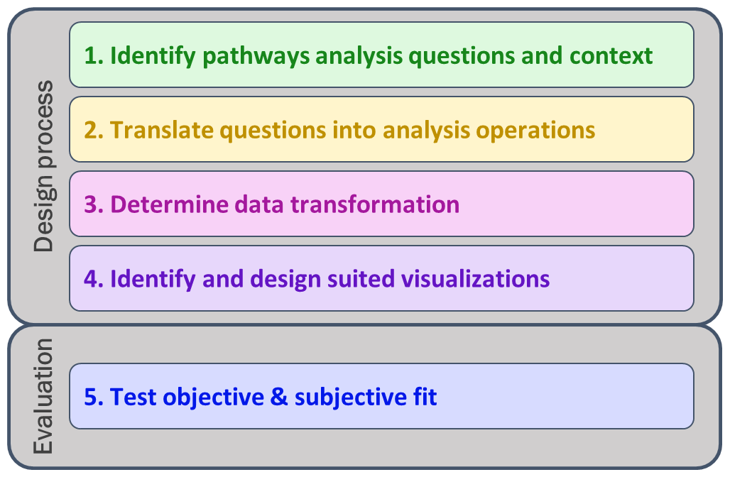
Figure 1Design process to develop a visual analytics dashboard and evaluate its objective and subjective fit.
2.1 Identify pathways analysis questions and context
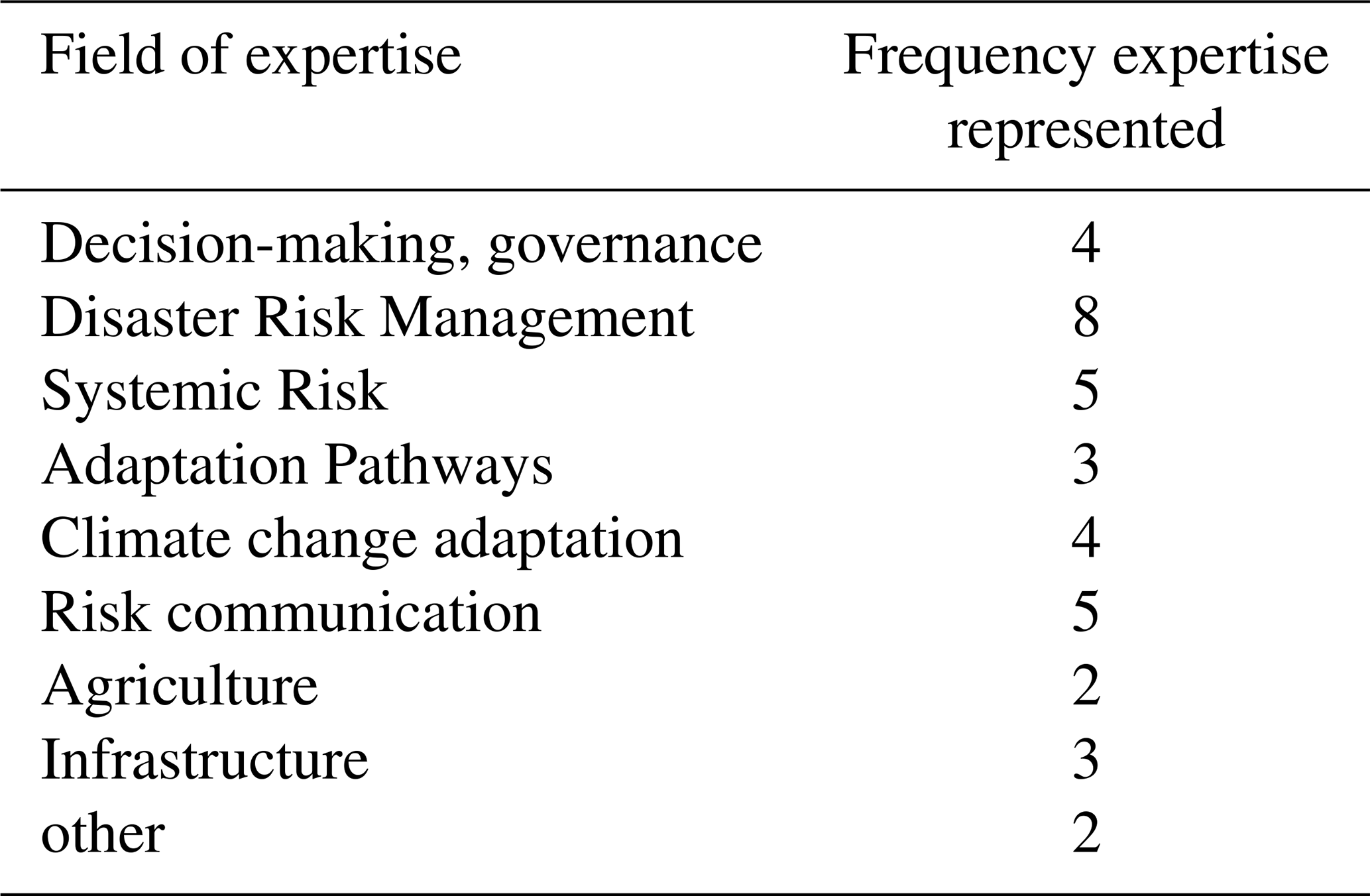
In the first step of the design of the pathways analysis dashboard, we defined the pathways analysis context, including identified target users and their capacities, and formulated key questions of interest. Similarly to Ruppert et al. (2013), we developed a set of user types. Based on our expertise and ongoing transdisciplinary research on multi-risk DRM, we first identified stakeholders generally involved in pathways development or risk assessment processes to aggregate specific generic characteristics of the stakeholders (e.g., capacities, questions of interest) into different user types. We calibrated and refined these user types through expert inputs from six semi-structured interviews and two 60-minute focus groups. We engaged 21 researchers from the professional network of co-authors working on disaster risk management, risk communication, climate change adaptation, and pathway thinking in different sectors, summarised in Table 1. The interviews and workshops followed the guidelines of Hove and Anda (2005). An extensive description of this first step can be found in the Supplement Sect. S1, including the final conceptualization of different user types.
Table 1Participants of validation exercise (n=21) and the key fields of expertise identified based on publicly available information.
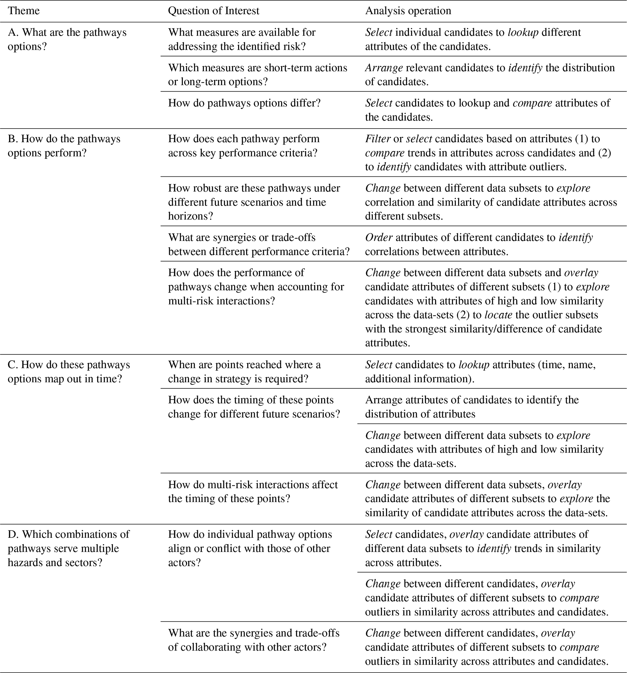
Feedback from interviews indicated that the pathways analysis process needs to be guided, introducing relevant concepts and the purpose of the analysis, as stakeholders often have limited time and resources. Multi-risk decision-making remains a relatively new and complex topic (Sakic Trogrlic et al., 2024), still largely situated in exploratory research and pilot initiatives. As a result, early adopters involved in pathways analysis come from diverse disciplines and administrative levels, motivated by (i) understanding multi-risk interactions and system-wide effects, (ii) identifying sector-specific low-regret pathways with low costs and high (co-)benefits, and (iii) identifying system-wide low-regret pathways combinations. Four themes of analysis emerged with more detailed analysis questions (Table 1): “What are the pathway options?”, “How do the pathway options perform?”, “How are these pathway options mapped over time?” and “Which combinations of pathways serve multiple hazards and sectors?” Most questions focus on sectoral perspectives, and stakeholders prioritise different indicators, timescales, or scenarios. Therefore, we assume that stakeholders are involved in a broader participatory modelling process to specify analysis criteria to develop forward-looking DRM pathways. Given the systems perspective of multi-risk DRM, the process also involves elements of collaborative learning (Laal and Laal, 2012), such as knowledge exchange and discussion among stakeholders with diverse needs and interests, to develop a cohesive DRM strategy across sectoral boundaries.
2.2 Translate questions into analysis operations
In the second step, we abstracted the pathways analysis questions into analysis operations to clarify the analysis goals and methods (Table 1), according to standard design practices (Amar et al., 2005; Wehrend and Lewis, 1990). These abstractions help clarify why users engage in the analysis (e.g., finding trends, outliers, etc.) and which types of analyses they would like to conduct (e.g., compare different alternatives, discover patterns, etc.) (Brehmer and Munzner, 2013). The abstraction identifies which properties of a pathway data set are most relevant and what properties of a visualisation will be used to find answers to the question of interest. The italicized terms in Table 2 used to describe the analysis operations are based on Brehmer and Munzner (2013) (definitions in Table A2). We used the term “candidate” to refer to both a pathway option or a specific action as part of a pathway, and we used the term “attribute” to refer to any property or value of the candidate (such as name, description, performance objective, etc.). We also used the term “data subset” to express that some datasets to be visualised will be only subsets of the whole dataset, for example, showing values for objective keys for a specific time horizon, scenario, or combination of pathways.
Table 2Four themes of pathways analysis (first column), related questions of interest (second column), and corresponding analysis operations (third column). Italic terms in the second column mark analysis operations which are defined in the Table A1.
2.3 Determine data transformations
After defining user analysis needs, this step focused on suitable data transformations to visualize these needs. DRM data for pathway analysis are multidimensional, spanning scenarios with external (climate, socio-economic) and internal (actor measures) uncertainties. However, effective visualisation typically handles up to five dimensions to maintain clarity (Mackinlay, 1986; Siirtola, 2007). This means that choices must be made regarding reducing dimensionality and the number of data points shown. Both depend on the interest of the stakeholders and their previous experience or analysis capabilities (Bonham et al., 2024; Kwakkel et al., 2016).
In DMDU, statistics-based summary methods are commonly used for dimensionality reduction to calculate the robustness of pathways. Robustness is defined as the ability of a policy option to perform well across an ensemble of uncertainties while minimizing regret. Various performance robustness indicators can be calculated using combinations of statistical properties (e.g., mean and standard deviation) of the data set in a (sub)set of scenarios (Bartholomew and Kwakkel, 2020). Furthermore, filtering often reduces data density (Brehmer and Munzner, 2013). For example, while the performance of different pathways could be analysed for each year of the planning horizon, specifying (a set of) times of interest reduces the number of relevant data points to be considered for the analysis (e.g., Kwakkel et al., 2015; Schlumberger et al., 2024).
To explore relevant transformations, data from a case study on the Waal River in the Netherlands was used, modelling flood and drought interactions across agriculture, urban, and shipping sectors over 100 years with a resolution of 10 d (Haasnoot et al., 2012; Schlumberger et al., 2024). Each sector manages climate risks by implementing sequences of DRM measures called “DRM pathways”. The pathways of each sector are evaluated based on sectoral objectives in combination with the DRM pathways of different sectors and accounting for climate variability and climate change scenarios (Schlumberger et al., 2024). Details on the case study and data flow are provided in Sect. S2.
2.4 Designing information visualisations to complete the analysis operations
When developing the interactive dashboard (https://www.pathways-analysis-dashboard.net/, last access: 18 October 2025) and integrating fit-for-purpose visualisations, we focused on two components: (1) designing information visualisations to complete the analysis operations and (2) creating an environment that serves different user types to gain additional insight into the concepts and purpose of the themes of analysis.
The systematic design process resulted in a dashboard environment that supports users in analysing DRM pathways and their effectiveness in reducing the complexity of climate risk analysis through interactive visualisations. The visualisations on the dashboard are aligned with analysis operations, creating an accessible and interactive environment that serves a wide range of users. Built with Python 3.10, the dashboard uses open-source tools (Dash https://dash.plotly.com/, last access: 18 October 2025), Plotly https://plotly.com/, last access: 18 October 2025, and Pathways Generator https://github.com/Deltares-research/PathwaysGenerator, last access: 18 October 2025)) and is hosted on Heroku. The URL of the dashboard, https://www.pathways-analysis-dashboard.net (last access: 18 October 2025), is accessible with a Web browser and an Internet connection.
2.4.1 Designing information visualisations to complete the analysis operations
Research in information visualisation and cognitive science offers a wide array of guidelines to develop fit-for-purpose visualisations (e.g., Munzner, 2009; Padilla et al., 2018). Effective visualisations must balance human perceptual limits, especially when encoding complex, multi-dimensional data. Research has shown that humans can process up to five dimensions using spatial encodings, such as position on an axis, combined with visual cues like color or shape (Siirtola, 2007). However, visual clarity declines when more than seven colors are used, particularly for users with visual impairments (Munzner, 2014). Therefore, balancing the expressiveness of visualisations – how much data is conveyed – with their effectiveness – how easily insights are grasped – requires careful consideration (Mackinlay, 1986). Initially, we focused on static visual encodings. These proved too limited for the amount of data (dimensions) and range of analysis operations we sought to address. Consequently, we shifted towards interactive visualisations that allowed for the same visual encodings but provided greater flexibility by offering information on demand and highlighting specific properties of the data. Ultimately, the design process resulted in the development of a dashboard environment, which offers the highest degree of interaction with the visualizations as well as contextual support for interpreting the data while minimizing the cognitive load on the visualizations themselves (Franconeri et al., 2021; Ceneda et al., 2017). Following inspiration from Munzner (2014), we identify a list of visualisations that can handle the data dimensions/density and analysis operations, as summarised in Table A2 in the Appendix. We aimed to identify one visualisation type per theme. We don't claim that we considered all possible visualisation types, but got inspiration from common visualisation research and cognitive studies (e.g., Börner et al., 2019; Munzner, 2014), the DMDU community (e.g., Gold et al., 2022; Gratzl et al., 2013; Haasnoot et al., 2024; Moallemi et al., 2020; Trindade et al., 2019), author discussions, and preliminary testing. During the process, we encountered multiple visualisation types, which we deemed unsuited after first testing and reflection, mostly because they could cope less well with the number of dimensions or information density.
When developing the visualisations, we took into account multiple guiding principles. Where possible, we used two different coding channels to convey the key information. As such, we used colours and patterns to distinguish between different measures, or colours in combination with annotations or information on demand, to obtain information about the performance robustness of pathways. Also, we use descriptive figure titles to allow users to easily deduce which (sub)-dataset is currently visualised. For the choice of the colour scheme, we considered the potential use context of the dashboard: multiple stakeholders would analyse their specific pathway options before coming together to investigate synergies and trade-offs across sectors and risks. We identified objectives as the core element of the analysis that should be recognisable across the different steps. As such, we chose the colour schemes per sector to combine them across the sectors without leading to confusion by changing colour schemes.
We identified interactive Decision Trees (DTs) as the most effective format to explore pathway options. DTs are well-suited to represent hierarchical structures (Shneiderman, 1996) and help users learn about the sequences of specific measures and their relevance as short- or long-term actions. On-demand information provides additional context on each measure. In line with best practices (Munzner, 2014), we used dual encoding – colour and pattern – to highlight measures of interest (Fig. 2a).
For the assessment of the performance of the pathways, we identified three alternatives:
-
Parallel Coordinates Plots (PCP) are effective for revealing correlations in high-dimensional data (Itoh et al., 2017; Siirtola et al., 2009). They use polylines intersecting multiple parallel y-axes to show how pathways perform across objectives. PCPs work best when the number of options and objectives is moderate, preventing visual clutter (Dzemyda et al., 2013; Munzner, 2014). Users can interactively filter values by selecting ranges on one or more axes (Siirtola, 2000), and colour hue is used to distinguish between pathway options, including those with and without interaction effects (Fig. 2b). PCPs are also scalable, allowing more objectives to be added for system-level analysis.
-
Stacked Bar Charts (SBC) use dimensional stacking to present the cumulative performance of pathways while preserving information about the performance per individual objective (Gratzl et al., 2013; Streit and Gehlenborg, 2014). This design supports users who want to analyse either overall or objective-specific performance. Colour hue and pattern are used to distinguish between different performance objectives and different interaction effects, respectively. We used on-demand information in combination with the bar lengths to encode the key information of pathway performance and interaction effects (Fig. 2c). We ordered bars by total value for system-level views to facilitate comparison (Gratzl et al., 2013).
-
Heatmaps (HM) display quantitative data across two categorical keys using colour-coded matrices (Munzner, 2009). HMs are scalable, similar to PCPs, and are suited for visualising complex combinations at the system level. We normalised values to apply a consistent colour scheme across attributes (Shavazipour et al., 2021), enabling comparison and pattern recognition. HMs offer high information density and effectively summarise trends and clusters (Hindalong et al., 2020). Instead of interactivity, we use annotations in addition to colours for dual encoding the performance and interaction effects per objective (Fig. 2d).
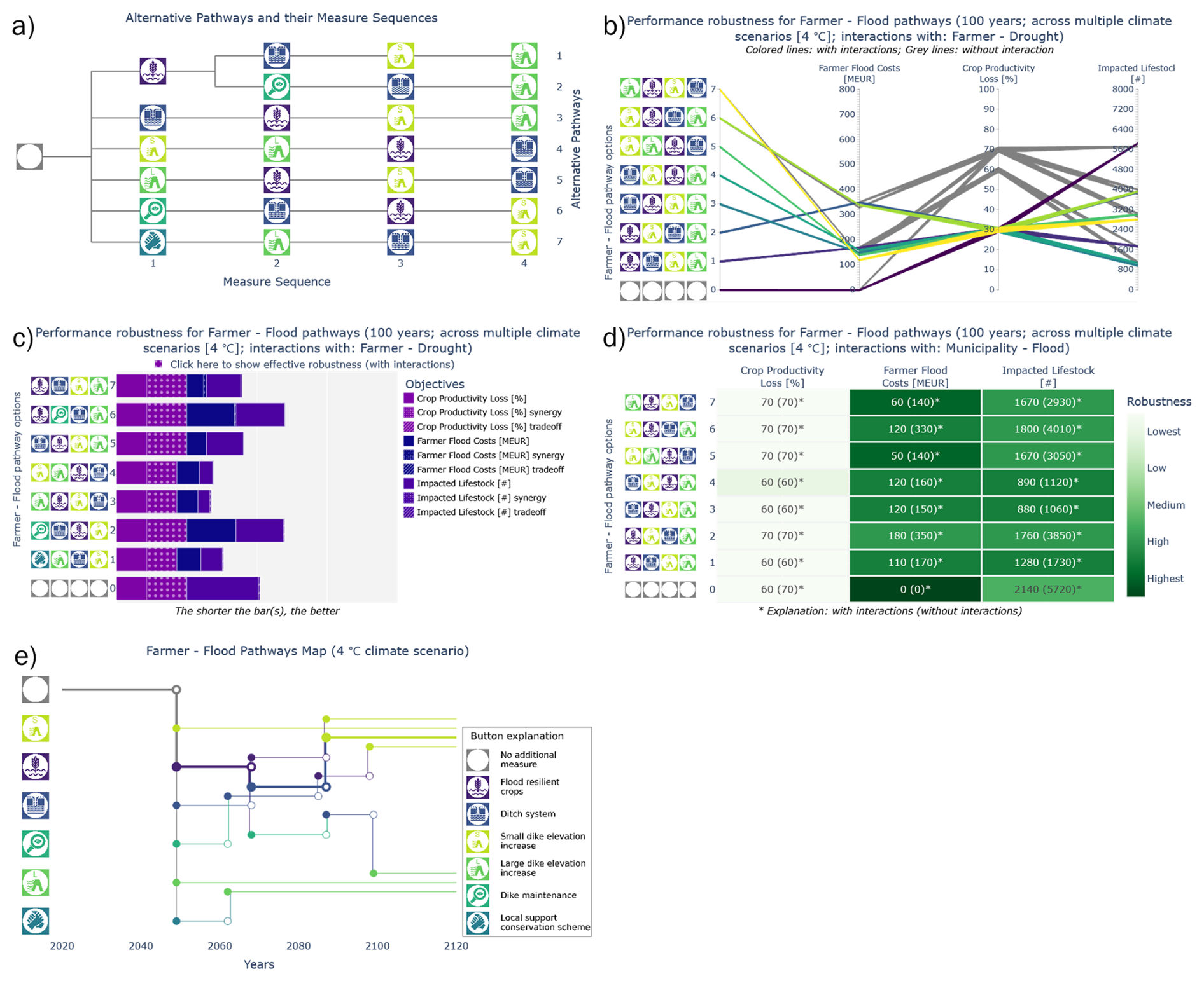
Figure 2Set of visualisation types for pathways analysis. Visualisation of pathway options using Decision Tree (a). Parallel Coordinates Plot (b), Stacked Bar Chart (c), and Heatmap (d) are used to explore performance across multiple objectives for different pathway options. Pathways map to investigate the timing of decision-making (e).
To address questions on the timing of adaptation tipping points, we implemented Pathway Maps (PMs), which visualise sequences of decisions over time (Haasnoot et al., 2012, 2024). These “Metro-map” style diagrams move from left to right, with splits and intersections indicating decision points – moments requiring a choice between continuing or adjusting the course of action. PMs add information on timing when compared to DTs and help stakeholders understand how early decisions shape future flexibility. Our interactive PMs allow users to highlight all pathways linked to a specific tipping point (Fig. 2e). On-demand details support the interpretation of the timing of adaptation tipping points. We overlaid maps for cases with and without interactions to visualise interaction effects. For system-level analyses, we opted to display separate PMs for different actors, avoiding the complexity of integrated system-level maps as in Schlumberger et al. (2022).
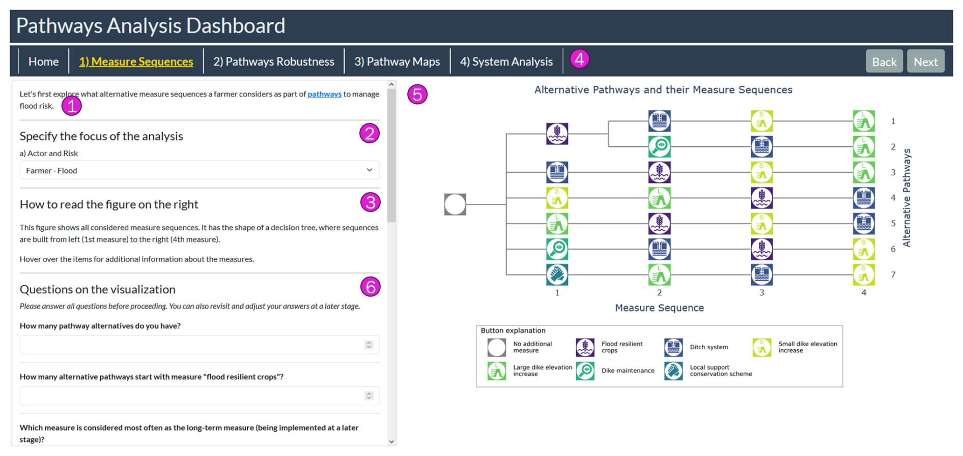
Figure 3Dashboard outline. To offer guidance and flexibility, it contains the following elements: A short description of the analysis task at hand, including additional information on demand regarding key concepts (1). A section to select the relevant analysis focus. This section varies from theme of analysis to theme of analysis (2). A short explanation of how to read the visualisation and what options for interaction are given (3). A Navigation bar offers means to navigate between the different themes and clarify the current theme of analysis (4). The interactive visualisation itself is used for the analysis operations (5). The survey was embedded into the dashboard to improve accessibility (6).
2.4.2 Creating an environment that serves a wide range of users
The dashboard's multi-page layout separates the four themes of analysis, guiding users through a stepwise analysis. Users first analyse their specific sectoral pathway options, then their pathway performance, and finally the timing of adaptation tipping points to identify a short list of promising pathways that best meet their specific objectives. The last analysis step combines pathways from different sectoral actors to explore the interaction effects on the entire system. The general dashboard structure is shown in Fig. 3, and possible options to modify the visualization are available, e.g., selecting a specific time horizon or climate scenario or choosing different robustness definitions to determine the performance robustness. Additionally, guidance on how to read the visualisation is provided, and explanations for key terms relevant to the pathways analysis (e.g., robustness, scenario) can be obtained on demand.
2.5 Test objective and subjective fit
To evaluate the effectiveness of the dashboard and the visualisations, we embedded a 15 to 30 min questionnaire based on best practices (Kosara et al., 2003; Conati et al., 2014; Dimara et al., 2018). The survey questions were developed based on the general analysis questions presented in Table 2. The questions were tailored to objectively evaluate the answers for the specific case study data used. The full list of questions can be found in Table A3 in the Appendix. The co-authors shared the link to participate in the survey within their professional and personal contexts, which includes the research institutes and multi-risk projects, as well as networks from past conferences. The survey was open for 6 weeks from September to October 2024. The survey involved a broad and diverse range of 54 potential users and experts in information visualisation, disaster risk management, pathways thinking, and beyond. Responses were screened out for validity, notably excluding dummy inputs (e.g., a combination of no free-text feedback, identical Likert-scale evaluations, and overarchingly random inputs) and duplicates (which happened if they kept their sessions open too long). Although participants were encouraged to complete the entire questionnaire, intermediate results were saved per analysis theme. We consider all available data for the evaluation, even if the participants did not complete the entire questionnaire.
The objective fit of the dashboard and its visualisations was evaluated by the precision of the responses to a set of analysis questions compared to the answers the authors deemed correct (Gratzl et al., 2013). We chose a varying set of simple and more complicated questions. We performed a dashboard analysis from an aggregated level to the specific analysis task of a given visualisation (Plaisant, 2004). In the analysis, we strongly emphasised questions where the response's precision was below 70 % to discuss challenges and misconceptions that were widely represented among survey participants. To evaluate the subjective fit of the dashboard, participants were asked to express their agreement with sentences stating that the visualisation was easy to understand, that they are confident in their response, that they had enough information to use the visualisation effectively and that they would use this type of visualisation for similar questions (Dimara et al., 2018) using the 5-point Likert scale (“totally disagree” to “totally agree”). Qualitative feedback provided additional anecdotal evidence on dashboard strengths and areas for improvement (Conati et al., 2014).
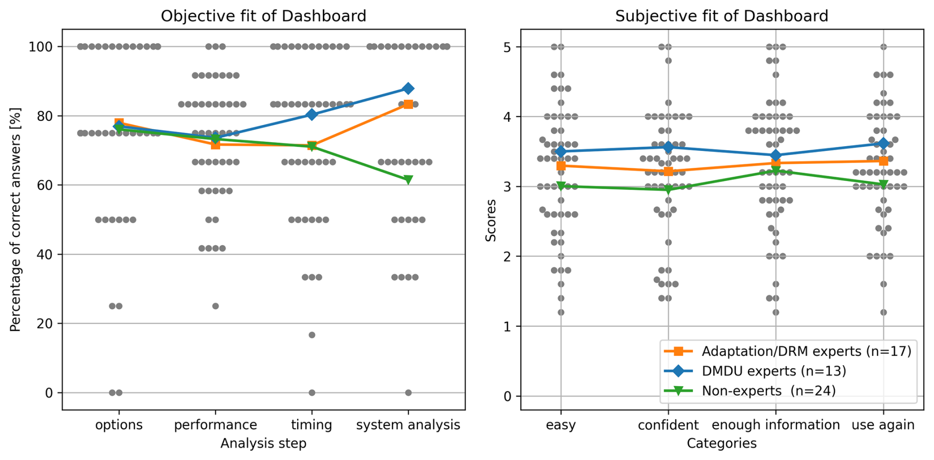
Figure 4Percentage of correct answers (left, objective fit of dashboard) and subjective evaluation (right, subjective fit of dashboard) for all participants (gray dots) and averaged across participants of the same expertise (coloured lines and markers) for the four themes of analysis. Note that the number of participants is different for each step: exploration of pathway options (n=54), pathways performance (n=42), pathways timing (n=40), and system analysis (n=35). Legend for both figures plotted on the right figure.
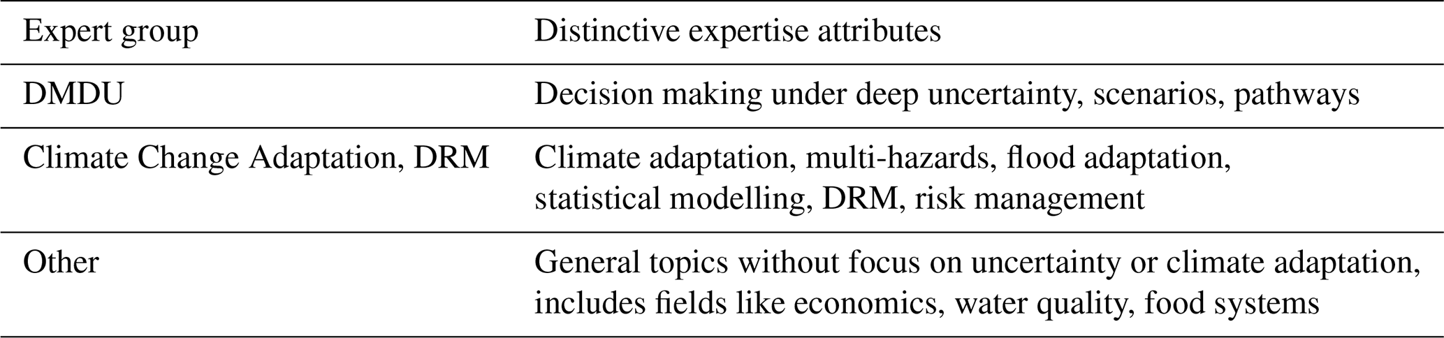
We collected feedback from 54 participants, with responses from all participants on visualisation of the pathways options, 85 % (n=46) on the robustness of performance, and 81 % (n=44) on decision timing. Approximately 70 % (n=38) completed the survey for all analysis themes. Most of the participants (78 %, n=42) worked in research, 9 % in the private sector (n=5), and 96 % did not report visual impairments (n=52). The expertise of the participants included DMDU/Pathways (n=13), Climate Adaptation/DRM (n=17) and other fields such as Architecture, Computational Science, and Governance (n=24) (see Table A4).
The dashboard provided relevant information to the participants, see Fig. 4. The correct answer rates were above 70 % for most expert groups and analysis themes, with one outlier for the analysis of the system for non-experts (61 %). Expertise influenced success in decision-timing and system analysis, favouring those with prior experience in pathways and system thinking. The subjective fit was similarly expertise-dependent. DMDU experts were more likely to find the visualisations clear, be confident in their responses, and foresee using them again, while non-experts were more neutral.
3.1 Evaluation of the dashboard to support pathways options analysis
Pathway options were analysed using a DT (Fig. 2a). The objective fit was assessed using four questions (see Fig. 5a), with the participants accurately answering A1 and A4. Questions A2 and A3 were less well answered (hit rates: 60 %, n=54) for different possible reasons. Question A2 required participants to identify the starting measure in most pathway options. One participant reflected that “information is spread over the entire figure [...]. I need to read the y-axis on the right and move back to the left.”. Similarly, participants pointed out that the visualisation design did not intuitively lead the focus of a participant from the left to the right (e.g. “Connecting lines could have arrowheads, would make the sequence visually more intuitive”).
Question A3 required participants to identify the most frequent measure being implemented in the long term. The question lacked clarity about the definition of “long-term” (“What is most the option to be implemented at a later stage. “Large dike increase” is the last option most often. However, “small dike elevations” occurs most often in the last two steps.”). We considered only the last option to be defined as long-term, but fifteen out of the 19 incorrect answers considered the past two sequence steps as long-term, which could arguably be correct as well.
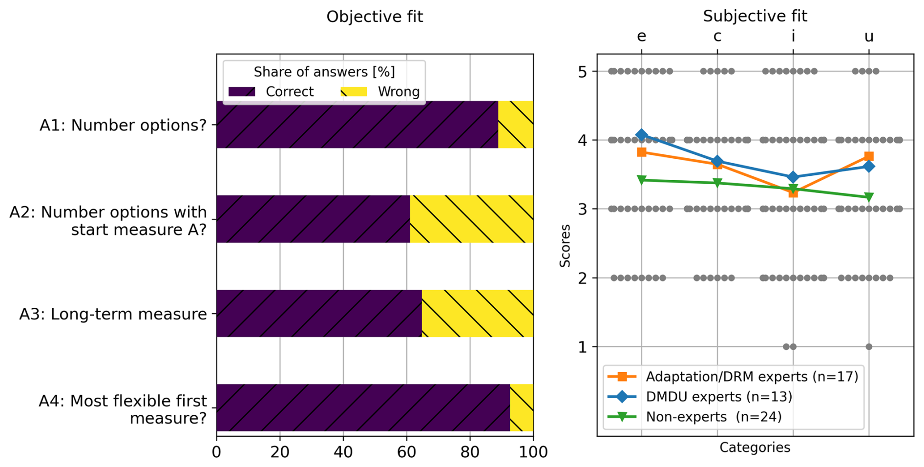
Figure 5Evaluation of the dashboard for the first theme of analysis (“What are the pathway options?”) based on the inputs from the users (n=54). Left: Evaluating the objective fit based on the share of correct (C), wrong (W), and partially correct answers (o) for four questions (detailed questions in Table A3). Right: Evaluating the subjective fit, differentiated in how easy they find the visualisation (e), how confident they are about the made choice (c), if the had enough information (i), and whether they would use this visualisation type for similar problems (u).
The evaluation of the subjective fit is overarchingly positive, as summarised in Fig. 5 (right). Participants generally agree that the visualisation provides enough information, is easy to understand, makes them feel confident that they answered correctly, and would be used for similar problems. Subjectively, participants positively valued the colour scheme and symbols (e.g. “The icons are clear, the colours assist distinguishing the measures”) but noted issues with colour logic and icon density (e.g. “There are a lot of symbols, which if you're not used to them takes time to read the figure. Greater difference in colours might be useful.” or “colours for measure are not logical (elevation should be brown, crops yellow, ditch blue...”). The participants appreciated the interactive nature of the visualisations (e.g. “I like the interactive nature of the figure. The extra information that comes when you hover over an action is helpful.”). At the same time, multiple participants criticised the lack of background information, which makes it challenging to make sense of the pathway options presented and why some are possible and others are not (e.g. “no additional information on the feasibility of each pathway, which makes it more difficult to understand why some measures need to be in an earlier stage compared to others or why one is more flexible.”).
3.2 Evaluation of the dashboard to support pathways performance analysis
For the performance analysis, the participants were randomly presented with a PCP, SBC, or HM (Fig. 2b to d). PCP and SBC outperformed HM in clarity and correctness, as shown in Fig. 6. Subjectively, participants found HM challenging to interpret and would not use such a visualisation for similar problems. In contrast, PCP was appreciated for dealing with the multi-objective analysis of performance robustness and would use it again despite lower confidence in their chosen answers. The evaluation of the subjective fit is somewhat ambiguous. It should be noted that the DMDU experts perceived PCP much more positively than the other expert groups, while the patterns were quite similar for SBC. Non-experts were particularly uncertain about their responses when using PCP and HM. Although participants subjectively tended to agree that SBC offered sufficient information and that they were confident in their responses, they disagreed that the visualisation was easy to use and thus tended not to use it for similar problems.
The participants mentioned some challenges that were relevant to all different visualisations. The participants particularly struggled to understand the concept of robustness of the pathways and thus how they could deduce information about robustness from the figure (e.g. “I struggle to understand how to evaluate robustness”). One participant asked for more information on how it is calculated (e.g. “Black-box how performance robustness was calculated.”). Similarly, participants stated that they would need more contextual information to understand why the pathways options are analysed and where the differences come from (e.g. “I don't understand, but want to know how the strategies were identified and if the differences between them are meaningful.”) and how terms such as synergies and trade-offs are applied in this context (e.g. “it is not clear on the difference between synergy loss and trade-off loss [...] Some explanation of how these terms are applied here and are different from each other in their application to farmer strategies could help.”). Multiple participants suggested additional guidance (e.g. “Put a video with a talk to help navigate with an example.' or “Everything is useful, but need to put an example first.”).
For PCP, question B3 was not answered correctly by any participant (n=13), while 50 % of the participants provided partially correct answers to question B6. For question B3, the task was to identify the pathway option with the best robustness, and a combined consideration of robustness performance across multiple objectives was required. In the introductory text, it is mentioned that robustness is evaluated across objectives. However, no further details were provided on how to conduct this evaluation between the objectives. Additionally, aggregating this performance across parallel axes is a recognised weakness of this type of visualisation (Siirtola, 2007). For question B6, asking to identify the pathway(s) with the best robust performance concerning one objective when accounting for interactions, it appears that similar colour coding of lines representing different pathways led participants to incorrect answers (“difficult to follow the lines across the figure – some colours were difficult to distinguish, so hard to determine what the value was for some of the pathways”). This also implied that some participants did not use the full potential of the interactive elements, which would have allowed them to filter pathway options that fall in certain ranges along each of the axes. The general feedback was positive (“I've never seen a figure like this and I actually find it a very good way to summarise key information that I (trying to put myself in shoes of a farmer) would want to see.”). Participants appreciate how the figure allows for comparing multiple variables simultaneously and visually represents different scenarios, helping to evaluate the efficiency of adaptation investments. The use of colours and multiple axes to show robustness scores is noted as a valuable feature that makes information easier to interpret (“The different colours and the different axes illustrating the different robustness scores”).
For SBC, more participants could correctly answer question B3 (47 %, n=9), understanding that the shortness of the stacked bar measured the robustness across objectives. One participant interpreted the length in the opposite way, selecting the pathway with the longest bar as the most robust. The number of partially right answers to question B3 can be associated with a bug (before fixing the bug: 1 out of 9 participants correct; after fixing bug: 8 out of 10 participants correct) in the early version which resulted in bars of equal performance having different lengths (“the crop productivity loss bar looked different for different pathways, but the information shown by hovering was that the loss was same”). Most participants did not correctly answer question B6 (hit rate 30 %), identifying the pathways with the best performance concerning one objective when considering interactions with another sector. The incorrect answers seem to be misled by the representation of synergy and trade-off effects in the visualisation as additional bars of different lengths (“I don't know what the synergy or trade-off effects mean.”). Multiple participants indicated that they would prefer more information. One participant stated: “The sizing of the bars is not 100 % intuitive. Potentially adding an x-axis would help.” The participants appreciated interactive features such as hovering, which allowed participants to engage with the content and explore various climate scenarios, helping to visualise interactions effectively (“Very clear descriptions on the bottom when hovering over each box”). Furthermore, participants confirmed that the colours and shading used in the figure help readability, making complex information more accessible (“The colours and shading help to understand the graphic”).
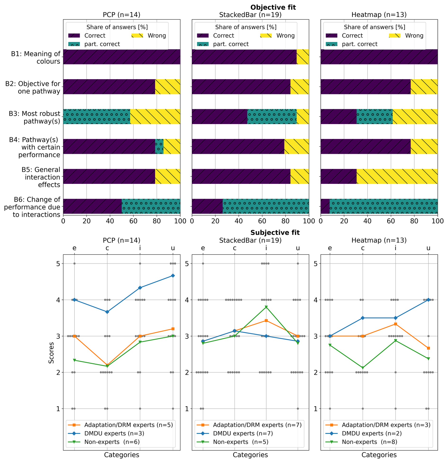
Figure 6Evaluation of the dashboard for the second theme of analysis (“How do the pathways options perform?”) based on the inputs from the users (n=46). Left: Evaluating the objective fit based on the share of correct (C), wrong (W), and partially correct answers (o) for six questions (detailed questions in Table A3). Right: Evaluating the subjective fit, differentiated in how easy they find the visualisation (e), how confident they are about the made choice (c), if the had enough information (i), and whether they would use this visualisation type for similar problems (u).
For HM, participants particularly struggled with questions B3, B5 and B6 (Fig. 6). Regarding question B3 (hit rate 30 %, n=11), an explanation is that the robustness between objectives is not clearly encoded in the visualisation of HM (and PCP) compared to SBC. For questions B5 and B6 (hit rate 40 % and 10 %), participants were asked to discover patterns of interaction effects. 7 out of 9 incorrect answers indicated they could not discover clear patterns of interaction effects. Feedback from multiple participants suggested that the information was not clearly provided (e.g. “Interaction effects are difficult to determine [...]. I think some additions such as an arrow (up or down for conflict vs. synergy) or a texture (different hatches to denote conflict or synergy) would be very helpful for understanding interactions” and “There's too much information in this figure for it to be easy to understand. While helpful to have the explanation, the asterisk busies the figure”). At the same time, participants appreciated the structure and outline using colour-coding to highlight robustness (“I like the clear representation of robustness tradeoffs across the three criteria”) and completeness of information (“I think this table shows the results of each pathways which is very informative.”).
3.3 Evaluation of the dashboard to support pathways timing analysis
PM (Fig. 2e) were used to analyse the timing, with six questions that evaluated the objective fit, as shown in Fig. 7 (left). Interestingly, the participants only struggled with question C2 (hit rate 40 %, n=44), which asked for the maximum number of measures to be implemented in a specific scenario for any pathway. Most of the participants who gave an incorrect answer indicated a higher number of measures than actually necessary, which can be related to a lack of clarification on the different markers used (e.g. “I don't know what the filled in vs. not filled circles meant”). It appears that participants who struggled with question C2 did not make use of interactive options to highlight the pathways from or to a specific measure, which makes the pathways of interest distinguishable from the rest. Furthermore, some might not have seen that additional information on demand is available in a box below the plot (“I prefer to have the button explanation in the figure, rather than use it in a legend.”).
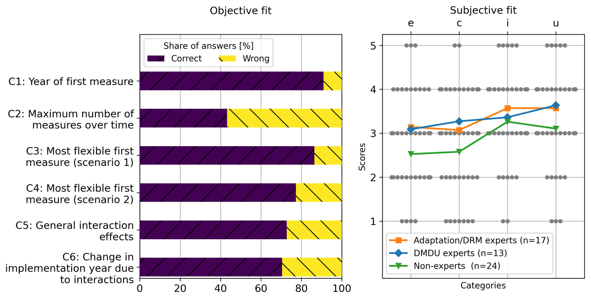
Figure 7Evaluation of the dashboard for the third theme of analysis (“How do these pathway options map out in time?”) based on the inputs from the users (n=44). Left: Evaluating the objective fit based on the share of correct (C), wrong (W), and partially correct answers (o) for six questions (detailed questions in Table A3). Right: Evaluating the subjective fit, differentiated in how easy they find the visualisation (e), how confident they are about the made choice (c), if the had enough information (i), and whether they would use this visualisation type for similar problems (u).
In general, the evaluation of the subjective fit of the pathways was positive, as shown in Fig. 7 (right). Although most of the non-expert participants would not agree that the visualisation is easy to understand and that they are confident in their choices, the participants tended to agree that the visualisation offers enough information and that they would use such a figure for similar purposes. The most relevant challenges participants encountered with the figure included difficulty distinguishing between overlapping pathways, especially when several converge around the same tipping points. Some participants found it challenging to differentiate the colours, making it difficult to follow specific pathways and understand the timing of certain measures. The absence of pathway numbers and the proximity of circles made the figure harder to navigate, with some participants unsure if empty markers represented tipping points or measures. Additionally, the reliance on visual rather than textual information and the placement of the legend added to the confusion. Some participants also struggled to understand the goals implied by questions such as “need to be”; a few found it difficult to comprehend the y-axis.
On the positive side, participants appreciated the visualization's ability to clearly represent the timing of measures and tipping points once they became familiar with it. The interactive elements that allowed participants to click on the pathways for more detailed information were considered valuable. The figure effectively illustrated the path dependencies and the influence of interactions on timing (e.g. “It is easy to identify synergies”). The design also allowed for a clear comparison of long-term versus short-term actions (“The concept is quite intuitive and assists in seeing long-term vs short-term actions and what is available later in the period”). The participants generally found the PM a strong communication tool to represent complex scenarios.
3.4 Evaluation of the dashboard to support system-level pathways analysis
3.4.1 System-level performance analysis
Evaluating the objective fit revealed challenges with the navigation of the interface and the clarity of the figure, as shown in Fig. 8. Some participants (HM: n=2, PCP: n=2, SBC: n=1) filled in obviously incorrect answers in combination with a clear indication that they could not read the figures because they did not use the navigation bars of the dashboard (“don't know, too much complexity!” or “No data was displayed. Did I do sth wrong? My answers are not based on any analysis.”). One participant noted that the interface was easier to use for this analysis question than for others, making the analysis more complicated than necessary: “I think it was more the fiddly interface, but this section was less easy to operate and understand for me.”. Most participants found the visualisations rather difficult to understand, along with a similar reasoning outlined in Sect. 3.2. Furthermore, labels used to indicate combinations of pathways from different sectors felt abstract and difficult to interpret quickly (“The row label (e.g., 1,5,3,0) can require some effort to understand correctly”).
Specifically, SBC were more effective, and the participants agreed that they would reuse them for similar tasks. At the same time, PCP and HM were more complicated to interpret, as summarised in Fig. 8 (right). An explanation may be that the option to increase the number of stacked bars to be shown gradually helps its completeness (e.g. “was nice to be able to show multiple combinations in one figure for robustness”).
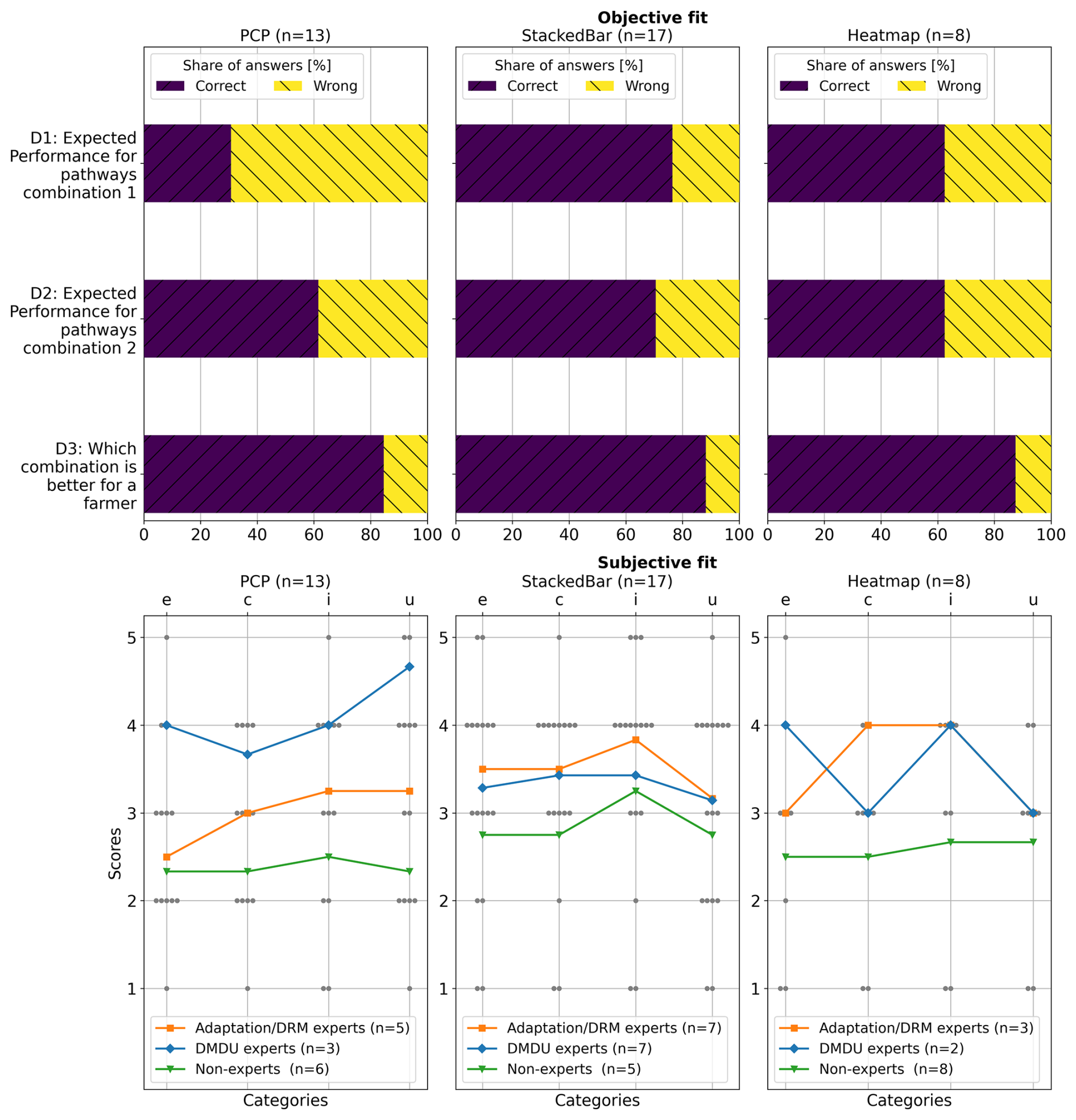
Figure 8Evaluation of the dashboard for the fourth theme of analysis (“Which combinations of pathways serve multiple hazards and sectors?”) based on the inputs from the users (n=38). Here, the focus is on the analysis of the performance. Left: Evaluating the objective fit based on the share of correct answers (C) compared to wrong (W) and partially correct answers (o) (detailed questions in Table A3). Right evaluating the subjective fit, differentiated in how easy they find the visualisation (e), how confident they are about the made choice (c), if they had enough information (i), and whether they would use this visualisation type for similar problems (u).
3.4.2 System-level decision-timing analysis
PM for timing analysis showed a strong objective fit, as shown in Fig. 9 (left). However, some participants reported technical problems or feeling overwhelmed by information (e.g. “The pathway map figure is not working for me. Please disregard all answers pertaining to it (answering was mandatory).”). Subjectively, participants valued the feature that allowed the highlighting of specific pathways, helped clarity, and made it easier to explore the integration of pathways into a broader set of combinations of pathways. The subjective fit was perceived as overall positive. The participants found several advantages in the figure. Participants indicated that they liked the simplicity of the pathways figure, finding it less overwhelming than PM in the previous analysis theme, resulting in a similar evaluation of the subjective fit as shown in Fig. 9 (right).
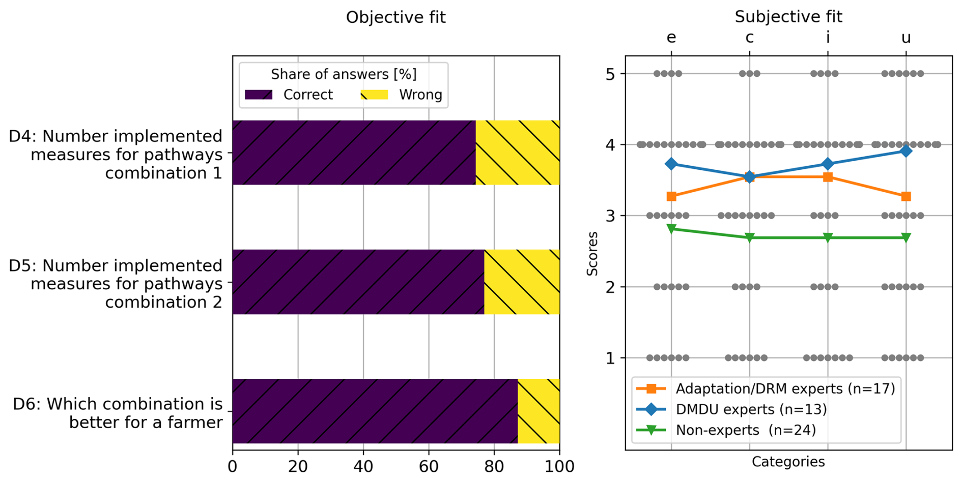
Figure 9Evaluation of the dashboard for the fourth theme of analysis (“Which combinations of pathways serve multiple hazards and sectors?”) based on the feedback from the users (n=39). Here, the focus is on the analysis with regard to the timing. Left: Evaluating the objective fit based on the share of correct (C), wrong (W), and partially correct answers (o) for three questions (detailed questions in Table A3). Right: Evaluating the subjective fit, differentiated in how easy they find the visualisation (e), how confident they are about the made choice (c), if the had enough information (i), and whether they would use this visualisation type for similar problems (u).
In this study, we developed a visual analytics dashboard prototype to support pathways analysis in complex systems, with applications for multi-risk DRM and DMDU. Despite study limitations, our findings provide valuable insight into the design process and visualisations for pathways analysis, offering lessons relevant beyond this study.
4.1 Limitations
This study has several limitations that may have impacted our findings. First, while the dashboard was designed for collaborative decision-making in a participatory modelling context, participants tested it as a standalone tool without any introductory presentation in the context of case studies. Some participants noted the need for additional context and training, indicating that such a complex topic requires more than an intuitive interface. We acknowledge that testing the dashboard without its intended contextual framing may limit the generalisability of participants' responses, particularly concerning its participatory development process and collaborative use, which remain open research questions. However, as the available multi-risk DRM pathways case study did not offer any involved stakeholders, we intentionally chose this minimal setup to test the dashboard's standalone interpretability as a form of stress-testing. The fact that many users could still use the tool effectively suggests a robustness in the design and a promising foundation for future, more contextualized applications. Second, we evaluated the dashboard with 54 participants, which – while comparable to similar studies (e.g., Bautista and Carenini, 2008; Conati et al., 2014; Dimara et al., 2018; Gratzl et al., 2013; Shavazipour et al., 2021) – is still limited, especially given the varied expertise and distribution among visualisation types. However, anecdotal feedback, a crucial information source on visualisation utility (Kosara et al., 2003), was consistent among participants. This suggests that the sample size may have been sufficient (Munzner, 2008). However, most participants were researchers, while policy- or decision-makers are the primary intended users. This choice was deliberate, given that multi-risk decision-making remains a relatively new and complex topic (Sakic Trogrlic et al., 2024) and is still primarily situated in exploratory research and pilot initiatives. In line with the theory of diffusion of innovation (Rogers, 2003) we here report on a first test with a small and engaged audience that we reached through our networks within and beyond multi-risk DRM research. Future phases of development will require co-development with policy partners in projects that are relevant to them to ensure the tool fits operational realities and supports real-world implementation. Given that early adopters of multi-risk DRM are often involved through research projects (Sakic Trogrlic et al., 2024), this limitation may be acceptable. However, more tests with more extensive and more diverse sets of participants are needed to validate our findings. Finally, the choice and complexity of the survey questions probably influenced the evaluation of the dashboard. We balanced complex and straightforward questions following the example of Conati et al. (2014) to obtain diverse insights while keeping the survey manageable. Still, some participants found specific questions unclear, potentially leading to confusion or errors. Evaluating decision support tools is inherently challenging, as subjective metrics such as confidence and satisfaction can be noisy indicators of usability (Dimara et al., 2018).
4.2 Design process insights
Despite these limitations, we gained meaningful insight into the design process and its results. Systematically defining visualisation elements, identifying users, their objectives, and their approach to finding information and matching it with available data and visualisation types were essential during the design process. For example, the iterative refinement of analysis questions and operations, particularly in a complex domain, confirmed the importance of continuously revisiting these design elements (Johnson, 2004; Munzner, 2008). In this study, we only engaged in limited input throughout the design process, which still offered valuable insights regarding limitations and useful elements of the visualisations. Involving actual decision-makers can even further improve the utility of the visualisations to minimise confusion and ensure that visualisations meet their intended purpose effectively (Sedlmair et al., 2012).
Outside of the information visualisation research community, there seems to be limited application of systematic design processes. We came across multiple studies that discussed or used visualisations with potential users (e.g., Gill et al., 2020; Shavazipour et al., 2021) or mentioned fundamental design principles to adhere to (e.g., Bonham et al., 2022), but none provided explicit reasoning for the final design or insight into the design process. Based on our positive experience, it seems vital for research communities such as multi-risk DRM or DMDU to not underestimate the value of thinking about how to use visualisations and for what purpose (Munoz et al., 2018).
4.3 Dashboard effectiveness
Survey results suggest that DT, PCP, SBC, and PM effectively support the analysis of pathways in complex systems, while HM seems less suitable. Most participants answered the analysis questions accurately, demonstrating the dashboard's potential for decision support. For some questions, e.g., question B3 in the performance robustness theme of analysis, the inherent strengths and weaknesses of different visualisation types also contributed to the quality of the responses. Ideally, users could switch between different visualisation types for specific analysis tasks or to confirm their interpretations. For example, while PCP helps explore tradeoffs across objectives, SBCs are good at comparing the overall performance across multiple objectives.
We incorporated interactive elements and a step-by-step analysis process to balance data complexity with user capacity (Franconeri et al., 2021). Most participants appreciated interactive elements that allowed them to explore different scenarios. Hovering or clicking to explore options in greater detail allowed users to simplify complex information. For example, in performance analysis, participants appreciated that hovering provided additional information, which could otherwise have been overwhelming if presented simultaneously. Additionally, evaluation suggests that users grew more confident with specific visualisation types (e.g., PM or SBC) across the individual themes of analysis despite added complexity.
However, feedback highlighted challenges related to information density. Multiple participants felt that dashboard visualisations showed too much information. In contrast, others found certain elements lacking sufficient information, particularly with regard to key concepts new to most survey participants (e.g., “synergies”, “robustness”) or did not fully utilise these features, suggesting the need for clearer instructions on how to use interactive elements to improve user experience and understanding. Several respondents suggested implementing storytelling techniques or scenario-based examples to make the analysis more relatable, which indicates that the effectiveness of the chosen visualisations and the dashboard can still be improved.
4.4 Contributing to the fields of multi-risk DRM and DMDU
This dashboard prototype, along with the user feedback collected, provides contributions to the use of visualisations and dashboards in the emerging field of multi-risk disaster risk management and DMDU. Most applied visualisations, such as HM, PCP, and PM, are already widely used within the DMDU community (Hadjimichael et al., 2024). Our study provides insights into the strengths and limitations of each visualisation type for users with varying degrees of expertise. By evaluating these visualisations in a structured environment, we contribute evidence on each approach's utility and potential pitfalls, supporting their adaptation in future DMDU applications. This study also emphasises the value of interactive visualisations for DMDU, such as our dashboard, providing users with options to explore details, interpret properties (e.g., tipping points within PM), and adjust the analysis focus (e.g., filtering by scenarios or time horizons). The interactive elements proved beneficial in helping users manage the complexity of the data by enabling a customised exploration, thus enriching the decision-making process. This study joins a small but growing body of work demonstrating the benefits of interactive visualisation in DMDU, such as Bonham et al. (2024), which developed a dashboard for evaluating water management strategies under different robustness criteria.
At the same time, this study offers a starting point for discussing and improving the toolset for policy analysis in the context of multi-risk DRM. The demand for DRM approaches that consider cross-sectoral, multi-hazard interactions over time is gaining traction (IPCC, 2022; Simpson et al., 2021; Thaler et al., 2023, UNDRR, 2022, Ward et al., 2022, Westra and Zscheischler, 2023), and there is a growing body of conceptual guidance to do so to support decision-making (e.g., de Angeli et al., 2022; Hochrainer-Stigler et al., 2023; Schlumberger et al., 2022). However, our experience developing this dashboard highlights a persistent gap (Boon et al., 2022): While decision-makers are encouraged to consider interconnected risks and interacting strategies, visualisation tools that clearly illustrate these complex interactions to help a decision-maker choose between two DRM options remain scarce.
This dashboard prototype and our findings from the iterative design and evaluation process could serve as a starting point for developing (better) multi-risk DRM decision support tools. Specifically, insights from our design process offer a basis for discussing and identifying (additional) key analysis questions relevant to multi-risk DRM. In contrast, the dashboard provides visual elements suitable for answering these questions effectively. In this study, we assumed that decision-makers would tackle sector-specific risk strategies before incorporating multi-sectoral interactions. This approach, progressing from simpler to more complex analyses, proved effective and may offer a practical approach for supporting decision-making in multi-risk DRM.
This study presents a novel visual analytics dashboard prototype tailored to support pathways analysis in complex, multi-risk decision-making contexts, specifically within DRM. Using a systematic iterative design approach, we developed a dashboard that addresses key steps in analysing pathways in complex systems, such as exploring pathway options, evaluating performance robustness, and visualising decision timing. Feedback from 54 participants at various levels of expertise provided information on the dashboard's utility, strengths, and limitations, revealing both the potential and areas for improvement in visualisation-based decision support for DRM.
The findings indicate that DT, PCP, SBC, and PM effectively analyse pathways within complex systems. These visualisations enable users to engage with DRM data, facilitating a comparative analysis of pathway options across dimensions like performance and timing. Participants valued the dashboard's interactivity, which allowed them to investigate different scenarios, explore specific measure sequences, and access additional details on demand. However, feedback also highlighted challenges with information overload, where participants felt overwhelmed by the volume of data or noted a lack of context for certain elements.
This study contributes to the Decision-Making Under Deep Uncertainty community by offering empirical evidence on the effectiveness of specific visualisations in analysing pathways. The prototype dashboard presents a first attempt at addressing the gap in DRM decision support tools regarding multi-criteria and multi-risk analysis through interactive, user-centred design. However, improving the objective and subjective fit of the dashboard by addressing survey feedback is an important next step. In particular, while the dashboard effectively supports pathway comparison regarding sequence, performance, and timing, participants noted that it offers limited insight into the underlying dynamics that explain pathway outcomes. This explanatory gap limits the utility of the dashboard as a decision support tool, particularly for users who need to understand the trade-offs and synergies behind different choices. Incorporating additional visualisations, such as time series graphs, could clarify how pathways evolve and why specific outcomes occur.
Moreover, adapting this prototype to a flexible, generalizable framework could allow it to be tailored for different datasets, criteria, and design choices, broadening its applicability. Although designed for DRM, the flexible structure of the dashboard suggests that it could be adapted for use in other domains, such as climate-resilient development, where decision-makers also face complex, multi-criteria, and uncertain environments (Di Fant et al., 2025; McEvoy et al., 2025). Studying how learning and decision-making evolve around such a tool would be valuable, especially as different stakeholders can bring diverse perspectives and criteria, often requiring negotiation to identify optimal DRM pathways for the system as a whole (Gold et al., 2022; Smith et al., 2019). In general, this dashboard prototype demonstrates the potential of visual analytics to support the analysis of DRM pathways by managing the complexity of multidimensional data and facilitating a nuanced understanding of the pathway options and their implications. With improvements in accessibility, guidance, and adaptability, the dashboard could serve as a valuable tool for decision-makers navigating uncertain futures across sectors. Recognising and managing the complexity of multiple risks and actors is becoming increasingly important in light of climate change and socioeconomic developments.
Table A1Terms for analysis operations and their definition as suggested in Brehmer and Munzner (2013) used in this study.
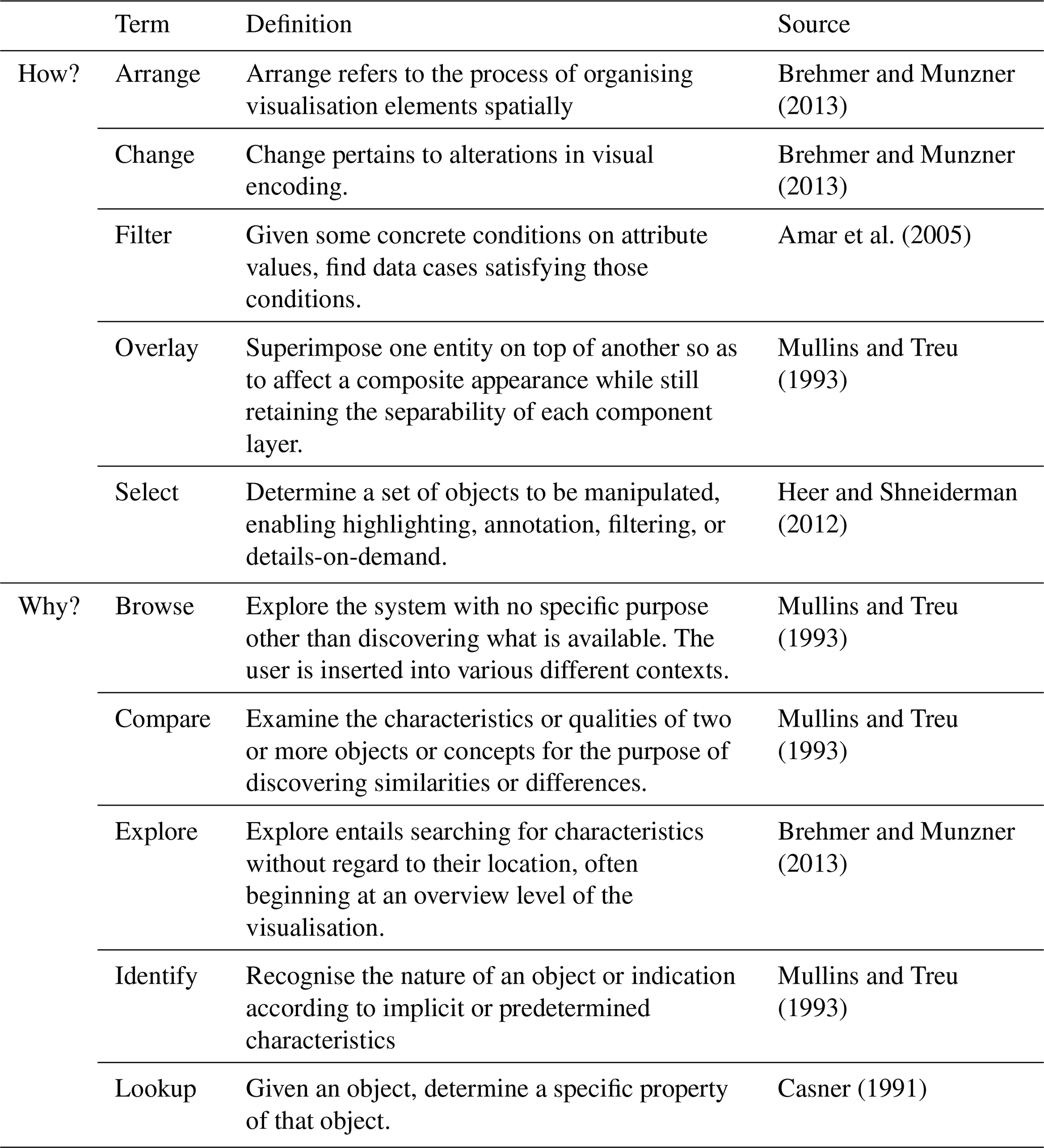
Table A2Matching questions of interest, analysis operations and data and suited visualisations.
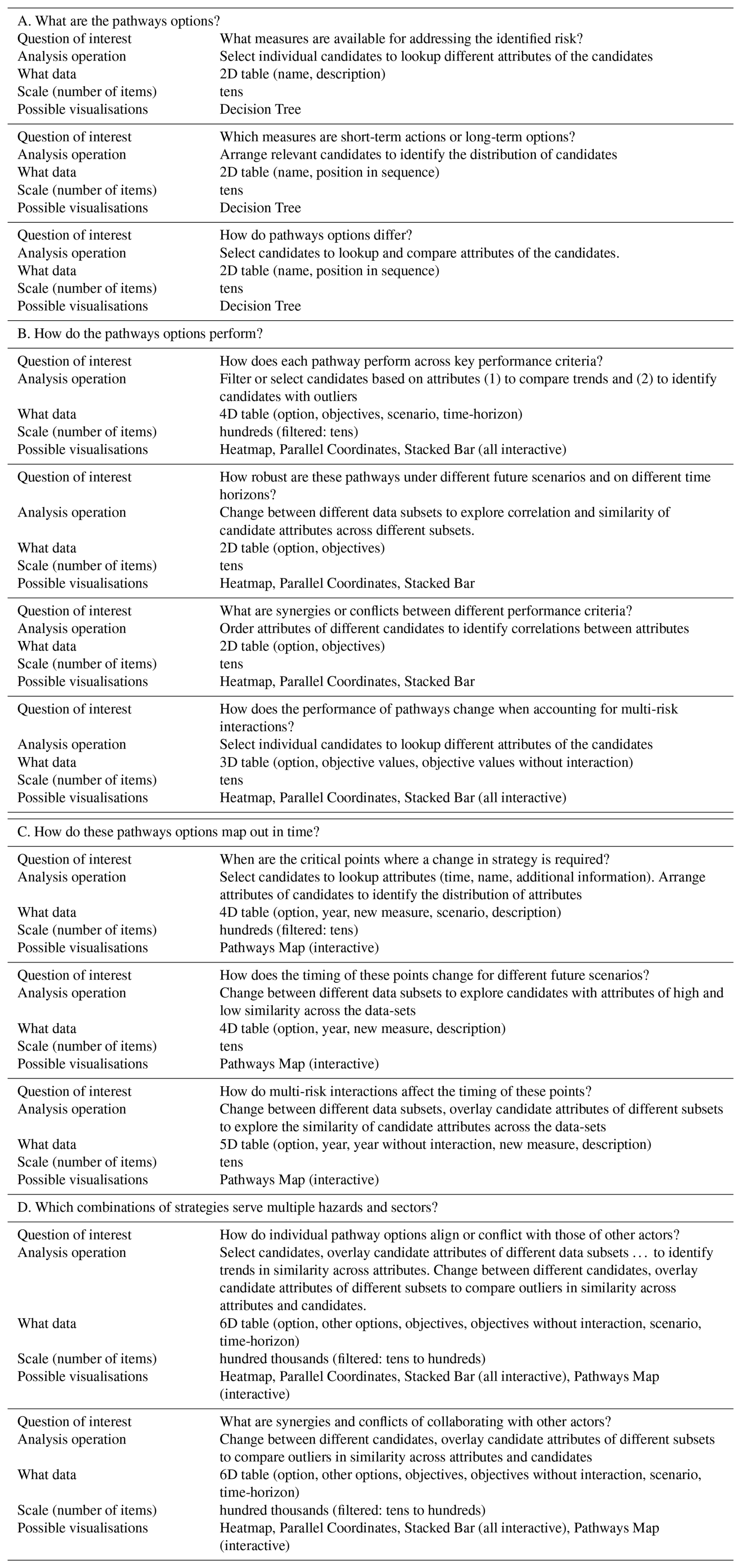
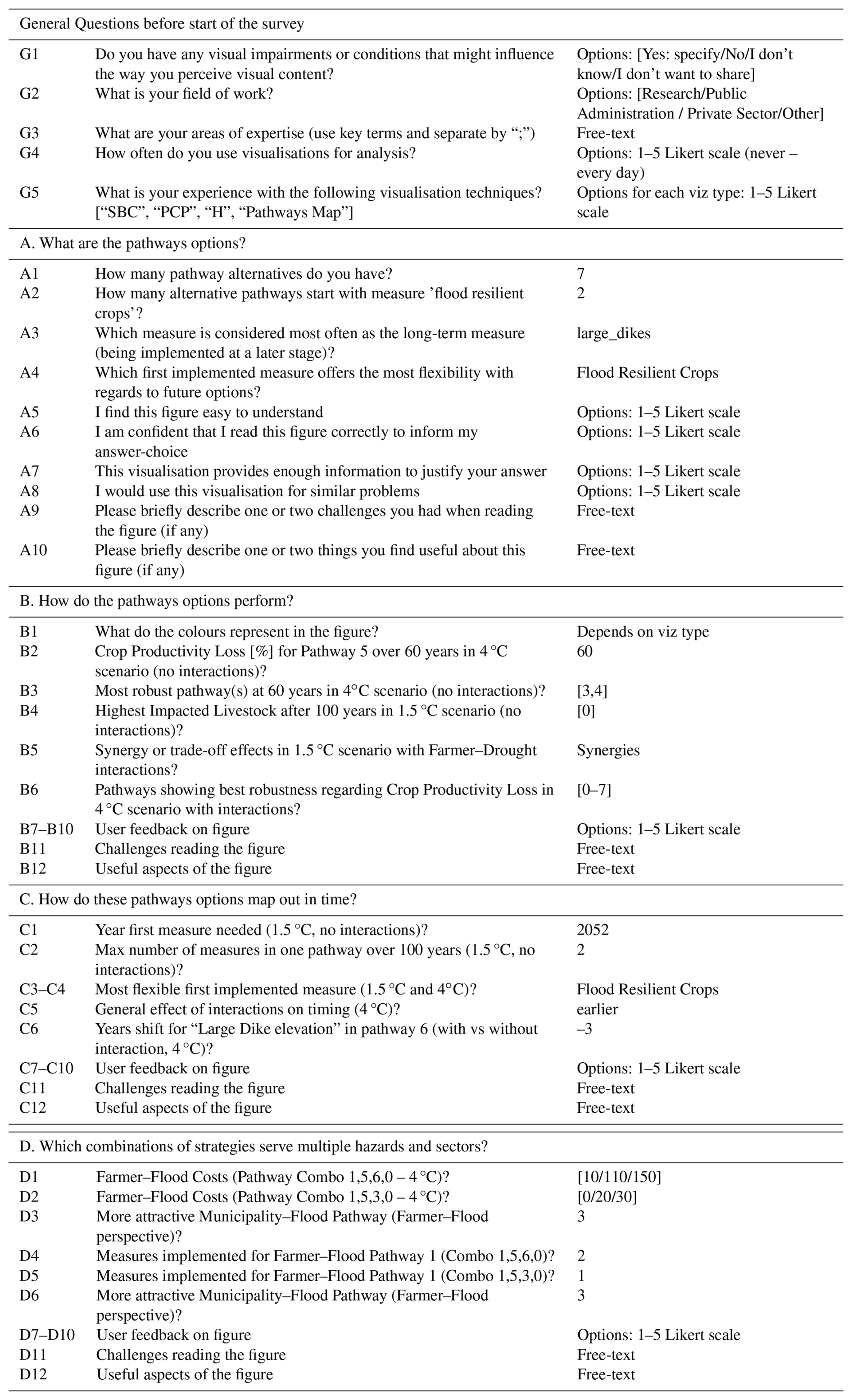
Table A4Overview of expert groups and key expertise attributes that are distinctive for allocating participants
The code and data used to develop and deploy the dashboard are available in Schlumberger (2025) (https://doi.org/10.5281/zenodo.17387349) and developed openly at https://github.com/JuliusSchlumberger/Pathways_Analysis_Dashboard (last access: 18 October 2025). It uses data from earlier work that is available in Schlumberger et al. (2023) (https://doi.org/10.5281/zenodo.10183850).
The supplement related to this article is available online at https://doi.org/10.5194/nhess-25-4089-2025-supplement.
We use CRediT to distinguish authors' contributions. JS: Conceptualisation, Data Curation, Formal Analysis, Investigation, Methodology, Software, visualisation, Writing (all lead). RŠT: Investigation (supporting), Methodology (supporting), Writing – Review & Editing (equal), Supervision (equal). JA: Conceptualisation (supporting), Writing – Review & Editing (equal), Supervision (equal). JHH: Methodology (supporting), Writing – Review & Editing (equal), Supervision (equal). SHS: Methodology (supporting), Writing – Review & Editing (equal), Supervision (equal). MdR: Conceptualisation (supporting), Writing – Review & Editing (equal), Supervision (equal). MH: Conceptualisation (supporting), Writing – Review & Editing (equal), Supervision (equal), visualisation (supporting).
At least one of the (co-)authors is a guest member of the editorial board of Natural Hazards and Earth System Sciences for the special issue “Methodological innovations for the analysis and management of compound risk and multi-risk, including climate-related and geophysical hazards (NHESS/ESD/ESSD/GC/HESS inter-journal SI)”. The peer-review process was guided by an independent editor, and the authors also have no other competing interests to declare.
Publisher's note: Copernicus Publications remains neutral with regard to jurisdictional claims made in the text, published maps, institutional affiliations, or any other geographical representation in this paper. While Copernicus Publications makes every effort to include appropriate place names, the final responsibility lies with the authors. Views expressed in the text are those of the authors and do not necessarily reflect the views of the publisher.
This article is part of the special issue “Methodological innovations for the analysis and management of compound risk and multi-risk, including climate-related and geophysical hazards (NHESS/ESD/ESSD/GC/HESS inter-journal SI)”. It is not associated with a conference.
A portion of the research discussed in this report was carried out during the Young Scientists Summer Programme (YSSP) at the International Institute for Applied Systems Analysis (IIASA) in 2023. We want to thank all 21 participants in our group discussions and semi-structured interviews, along with the 54 survey participants to test the dashboard, whose contribution was critical for meaningful research. Finally, Julius Schlumberger acknowledges the contributions of Dana Stuparu and Sarah Wright, who volunteered to discuss early versions of the visualisations and provided valuable feedback and ideas.
This research has been supported by the European Union's Horizon 2020 research and innovation programme (grant no. 101003276), the European Research Council, H2020 European Research Council (grant no. 884442), and the Nederlandse Organisatie voor Wetenschappelijk Onderzoek (grant no. VI.Veni.222.169).
This paper was edited by Aloïs Tilloy and reviewed by two anonymous referees.
Amar, R., Eagan, J., and Stasko, J.: Low-level components of analytic activity in information visualization, IEEE Symposium on Information Visualization, 111–117, https://doi.org/10.1109/infvis.2005.1532136, 2005. a, b
Bajracharya, S., Carenini, G., Chamberlain, B., Chen, K., Klein, D., Poole, D., Taheri, H., and Öberg, G.: Interactive Visualization for Group Decision Analysis, International Journal of Information Technology & Decision Making, 17, 1839–1864, https://doi.org/10.1142/S0219622018500384, 2018. a
Bartholomew, E. and Kwakkel, J. H.: On considering robustness in the search phase of Robust Decision Making: A comparison of Many-Objective Robust Decision Making, multi-scenario Many-Objective Robust Decision Making, and Many Objective Robust Optimization, Environmental Modelling & Software, 127, 104699, https://doi.org/10.1016/j.envsoft.2020.104699, 2020. a
Bautista, J. and Carenini, G.: An empirical evaluation of interactive visualizations for preferential choice, in: Proceedings of the working conference on Advanced visual interfaces, ACM, New York, NY, USA, https://doi.org/10.1145/1385569.1385603, 2008. a
Bonham, N., Kasprzyk, J., and Zagona, E.: post-MORDM: Mapping policies to synthesize optimization and robustness results for decision-maker compromise, Environmental Modelling & Software, 157, 105491, https://doi.org/10.1016/j.envsoft.2022.105491, 2022. a, b
Bonham, N., Kasprzyk, J., Zagona, E., and Smith, R.: Interactive and Multimetric Robustness Tradeoffs in the Colorado River Basin, Journal of Water Resources Planning and Management, 150, https://doi.org/10.1061/JWRMD5.WRENG-6199, 2024. a, b, c
Boon, E., Wright, S. J., Biesbroek, R., Goosen, H., and Ludwig, F.: Successful climate services for adaptation: What we know, don't know and need to know, Climate Services, 27, 100314, https://doi.org/10.1016/j.cliser.2022.100314, 2022. a
Börner, K., Bueckle, A., and Ginda, M.: Data visualization literacy: Definitions, conceptual frameworks, exercises, and assessments, Proceedings of the National Academy of Sciences of the United States of America, 116, 1857–1864, https://doi.org/10.1073/pnas.1807180116, 2019. a
Brehmer, M. and Munzner, T.: A Multi-Level Typology of Abstract Visualization Tasks, IEEE Transactions on Visualization and Computer Graphics, 19, 2376–2385, https://doi.org/10.1109/tvcg.2013.124, 2013. a, b, c, d, e, f, g
Buskop, F. E., Sperna Weiland, F., and van den Hurk, B.: Amplifying exploration of regional climate risks: clustering future projections on regionally relevant impact drivers instead of emission scenarios, Environmental Research: Climate, 3, 045030, https://doi.org/10.1088/2752-5295/ad9f8f, 2024. a
Casner, S. M.: Task-analytic approach to the automated design of graphic presentations, ACM Transactions on Graphics, 10, 111–151, https://doi.org/10.1145/108360.108361, 1991. a
Ceneda, D., Gschwandtner, T., May, T., Miksch, S., Schulz, H.-J., Streit, M., and Tominski, C.: Characterizing Guidance in Visual Analytics, IEEE Transactions on Visualization and Computer Graphics, 23, 111–120, https://doi.org/10.1109/tvcg.2016.2598468, 2017. a, b
Conati, C., Carenini, G., Hoque, E., Steichen, B., and Toker, D.: Evaluating the Impact of User Characteristics and Different Layouts on an Interactive Visualization for Decision Making, Computer Graphics Forum, 33, 371–380, https://doi.org/10.1111/cgf.12393, 2014. a, b, c, d
Correa, C. D., Chan, Y.-H., and Ma, K.-L.: A framework for uncertainty-aware visual analytics, in: 2009 IEEE Symposium on Visual Analytics Science and Technology, IEEE, https://doi.org/10.1109/vast.2009.5332611, 2009. a
Cradock-Henry, N. A. and Frame, B.: Balancing scales: Enhancing local applications of adaptation pathways, Environmental Science & Policy, 121, 42–48, https://doi.org/10.1016/j.envsci.2021.04.001, 2021. a
de Angeli, S., Malamud, B. D., Rossi, L., Taylor, F. E., Trasforini, E., and Rudari, R.: A multi-hazard framework for spatial-temporal impact analysis, International Journal of Disaster Risk Reduction, 102829, https://doi.org/10.1016/j.ijdrr.2022.102829, 2022. a
de Rigo, D., Rodriguez-Aseretto, D., Bosco, C., Di Leo, M., and San-Miguel-Ayanz, J.: An Architecture for Adaptive Robust Modelling of Wildfire Behaviour under Deep Uncertainty, in: Environmental Software Systems. Fostering Information Sharing, edited by: Hřebíček, J., Schimak, G., Kubásek, M., and Rizzoli, A. E., vol. 413 of IFIP Advances in Information and Communication Technology, , Springer Berlin Heidelberg, Berlin, Heidelberg, 367–380 ISBN 978-3-642-41150-2, https://doi.org/10.1007/978-3-642-41151-9_35, 2013. a
de Ruiter, M. C., de Bruijn, J. A., Englhardt, J., Daniell, J. E., de Moel, H., and Ward, P. J.: The Asynergies of Structural Disaster Risk Reduction Measures: Comparing Floods and Earthquakes, Earth's Future, 9, https://doi.org/10.1029/2020EF001531, 2021. a
Di Fant, V., Middelkoop, H., Dunn, F. E., and Haasnoot, M.: Supporting adaptive pathways planning using archetypes for climate adaptation, Regional Environmental Change, 25, https://doi.org/10.1007/s10113-024-02349-7, 2025. a
Dimara, E., Bezerianos, A., and Dragicevic, P.: Conceptual and Methodological Issues in Evaluating Multidimensional Visualizations for Decision Support, IEEE Transactions on Visualization and Computer Graphics, 24, 749–759, https://doi.org/10.1109/TVCG.2017.2745138, 2018. a, b, c, d
Dzemyda, G., Kurasova, O., and Žilinskas, J.: Multidimensional data visualization: Methods and applications/Gintautas Dzemyda, Olga Kurasova, Julius Žilinskas, vol. volume 75 of Springer optimization and its applications, Springer, New York and London, ISBN 978-1-4419-0235-1, https://doi.org/10.1007/978-1-4419-0236-8, 2013. a
Franconeri, S. L., Padilla, L. M., Shah, P., Zacks, J. M., and Hullman, J.: The Science of Visual Data Communication: What Works, Psychological science in the public interest: a journal of the American Psychological Society, 22, 110–161, https://doi.org/10.1177/15291006211051956, 2021. a, b
Gill, J. C., Malamud, B. D., Barillas, E. M., and Guerra Noriega, A.: Construction of regional multi-hazard interaction frameworks, with an application to Guatemala, Nat. Hazards Earth Syst. Sci., 20, 149–180, https://doi.org/10.5194/nhess-20-149-2020, 2020. a
Gold, D. F., Reed, P. M., Gorelick, D. E., and Characklis, G. W.: Power and Pathways: Exploring Robustness, Cooperative Stability, and Power Relationships in Regional Infrastructure Investment and Water Supply Management Portfolio Pathways, Earth's Future, 10, e2021EF002472, https://doi.org/10.1029/2021EF002472, 2022. a, b
Gratzl, S., Lex, A., Gehlenborg, N., Pfister, H., and Streit, M.: LineUp: visual analysis of multi-attribute rankings, IEEE Transactions on Visualization and Computer Graphics, 19, 2277–2286, https://doi.org/10.1109/TVCG.2013.173, 2013. a, b, c, d, e
Haasnoot, M., Middelkoop, H., Offermans, A., van Beek, E., and van Deursen, W. P. A.: Exploring pathways for sustainable water management in river deltas in a changing environment, Climatic Change, 115, 795–819, https://doi.org/10.1007/s10584-012-0444-2, 2012. a, b
Haasnoot, M., Warren, A., and Kwakkel, J. H.: Dynamic Adaptive Policy Pathways (DAPP), in: Decision Making under Deep Uncertainty, edited by: Marchau, V. A. W. J., Walker, W. E., Bloemen, P. J. T. M., and Popper, S. W., Springer eBook Collection, Springer International Publishing, Cham, 71–92, ISBN 9783030052522, https://doi.org/10.1007/978-3-030-05252-2_4, 2019. a
Haasnoot, M., Lawrence, J., and Magnan, A. K.: Pathways to coastal retreat, Science, 372, 1287–1290, https://doi.org/10.1126/science.abi6594, 2021. a
Haasnoot, M., Di Fant, V., Kwakkel, J., and Lawrence, J.: Lessons from a decade of adaptive pathways studies for climate adaptation, Global Environmental Change, 88, 102907, https://doi.org/10.1016/j.gloenvcha.2024.102907, 2024. a, b, c
Hadjimichael, A., Schlumberger, J., and Haasnoot, M.: Data visualisation for decision making under deep uncertainty: current challenges and opportunities, Environmental Research Letters, 19, 111011, https://doi.org/10.1088/1748-9326/ad858b, 2024. a, b
Hadka, D., Herman, J., Reed, P., and Keller, K.: An open source framework for many-objective robust decision making, Environmental Modelling & Software, 74, 114–129, https://doi.org/10.1016/j.envsoft.2015.07.014, 2015. a
Hanger-Kopp, S., Thaler, T., Seebauer, S., Schinko, T., and Clar, C.: Defining and operationalizing path dependency for the development and monitoring of adaptation pathways, Global Environmental Change, 72, 102425, https://doi.org/10.1016/j.gloenvcha.2021.102425, 2022. a
Heer, J. and Shneiderman, B.: Interactive Dynamics for Visual Analysis, Queue, 10, 30–55, https://doi.org/10.1145/2133416.2146416, 2012. a
Hindalong, E., Johnson, J., Carenini, G., and Munzner, T.: Towards Rigorously Designed Preference Visualizations for Group Decision Making, in: 2020 IEEE Pacific Visualization Symposium (PacificVis), IEEE, https://doi.org/10.1109/pacificvis48177.2020.5111, 2020. a, b, c
Hochrainer-Stigler, S., Trogrlić Šakić, R., Reiter, K., Ward, P. J., de Ruiter, M. C., Duncan, M. J., Torresan, S., Ciurean, R., Mysiak, J., Stuparu, D., and Gottardo, S.: Toward a framework for systemic multi-hazard and multi-risk assessment and management, iScience, 26, 106736, https://doi.org/10.1016/j.isci.2023.106736, 2023. a
Hove, S. E. and Anda, B.: Experiences from Conducting Semi-structured Interviews in Empirical Software Engineering Research, in: 11th IEEE International Software Metrics Symposium (METRICS'05), 23, IEEE, ISBN 0-7695-2371-4, https://doi.org/10.1109/METRICS.2005.24, 2005. a
IPCC: Annex II: Glossary, in: Climate Change 2022 – Impacts, Adaptation and Vulnerability, edited by: Pörtner, H.-O., Roberts, D. C., Tignor, M., Poloczanska, E. S., Mintenbeck, K., Alegría, A., Craig, M., Langsdorf, S., Löschke, S., Möller, V., Okem, A., and Rama, B., Cambridge University Press, 2897–2930, ISBN 9781009325844, https://doi.org/10.1017/9781009325844.029, 2022. a
Itoh, T., Kumar, A., Klein, K., and Kim, J.: High-dimensional data visualization by interactive construction of low-dimensional parallel coordinate plots, Journal of Visual Languages & Computing, 43, 1–13, https://doi.org/10.1016/j.jvlc.2017.03.001, 2017. a
Johnson, B. R., Ager, A. A., Evers, C. R., Hulse, D. W., Nielsen-Pincus, M., Sheehan, T. J., and Bolte, J. P.: Exploring and Testing Wildfire Risk Decision-Making in the Face of Deep Uncertainty, Fire, 6, 276, https://doi.org/10.3390/fire6070276, 2023. a
Johnson, C.: Top scientific visualization research problems, IEEE Computer Graphics and Applications, 24, 13–17, https://doi.org/10.1109/mcg.2004.20, 2004. a
Kool, R., Lawrence, J., Larsen, M. A. D., Osborne, A., and Drews, M.: Spatiotemporal aspects in coastal multi-risk climate change decision-making: Wait, protect, or retreat?, Ocean & Coastal Management, 258, 107385, https://doi.org/10.1016/j.ocecoaman.2024.107385, 2024. a
Kosara, R., Healey, C. G., Interrante, V., Laidlaw, D. H., and Ware, C.: Thoughts on user studies: Why, how, and when, IEEE Computer Graphics and Application, 23, 20–25, https://www.vrvis.at/publications/pdfs/pb-vrvis-2003-003.pdf (last access: 13 November 2024), 2003. a, b
Kwakkel, J. H., Haasnoot, M., and Walker, W. E.: Developing dynamic adaptive policy pathways: a computer-assisted approach for developing adaptive strategies for a deeply uncertain world, Climatic Change, 132, 373–386, https://doi.org/10.1007/s10584-014-1210-4, 2015. a
Kwakkel, J. H., Walker, W. E., and Haasnoot, M.: Coping with the Wickedness of Public Policy Problems: Approaches for Decision Making under Deep Uncertainty, Journal of Water Resources Planning and Management, 142, 01816001, https://doi.org/10.1061/(ASCE)WR.1943-5452.0000626, 2016. a
Laal, M. and Laal, M.: Collaborative learning: what is it?, Procedia – Social and Behavioral Sciences, 31, 491–495, https://doi.org/10.1016/j.sbspro.2011.12.092, 2012. a
Mackinlay, J.: Automating the design of graphical presentations of relational information, ACM Transactions on Graphics, 5, 110–141, https://doi.org/10.1145/22949.22950, 1986. a, b
McEvoy, S., Langendijk, G., Jeuken, A., and Haasnoot, M.: What is needed to make climate resilient development pathways planning actionable in cities?, Environmental Research Communications, 7, 082501, https://doi.org/10.1088/2515-7620/adf9c9, 2025. a
Moallemi, E. A., Kwakkel, J., de Haan, F. J., and Bryan, B. A.: Exploratory modeling for analyzing coupled human-natural systems under uncertainty, Global Environmental Change, 65, 102186, https://doi.org/10.1016/j.gloenvcha.2020.102186, 2020. a
Mullins, P. M. and Treu, S.: A task-based cognitive model for user-network interaction: defining a task taxonomy to guide the interface designer, Interacting with Computers, 5, 139–166, https://doi.org/10.1016/0953-5438(93)90016-m, 1993. a, b, c, d
Munoz, C., Campbell, A., Barber, S., Hemsworth, P., and Doyle, R.: Using Longitudinal Assessment on Extensively Managed Ewes to Quantify Welfare Compromise and Risks, Animals, 8, 8, https://doi.org/10.3390/ani8010008, 2018. a
Munzner, T.: Process and Pitfalls in Writing Information Visualization Research Papers, in: Information Visualization, Springer, Berlin, Heidelberg, 134–153, https://doi.org/10.1007/978-3-540-70956-5_6, 2008. a, b
Munzner, T.: A nested model for visualization design and validation, IEEE Transactions on Visualization and Computer Graphics, 15, 921–928, https://doi.org/10.1109/TVCG.2009.111, 2009. a, b, c, d, e
Munzner, T.: Visualization Analysis and Design, CRC Press, ISBN 9781498759717, 2014. a, b, c, d, e, f
Nilsson, M.: Important interactions among the sustainable development goals under review at the high-level political forum 2017, https://www.jstor.org/stable/pdf/resrep02837.pdf (last access: 13 November 2024), 2017. a
Padilla, L. M., Creem-Regehr, S. H., Hegarty, M., and Stefanucci, J. K.: Decision making with visualizations: a cognitive framework across disciplines, Cognitive research: principles and implications, 3, 29, https://doi.org/10.1186/s41235-018-0120-9, 2018. a
Plaisant, C.: The challenge of information visualization evaluation, in: Proceedings of the working conference on Advanced visual interfaces, edited by: Costabile, M. F., ACM, New York, NY, USA, 109–116, ISBN 1581138679, https://doi.org/10.1145/989863.989880, 2004. a
Rogers, E. M.: Diffusion of innovations, Free Press, New York and London and Toronto and Sydney, fifth edition edn., ISBN 9780743258234, https://ebookcentral.proquest.com/lib/kxp/detail.action?docID=4935198 (last access: 13 November 2024), 2003. a
Ruppert, T., Bernard, J., and Kohlhammer, J.: Bridging Knowledge Gaps in Policy Analysis with Information Visualization, 1617–5468, https://dl.gi.de/handle/20.500.12116/17254, 2013. a
Sakic Trogrlic, R., Reiter, K., Ciurean, R., Gottardo, S., Torresan, S., Daloz, A. S., Ma, L., Padron-Fumero, N., Tatman, S., and Ward, P. and the MYRIAD-EU Team: Challenges in Assessing and Managing Multi-Hazard Risks: A European Stakeholders' Perspective, EGU General Assembly 2024, Vienna, Austria, 14–19 Apr 2024, EGU24-3843, https://doi.org/10.5194/egusphere-egu24-3843, 2024. a, b, c
Salo, A. and Hämäläinen, R. P.: Multicriteria Decision Analysis in Group Decision Processes, in: Handbook of Group Decision and Negotiation, edited by: Shakun, M. F., Kilgour, D. M., and Eden, C., vol. 4 of Advances in Group Decision and Negotiation, Springer Netherlands, Dordrecht, 269–283, ISBN 978-90-481-9096-6, https://doi.org/10.1007/978-90-481-9097-3_16, 2010. a
Schlumberger, J.: Pathways Analysis Dashboard Input and Code, Zenodo [code], https://doi.org/10.5281/zenodo.17387349, 2025. a
Schlumberger, J., Stuparu, D., Ciurean, R. L., Duncan, M., Mysiak, J., Khazai, B., Rimmer, J., Dochiu, C., and Claassen, J.: D1.3 Report on policies, policy-making processes, and governance for multi- hazard, multi-risk management, Zenodo, https://doi.org/10.5281/zenodo.7096834, 2022. a, b
Schlumberger, J., Haasnoot, M., Aerts, J., Bril, V., van der Weide, L., and de Ruiter, M.: Waas-MR model (Version 6), Zenodo [software], https://doi.org/10.5281/zenodo.10183850, 2023. a, b
Schlumberger, J., Haasnoot, M., Aerts, J. C. J. H., Bril, V., van der Weide, L., and de Ruiter, M.: Evaluating Adaptation Pathways in a Complex Multi–Risk System, Earth's Future, 12, https://doi.org/10.1029/2023EF004288, 2024. a, b, c, d
Sedlmair, M., Meyer, M., and Munzner, T.: Design Study Methodology: Reflections from the Trenches and the Stacks, IEEE Transactions on Visualization and Computer Graphics, 18, 2431–2440, https://doi.org/10.1109/TVCG.2012.213, 2012. a
Shavazipour, B., López-Ibáñez, M., and Miettinen, K.: Visualizations for decision support in scenario-based multiobjective optimization, Information Sciences, 578, 1–21, https://doi.org/10.1016/j.ins.2021.07.025, 2021. a, b, c, d
Shneiderman, B.: The eyes have it: a task by data type taxonomy for information visualizations, in: IEEE symposium on visual languages, IEEE Comput. Soc. Press, 336–343, ISBN 0-8186-7508-X, https://doi.org/10.1109/VL.1996.545307, 1996. a, b
Siirtola, H.: Direct manipulation of parallel coordinates, in: CHI '00 extended abstracts on Human factors in computing systems, edited by: Tremaine, M., ACM Digital Library, New York, NY, USA, 119–120, ISBN 1581132484, https://doi.org/10.1145/633292.633361, 2000. a
Siirtola, H.: Interactive visualization of multidimensional data, vol. 7 of Dissertations in interactive technology, Tampere University Press, Tampere, ISBN 978-951-44-6871-1, 2007. a, b, c
Siirtola, H., Laivo, T., Heimonen, T., and Räihä, K.-J.: Visual Perception of Parallel Coordinate Visualizations, in: 2009 13th International Conference Information Visualisation, 3–9, IEEE, https://doi.org/10.1109/IV.2009.25, 2009. a
Simpson, N. P., Mach, K. J., Constable, A., Hess, J., Hogarth, R., Howden, M., Lawrence, J., Lempert, R. J., Muccione, V., Mackey, B., New, M. G., O'Neill, B., Otto, F., Pörtner, H.-O., Reisinger, A., Roberts, D., Schmidt, D. N., Seneviratne, S., Strongin, S., van Aalst, M., Totin, E., and Trisos, C. H.: A framework for complex climate change risk assessment, One Earth, 4, 489–501, https://doi.org/10.1016/j.oneear.2021.03.005, 2021. a, b
Simpson, N. P., Williams, P. A., Mach, K. J., Berrang-Ford, L., Biesbroek, R., Haasnoot, M., Segnon, A. C., Campbell, D., Musah-Surugu, J. I., Joe, E. T., Nunbogu, A. M., Sabour, S., Meyer, A. L. S., Andrews, T. M., Singh, C., Siders, A. R., Lawrence, J., van Aalst, M., and Trisos, C. H.: Adaptation to compound climate risks: A systematic global stocktake, iScience, 26, 105926, https://doi.org/10.1016/j.isci.2023.105926, 2023. a
Smith, R., Kasprzyk, J., and Dilling, L.: Testing the potential of Multiobjective Evolutionary Algorithms (MOEAs) with Colorado water managers, Environmental Modelling & Software, 117, 149–163, https://doi.org/10.1016/j.envsoft.2019.03.011, 2019. a
Streit, M. and Gehlenborg, N.: Bar charts and box plots, Nature Methods, 11, 117, https://doi.org/10.1038/nmeth.2807, 2014. a
Thaler, T., Hanger-Kopp, S., Schinko, T., and Nordbeck, R.: Addressing path dependencies in decision-making processes for operationalizing compound climate-risk management, iScience, 107073, https://doi.org/10.1016/j.isci.2023.107073, 2023. a, b
Trindade, B. C., Reed, P. M., and Characklis, G. W.: Deeply uncertain pathways: Integrated multi-city regional water supply infrastructure investment and portfolio management, Advances in Water Resources, 134, 103442, https://doi.org/10.1016/j.advwatres.2019.103442, 2019. a
UNDRR: Global Assessment Report on Disaster Risk Reduction 2022: Our World at Risk: Transforming Governance for a Resilient Future, 2022. a
Walker, D. H. T., Bourne, L. M., and Shelley, A.: Influence, stakeholder mapping and visualization, Construction Management and Economics, 26, 645–658, https://doi.org/10.1080/01446190701882390, 2008. a
Ward, P. J., Daniell, J., Duncan, M., Dunne, A., Hananel, C., Hochrainer-Stigler, S., Tijssen, A., Torresan, S., Ciurean, R., Gill, J. C., Sillmann, J., Couasnon, A., Koks, E., Padrón-Fumero, N., Tatman, S., Tronstad Lund, M., Adesiyun, A., Aerts, J. C. J. H., Alabaster, A., Bulder, B., Campillo Torres, C., Critto, A., Hernández-Martín, R., Machado, M., Mysiak, J., Orth, R., Palomino Antolín, I., Petrescu, E.-C., Reichstein, M., Tiggeloven, T., Van Loon, A. F., Vuong Pham, H., and de Ruiter, M. C.: Invited perspectives: A research agenda towards disaster risk management pathways in multi-(hazard-)risk assessment, Nat. Hazards Earth Syst. Sci., 22, 1487–1497, https://doi.org/10.5194/nhess-22-1487-2022, 2022. a
Wehrend, S. and Lewis, C.: A problem-oriented classification of visualization techniques, in: Proceedings of the First IEEE Conference on Visualization: Visualization `90, IEEE Comput. Soc. Press, 139–143, ISBN 0-8186-2083-8, https://doi.org/10.1109/VISUAL.1990.146375, 1990. a
Werners, S. E., Wise, R. M., Butler, J. R., Totin, E., and Vincent, K.: Adaptation pathways: A review of approaches and a learning framework, Environmental Science & Policy, 116, 266–275, https://doi.org/10.1016/j.envsci.2020.11.003, 2021. a
Westra, S. and Zscheischler, J.: Accounting for systemic complexity in the assessment of climate risk, One Earth, 6, 645–655, https://doi.org/10.1016/j.oneear.2023.05.005, 2023. a
Woodruff, M. J., Reed, P. M., and Simpson, T. W.: Many objective visual analytics: rethinking the design of complex engineered systems, Structural and Multidisciplinary Optimization, 48, 201–219, https://doi.org/10.1007/s00158-013-0891-z, 2013. a
- Abstract
- Introduction
- Methods
- Evaluating the visual analysis dashboard
- Discussion
- Conclusions & Recommendations
- Appendix A: Appendix
- Code and data availability
- Author contributions
- Competing interests
- Disclaimer
- Special issue statement
- Acknowledgements
- Financial support
- Review statement
- References
- Supplement