the Creative Commons Attribution 4.0 License.
the Creative Commons Attribution 4.0 License.
 | 02 Dec 2019
Difficulties in explaining complex issues with maps: evaluating seismic hazard communication – the Swiss case
Michael Stauffacher
Stefan Wiemer
A total of 2.7 billion people live in areas where earthquakes causing at least slight damage have to be expected regularly. Providing information can potentially save lives and improve the resilience of a society. Maps are an established way to illustrate natural hazards. Despite being mainly tailored to the requirements of professional users, they are often the only accessible information to help the public in deciding about mitigation measures. There is evidence that hazard maps are frequently misconceived. Visual and textual characteristics as well as the manner of presentation have been shown to influence their comprehensibility. Using a real case reflecting current practices, the material to communicate the updated seismic hazard model for Switzerland was analyzed in a representative online survey of the population (N=491) and in two workshops involving architects and engineers not specializing in seismic retrofitting (N=23). Although many best-practice recommendations have been followed, the understanding of seismic hazard information remains challenging. Whereas most participants were able to distinguish hazardous from less hazardous areas, correctly interpreting detailed results and identifying the most suitable set of information for answering a given question proved demanding. We suggest scrutinizing current natural-hazard communication strategies, empirically testing new products, and exploring alternatives to raise awareness and enhance preparedness.
- Article
(6030 KB) - Full-text XML
- BibTeX
- EndNote


Many of the 2.7 billion people living in areas where earthquakes causing at least slight damage have to be expected regularly1 (Pesaresi et al., 2017) are unaware of this threat or underestimate it. Earthquake hazard is invisible, as the processes of relevance occur deep underground. In addition, earthquakes are characterized as low-probability, high-impact events allowing for no warning. Currently, seismic hazard maps are the most commonly used means of visualizing and communicating this danger (see a selection in Fig. 1; Bostrom et al., 2008; Gaspar-Escribano and Iturrioz, 2011; Kunz and Hurni, 2011).
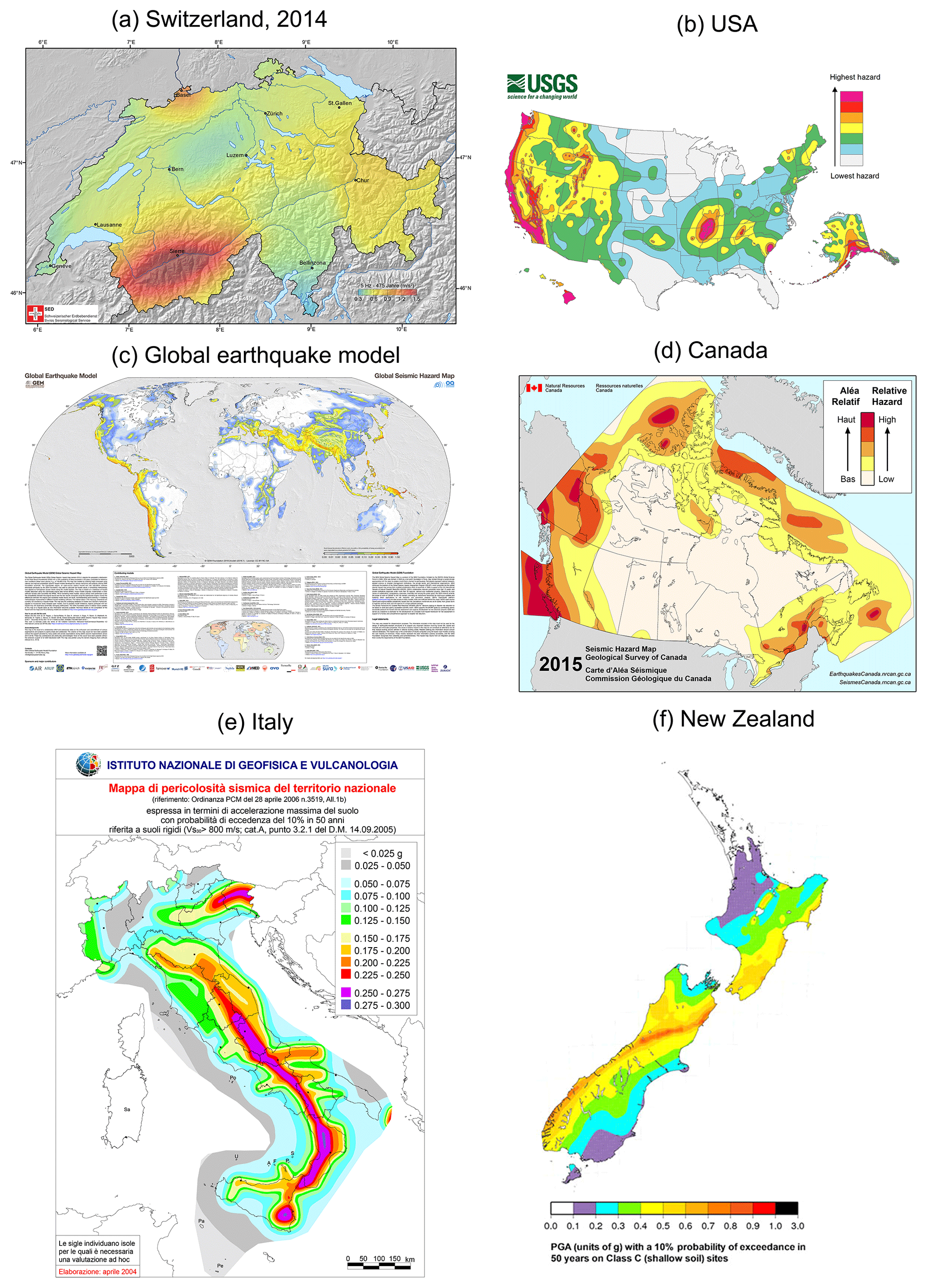
Figure 1Selection of national seismic hazard maps: (a) Swiss seismic hazard map (Swiss Seismological Service, 2018; http://www.seismo.ethz.ch/knowledge/seismic-hazard-switzerland/), (b) US seismic hazard map (United States Geological Survey, 2018; https://earthquake.usgs.gov/hazards/hazmaps/), (c) Global Earthquake Model (GEM) Seismic Hazard Map (version 2018.1 – December 2018; Pagani et al., 2018; https://www.globalquakemodel.org/gem, last access: 2 July 2019), (d) simplified seismic hazard map for Canada (the provinces and territories; Natural Resources Canada, 2018; http://www.earthquakescanada.ca/hazard-alea/simphaz-en.php), (e) “pericolosità sismica di riferimento per il territorio nazionale” (Istituto Nazionale di Geofisica e Vulcanologia, 2018; http://zonesismiche.mi.ingv.it/), and (f) the 2010 National Seismic Hazard Model for New Zealand (Institute of Geological and Nuclear Sciences Limited, 2018; https://www.gns.cri.nz/Home/Our-Science/Natural-Hazards-and-Risks/Earthquakes/Earthquake-Forecast-and-Hazard-Modelling/2010-National-Seismic-Hazard-Model).
Knowing and understanding seismic hazard is a major step towards loss reduction (Gaspar-Escribano and Iturrioz, 2011; Shaw et al., 2004). An earthquake-resistant building design, based on seismic hazard values (Perry et al., 2016), is the most efficient means of reducing seismic risk and generally implemented by professionals. This is not only valid for new constructions but also when conducting renovations at older facilities. However, even when strict building codes are in place, their application is often deficient or impeded (Day, 2012). For example, in Switzerland the enforcement of building codes depends in many parts of the country exclusively on non-specialized engineers and architects or knowledgeable building owners. The information provided in the framework of the national seismic hazard map is their principle source for understanding the seismic hazard of a given area. This also applies for homeowners, who need to make a decision about getting earthquake insurance. This is not exclusively the case for Switzerland; earthquake damage is underinsured worldwide (OECD, 2018). In addition, building codes only set a minimal standard which can easily be exceeded by a specific event. Therefore, individual preparedness is essential.
Even though natural-hazard maps are mainly tailored to the needs of primary users (Perry et al., 2016), they are used in their unaltered form to communicate with other recipients (Thompson et al., 2015). In consequence, recent publications indicate that they often fail to transmit their content (Meyer et al., 2012). Non-experts in the field, in particular, often struggle to interpret the maps correctly (Hagemeier-Klose and Wagner, 2009; Kjellgren, 2013; Perry et al., 2016; Severtson and Vatovec, 2012). This is fundamental, because as stated above, improving resilience requires not only knowledgeable experts but also politicians, authorities, and informed members of society to support precautionary actions.
Identifying and providing seismic hazard values are a primary responsibility of seismological services around the world. Earthquake hazard describes how often a certain horizontal acceleration caused by an earthquake has to be anticipated at a specific location (Swiss Seismological Service, 2018). The access statistics of the website of the seismological service (http://www.seismo.ethz.ch, last access: 22 November 2019) demonstrate for Switzerland that seismic hazard information is highly requested: the respective pages dedicated to non-professionals are among the most popular. For professionals, there is a separate portal where also hazard spectra and curves can be accessed (http://www.efehr.org, last access: 22 November 2019). In addition, the media often asks to reprint the seismic hazard map for a return period of 475 years.
The main users or recipients of seismic hazard maps can be broken down into three groups (Meyer et al., 2012): (1) experts, mainly seismologists, geologists, and specialized civil engineers, who use seismic hazard maps on a regular basis for professional purposes; (2) other professionals, like architects, engineers not specializing in seismic retrofitting, and emergency and disaster managers, who only deal occasionally with seismic hazard maps; and (3) the public, who are confronted by authorities or media with seismic hazard maps or seek advice before purchasing a house or getting insurance. They are usually unfamiliar with many of the maps' components.
Previous studies evaluating maps for risk management purposes mainly focused on directly involved stakeholders and authorities (Dransch et al., 2010). The few studies that analyzed the public's needs regarding hazard maps did so either by questioning experts or by mostly relying on a small sample (Hagemeier-Klose and Wagner, 2009; Kjellgren, 2013; Meyer et al., 2012; Thompson et al., 2015). The understanding of seismic hazard by non-experts in the field and the public has thus been neglected. The challenge lies not only in making accurate information available but also in presenting it in understandable ways (Peters et al., 2008). Publishing hazard maps online is seen as an important option for providing hazard information to the public (Hagemeier-Klose and Wagner, 2009; Kostelnick et al., 2013).
With respect to flood maps, Meyer et al. (2012) recommend implementing a less complex map design for the public in contrast to primary users. Different requirements and expectations are also emphasized by Hagemeier-Klose and Wagner (2009), who stress that when presenting flood maps, technical terms should be avoided and “emotional empathy” created. With regard to volcanic hazard maps, accurate data classification, meaningful application of color schemes, and textual elements are emphasized as being important for user engagement and the interpretation of map content (Thompson et al., 2015). Overall, there is a serious lack of empirically tested knowledge on how to design (seismic) hazard maps, especially when addressing the public.
For the first time, we study how well seismic hazard maps, as the most prominent output of any model, are able to inform non-experts. Thus, we focus on the general public as well as on architects and engineers not specializing in seismic retrofitting. They are both indispensable in improving earthquake resilience, but neither are currently of specific relevance for the producers of most seismic hazard maps nor the focus of the research about maps to communicate natural hazards. Our study is based on a real-world case, analyzing the seismic hazard maps and aligned information provided by the Swiss Seismological Service (SED) at ETH Zurich.
This case was chosen as it is representative of the way results of a natural-hazard assessment are presented to a variety of users. It typically reflects the work seismological services and other natural-hazard agencies are doing around the world. By taking into account the newest findings not only in the model calculation but also in the presentation of the results, the SED has gone one step further. We analyze how well participants are able to handle the information provided as well as their competence in giving answers to specified questions. We also examine their ability to interpret statistical information and the effect of interactive access. The results will allow for deriving best practices for improving seismic hazard and natural-hazard communication worldwide.
Risk communication can lead to more accurate beliefs about seismic hazard and a tendency towards taking precautionary measures (Whitney et al., 2004). As elaborated previously, maps are the means of choice to communicate seismic hazard. In the following, we discuss the factors determining how hazard maps are read, interpreted, and understood. This sets the baseline for analyzing the maps produced by the SED.
2.1 Visual characteristics
Visual characteristics of seismic hazard maps are mainly defined by colors, contrast, and the explanatory legend. A survey compared volcanic hazard maps with a red–yellow and a red–yellow–blue color scheme (Thompson et al., 2015). Despite indicating the same values, identical hazard levels were interpreted differently. In a red–yellow map, areas colored yellow were considered to be at risk. In contrast, in a red–yellow–blue map, areas previously colored yellow and then colored blue gave the impression of being safe. Red color schemes are, with some cultural differences, commonly associated with danger, hazard, and risk (Bostrom et al., 2008). In contrast, light colors naturally seem less alarming than dark colors (Gaspar-Escribano and Iturrioz, 2011; Peters et al., 2008).
Clear colors and high contrast ratios improve the understanding of maps (Hagemeier-Klose and Wagner, 2009). Contrasts are especially relevant for people with defective color vision (Kunz et al., 2011). This is particularly important for maps with color schemes ranging from green to red (Thompson et al., 2015). Depicting certain values directly on the map instead of only mentioning them in the legend helps people with visual impairments to interpret the content correctly.
The chosen colors should allow easy distinction between data classes. The use of different color hues at each end of the scheme instead of a single hue helps. However, having too many classes diminishes users' ability to distinguish color values and decreases saturation of a specific class (Kunz and Hurni, 2011). It is worth testing which intervals are most likely to be understood and categorizing the data into three to five classes (Fuchs et al., 2011; Gaspar-Escribano and Iturrioz, 2011). Alternatively, unclassified maps can be used to depict continuous data. Even though users cannot distinguish small changes and might have difficulties in situating single data points in the legend, unclassified maps represent the data more accurately (Severtson and Myers, 2013).
Legends are another important aspect of visuals. If users cannot clearly understand or see the legend, they will probably misunderstand the map content (Kunz and Hurni, 2011). As different users have different needs, Gaspar-Escribano and Iturrioz (2011) recommend comprehensive, numerical information for professionals and qualitative legends for non-professionals. Another approach suggests combining unclassified maps with verbal legends (e.g., low to high risk), as in any case, users struggle to assign specific color hues to single data points in the legend. In contrast, isarithmic maps, which connect points of equal values with lines, are preferably combined with numerical values (Severtson and Myers, 2013).
2.2 Textual characteristics
Descriptions support the understanding of graphics and enhance their persuasive impact (Lipkus, 2007). To reach this aim, the trade-off between the completeness and the comprehensibility of information needs to be well balanced. Access to more complete information does not necessarily lead to enhanced comprehension and a better quality of choice (Peters et al., 2007). This is especially true for older persons and those with lower numeracy skills (Peters, 2008). Numeracy acts as a representative for cognition (Severtson and Myers, 2013) and may influence the general ability to understand graphics (Spiegelhalter et al., 2011). Providers should shift from an approach centered on information completeness to one that facilitates users' decision-making (Peters, 2008) by emphasizing important information (Pang, 2008).
In the context of seismic hazard communication, technical jargon, transmitting odds, and other statistical information is of further special relevance.
2.2.1 Technical vocabulary
Whenever possible, technical vocabulary should be avoided for non-experts (Hagemeier-Klose and Wagner, 2009). Recent usability studies (e.g., Burningham et al., 2008) in the context of flood hazards emphasize that non-experts struggle to understand technical terms accompanying flood maps, like “return periods expressed as probabilities” (Meyer et al., 2012) or a “one hundred year flood” (Hagemeier-Klose and Wagner, 2008).
2.2.2 Odds
Most people struggle to understand odds. What they would like to know is the likelihood of an earthquake occurring within a conceivable period (Nathe, 2000). In the context of volcanic hazard, using “within” instead of “in” to describe the period helps with achieving a more balanced judgment of the distribution of the likelihood of volcanic eruptions over a given time frame (Hudson-Doyle et al., 2011). Nevertheless, the effect is only visible for longer periods and is more pronounced in likelihood judgments by non-scientists (Doyle et al., 2014).
2.2.3 Statistical information
When it comes to statistics, it has proven especially challenging to communicate single-event probabilities, conditional probabilities, and relative risks (Gigerenzer and Edwards, 2003).
Statistical judgments by experts and non-experts improve similarly if they are based on frequencies rather than probabilities (Hoffrage et al., 2000). Nevertheless, in a study on volcanic hazard, participants with relatively high numeracy skills expressed a preference for percentages only or percentages in combination with natural frequencies (Thompson et al., 2015). Alternatively, verbal and linguistic probabilities can be used (e.g., “likely” or “certain”) even though they appear to be interpreted very differently. To minimize the risk of misinterpretation, combining verbal and numerical information is seen as the most promising approach (Bodemer and Gaissmaier, 2012; Budescu et al., 2014).
Conditional probabilities pose another challenge. The standard seismic hazard map depicts a probability of exceedance of 10 % within 50 years. Health-related studies demonstrate that such conditional probabilities are often misconceived by both physicians and patients (Bodemer and Gaissmaier, 2012; Gigerenzer and Edwards, 2003).
Relative risks are more difficult to understand than absolute risks (Bodemer and Gaissmaier, 2012; Gigerenzer and Edwards, 2003). Communicating absolute risks improves the correct understanding of a given statistical statement (Gigerenzer and Edwards, 2003).
2.3 Manner of presentation
Experiential and interactive information generates a stronger impact on attitudes and leads to a higher level of preparedness (Becker et al., 2013; McIvor and Paton, 2007). Bostrom et al. (2008) point out the potential in offering interactive visualizations to explore seismic risk information, allowing individual configurations to cover different user groups' needs. However, interactive visualizations should not be overloaded or too complex. Moreover, they should be based on clear communication goals and only offer functionalities that serve those goals (Dransch et al., 2010). In a study, natural-hazard experts confirmed the usefulness of interactive hazard-mapping tools (Kunz and Hurni, 2011).
Interactive map visualization facilitates the comparison of different parameters and allows for personalized settings, e.g., for transparency. Maps should enable appropriate hazard assessment and therefore make it possible to compare hazards at different times and in different areas (Dransch et al., 2010; Hagemeier-Klose and Wagner, 2009). Adaptive zooming is strongly recommended. It reduces the amount of information visible at once (Kunz and Hurni, 2011). The interface provided has to be user-friendly and offer access to further information (Hagemeier-Klose and Wagner, 2008). An extensive review of flood maps in Europe revealed that all analyzed maps were either too simple or too complex. Many included too many functionalities and too much information, which diminished their comprehensibility (Hagemeier-Klose and Wagner, 2009).
Testing hazard products is seen as an important success factor for information-presenting strategies (Kostelnick et al., 2013; Perry et al., 2016; Peters, 2008; Thompson et al., 2015). A testing campaign should determine how well the given information is understood, the extent to which the communication goals are reached, and the influence of the presented materials on actual choices (Peters et al., 2008). Our case study uses the original maps the SED provides to communicate its hazard model. In the following, we discuss their qualities with respect to the aforementioned best practices.
3.1 Qualities in the presentation of the Swiss seismic hazard model
Besides traditional hazard maps depicting ground acceleration values, the SED introduced two other map types: effect and magnitude maps (see Fig. 2). Effect maps show the probability of a particular intensity (EMS-98) and the associated effects within a certain period. Magnitude maps illustrate how often an earthquake of, or above, a certain size is expected to occur within a specific radius and period. These maps were developed because users mostly do not ask for ground acceleration values but instead want to know how often a damaging earthquake or an earthquake with a certain magnitude has to be expected at a specific location (Wiemer et al., 2015).
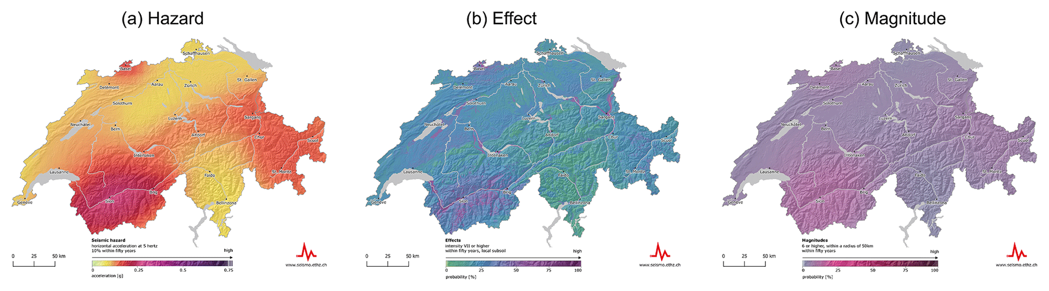
Figure 2Comparison of the color scales of the three map types offered for the release of the updated seismic hazard model: (a) hazard map (in units of m s2), (b) effect map (in units of EMS intensity), and (c) magnitude map (in units of magnitude; Swiss Seismological Service, 2018; http://www.seismo.ethz.ch/knowledge/seismic-hazard-switzerland/).

Figure 3Same color scale for hazard maps with different return periods. From left to right are return periods of (a) 75 years, (b) 500 years, (c) 2500 years, and (d) 10 000 years (Swiss Seismological Service, 2018; http://www.seismo.ethz.ch/knowledge/seismic-hazard-switzerland/maps/hazard/, last access: 22 November 2019).
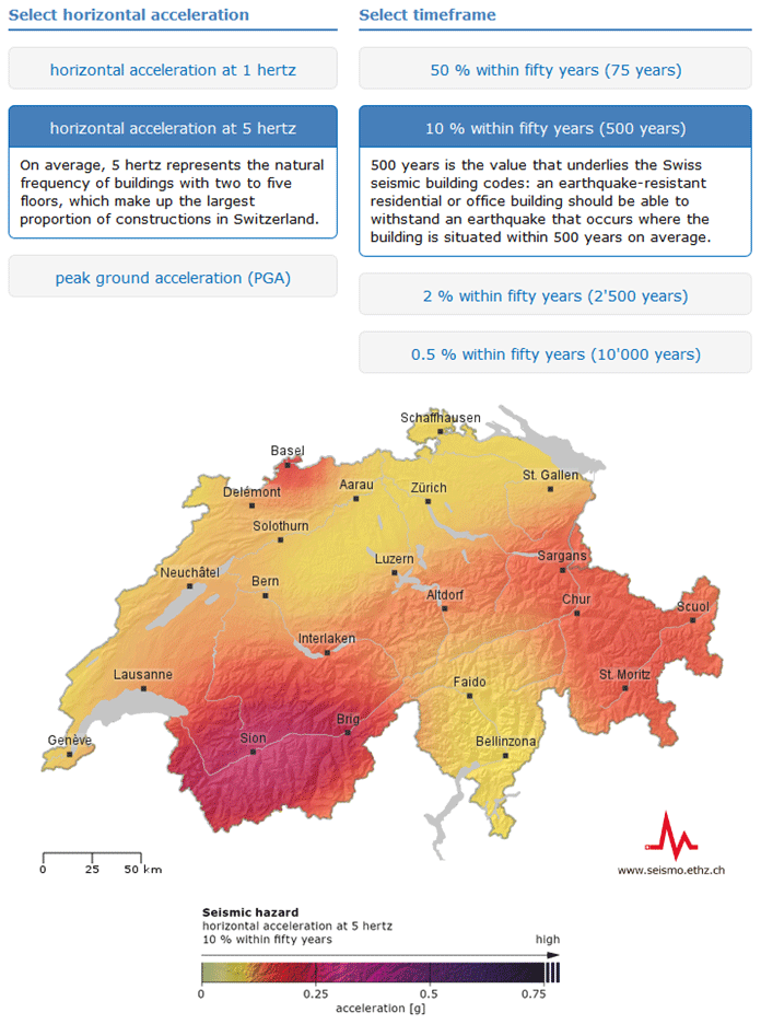
Figure 4Screenshot of the Swiss seismic hazard model interactive web tool 2015 (Swiss Seismological Service, 2018; http://www.seismo.ethz.ch/knowledge/seismic-hazard-switzerland/maps/hazard/).
To make it easier to compare maps in terms of, for example, return periods, the same color scale is used for all map variations within one of the three map types (Fig. 3). In total, 45 maps were made accessible in an interactive web tool (Fig. 4).
With regard to visual characteristics (see Sect. 2.1), darker colors are used to depict areas with higher hazard, intensity, or magnitude values, as recommended in other studies (Gaspar-Escribano and Iturrioz, 2011; Peters et al., 2008). In contrast to its previous version (see Fig. 1a), the seismic hazard map is mostly colored yellow–red, indicating that the whole country is potentially endangered. All maps are unclassified, as they depict continuous data; this includes the downside of not allowing users to read single data points (Severtson and Myers, 2013). The contrast ratios are rather low, especially in the case of the magnitude and effect maps, as a consequence of using the same color scale for all maps of a certain type. Low contrast ratios degrade the readability of the maps and also impede the understanding of the information shown (Hagemeier-Klose and Wagner, 2009; Kunz et al., 2011). The legends are prominently positioned and depict numeric and qualitative information, as suggested by literature.
With respect to textual characteristics (see Sect. 2.2), the information provided follows best-practice recommendations. Even though technical vocabulary has not been avoided in the legends, it is explained in accompanying text around 100 to 200 words long. In addition, every map has a caption summarizing the most important parameters. All map types depict different probabilistic information, which is not only provided in numbers but also explained2.
The interactive tool allows different map parameters to be combined individually. However, there is no option to zoom in, select specific data points or information, or personalize the map displayed (e.g., transparency), which contradicts current best practices in the field (see Sect. 2).
3.2 Research questions
Although there are various fragments contributing to best practices in the conceptualization of hazard maps and accompanying information, a comprehensive theoretical background is lacking. In addition, the few studies analyzing the conceptualization and comprehensibility of hazard maps mainly consulted primary users and usually worked with small, non-representative samples (Hagemeier-Klose and Wagner, 2009; Kjellgren, 2013; Meyer et al., 2012; Thompson et al., 2015). This is astonishing considering that maps are the most commonly used means of communicating hazard values to a greater audience. In the absence of alternatives, they play a particularly important role in raising the awareness of the population and in influencing decisions about precautionary measures.
To fill these research gaps, our study analyzes, based on a real case, how well the public, including architects and engineers not specializing in seismic retrofitting, understand and interpret the seismic hazard information provided by the SED. Our findings will significantly depend on how well the maps are conceptualized in terms of visuals, texts, and presentation format.
We are focusing on three areas: the handling and understanding of the maps, the interpretation of statistical information, and the benefit of interactive access. In addition, we are interested in factors influencing the performance of participants in understanding and interpreting hazard information, such as numeracy skills, age, gender, or education (Peters, 2008; Solberg et al., 2010; Thompson et al., 2015). Awareness and risk perception are further important precursors of future actions (Becker et al., 2013; Lindell and Perry, 2000; Ronan and Johnston, 2005). Because of their assumed influence, all these factors are controlled.
The most prominent output of the seismic hazard model is the seismic hazard map for a return period of 475 years. Based on the first research question, we aim to study whether people are able to correctly read and understand this particular seismic hazard map. Distinguishing hazardous from less hazardous areas requires correct interpretation of color hues, shading, and the information provided in the legend. It might also be beneficial to take into account and accurately interpret the accompanying information. In the following, the different research questions examined in this study are specified:
- 1.
Are participants able to distinguish regions with a higher seismic hazard from regions with a lower seismic hazard in Switzerland?
- 2.
Which factors influence the understanding of seismic hazard maps?
To execute predetermined tasks using magnitude or effect maps, participants need to derive the right conclusions based on color hues, legends, and textual information.
- 3.
Are participants able to choose the right magnitude or effect map for answering a given question?
- 4.
Are participants able to identify and correctly interpret probability values on a magnitude or effect map to answer a given question?
Statistics are fundamental for seismic hazard assessments and a genuine part of seismic hazard communication. They have proven to be very challenging to interpret. We therefore analyze how participants judge different statistical statements.
- 5.
How well do participants interpret statistical information?
Based on previous findings (Peters et al., 2008), we assume that numeracy influences the interpretation of statistical information and therefore formulate the following hypothesis:
-
Hypothesis 1. Participants with higher numeracy skills interpret the statistical information presented more accurately.
An interactive presentation of hazard data, allowing users to answer personalized questions, is believed to support the understanding of the information provided.
-
Hypothesis 2. An interactive exploration of the Swiss seismic hazard model positively influences the understanding of the content provided.
A combination of quantitative and qualitative methods was chosen to best picture how people understand and interpret the maps and information offered in the context of the updated seismic hazard model for Switzerland. According to Haynes et al. (2007), quantitative methods alone fail to “capture the complexity of risk perception” in the case of volcanic hazard. When analyzing flood hazard maps, too, a combination of both approaches proved to be advantageous (Hagemeier-Klose and Wagner, 2009). We conducted an online survey of the public in order to collect data and invited architects and engineers to participate in two workshops with the goal of gaining deeper insight.
4.1 Sample
In total, 491 members of the public answered the online survey. Random sampling based on quotas for age, gender, education, and language was carried out by a professional research company using their panel. From a total of 1042 participants, 478 were not allowed to complete the survey after having first answered sociodemographic questions. Their quota was already full. From the remaining 564, 36 were suspended because they had not completed the survey and 37 for quality reasons because they invested less than 5 min to fill it in. The remaining participants took an average of 12.9 min to complete the survey; 257 of the participants were female and 234 male, and 71.1 % filled in the German version of the online survey, while 28.3 % filled in the French version3. The average age of participants was 46.9 years4, and most of them were renting a house or an apartment (66.4 %). The statistics on final examinations showed that 10.4 % had completed compulsory education, 52.1 % had gained upper-secondary-level qualifications (vocational education and training certificate), and 37.5 % had gained third-level qualifications (e.g., university degree). In sum, the sample was mostly representative of the Swiss population in terms of gender, language, and level of education.
Twenty-three architects and engineers participated in the two workshops, each of which lasted about 2 h. The four women and 19 men were 36 years old on average and mostly worked for civil-engineering companies in the German-speaking part of Switzerland. All of them had a university degree. Participants were selected using a snowball sampling approach.
4.2 Procedure and measurements
Both groups, the public and the architects and engineers, started by answering a standardized questionnaire (see Table 1). Detailed response options are specified in the Appendix. In the online survey, the response options were randomly reordered.
Table 1First set of standardized questions. The public answered the questions online, and the workshop participants answered the questions on a handout. Translated from German to English by the authors.
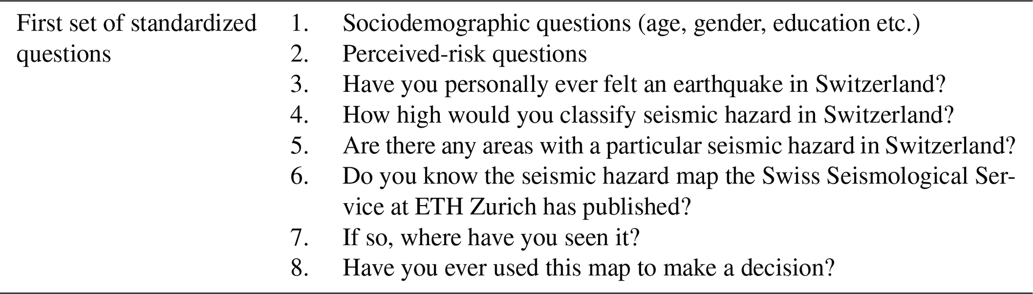
Table 2Survey section with usability tasks. The public answered the questions online, and the workshop participants noted their answers on a flip chart. The public solved the usability task as part of the online survey, and workshop participants needed to use the SED website to find their answers. Translated from German to English by the authors.
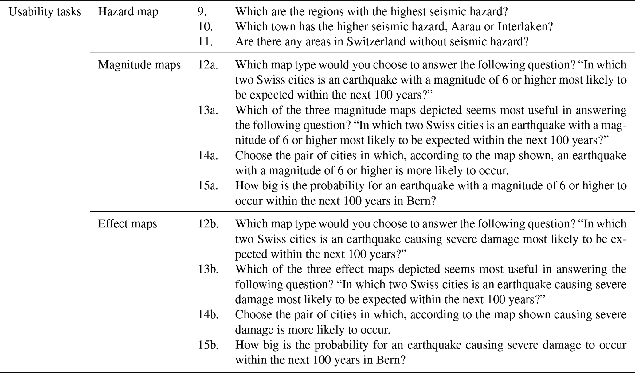
Afterwards, all participants had to conduct usability tasks (see Table 2). In the online survey, the maps questioned were always on display, including an explanatory legend, expect for question 12, where no map was depicted. All online participants had to reply the questions concerning the hazard map for a return period of 475 years. In the following, they were randomly assigned to answer questions either concerning the magnitude or the effect maps. For question 13, three magnitude (magnitude 5, 6, and 7) or effect (intensity of IV, VII, and VIII) maps were on display. For questions 14 and 15 one map either depicting the probability for an earthquake with a magnitude of 6 or higher or an intensity of VIII to occur within the next 100 years was shown. In total, online participants were confronted with four different maps.
The architects and engineers were split from the beginning into two groups. In front of a big screen, they had to navigate through the website of the SED (http://www.seismo.ethz.ch) to find the information needed to solve the usability tasks. Again, all participants were confronted with the hazard map, but only one group at a time answered the questions concerning the magnitude or the effect maps. Four observers documented their discussions, their navigation paths on the website, and their suggested answers to the given questions. Apart from the setting, the assignment of tasks was identical.
Table 3Second set of standardized questions. Translated from German to English by the authors.
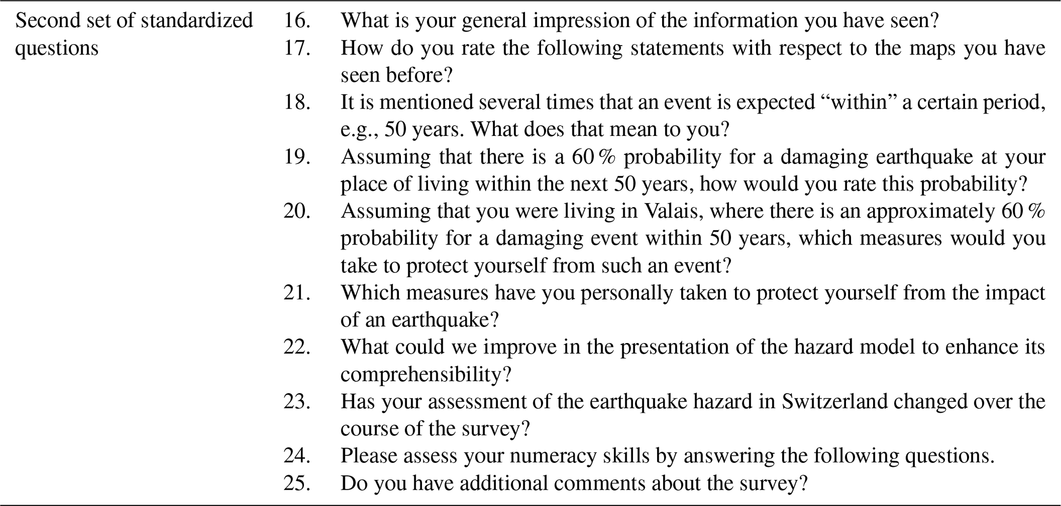
To conclude, both groups were asked, based on given adjectives and statements, to rate the information provided. A further set of questions dealt with their understanding of statistical information, their willingness to take precautionary measures, and changes in their risk perception. Finally, they had to evaluate their numeracy skills (see Table 3).
The following measurement parameters derive from the online survey; only there did enough people participate to allow for resilient statistical statements.
A five-point Likert scale was used to measure perceived risk (question 4), covering eight items compiled in an index with a Cronbach α of 0.7535. Earthquake hazard in Switzerland was classified on a five-point Likert scale (1 – “very low” – to 5 – “very high”).
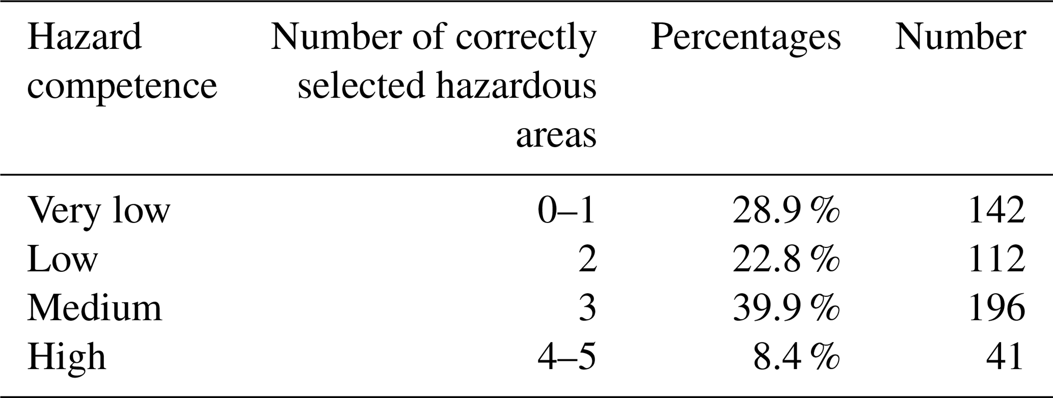
In the usability section, based on a list with nine areas, we measured the number of correctly selected hazardous areas (question 9) and built a variable reflecting seismic hazard competence (see Table 4). The five areas with an elevated seismic hazard are Valais, Basel, Grisons, central Switzerland, and Saint Gallen Rhine Valley. The four areas with low to moderate seismic hazard are Jura, Tessin, the Lake Geneva region, and eastern Switzerland.
In the second set of standardized questions we made the following measurements: firstly, a selection of seven adjectives measuring the general impression of the information presented had to be rated on a five-point Likert scale (question 16), leading to an index with a Cronbach α of 0.7906. Secondly, statements regarding the coloring of the maps, the differentiation of map types and color hues, and the explanations provided had to be rated on a five-point Likert scale; no index was compiled7 (question 17). This was followed by two questions addressing the understanding and interpretation of statistical information, also measured on a five-point Likert scale (questions 18 and 19). To conclude, participants' numeracy skills were measured with four items8 (Fagerlin et al., 2007) compiled in an index with a Cronbach α of 0.916 (question 24).
The following results are mainly based on the online survey conducted with members of the Swiss public. Unlike the data gathered at the workshops with the architects and engineers not specializing in seismic retrofitting, the analysis of the online survey allows for resilient statistical statements. Therefore, Sect. 5.1 to 5.3 solely reflect the results of the online survey, and Sect. 5.4 describes the observations made during the workshops.
Table 5Participants' selection of hazardous and other areas in Switzerland (N=491) with the map displayed. Number of selections taken is 1280.

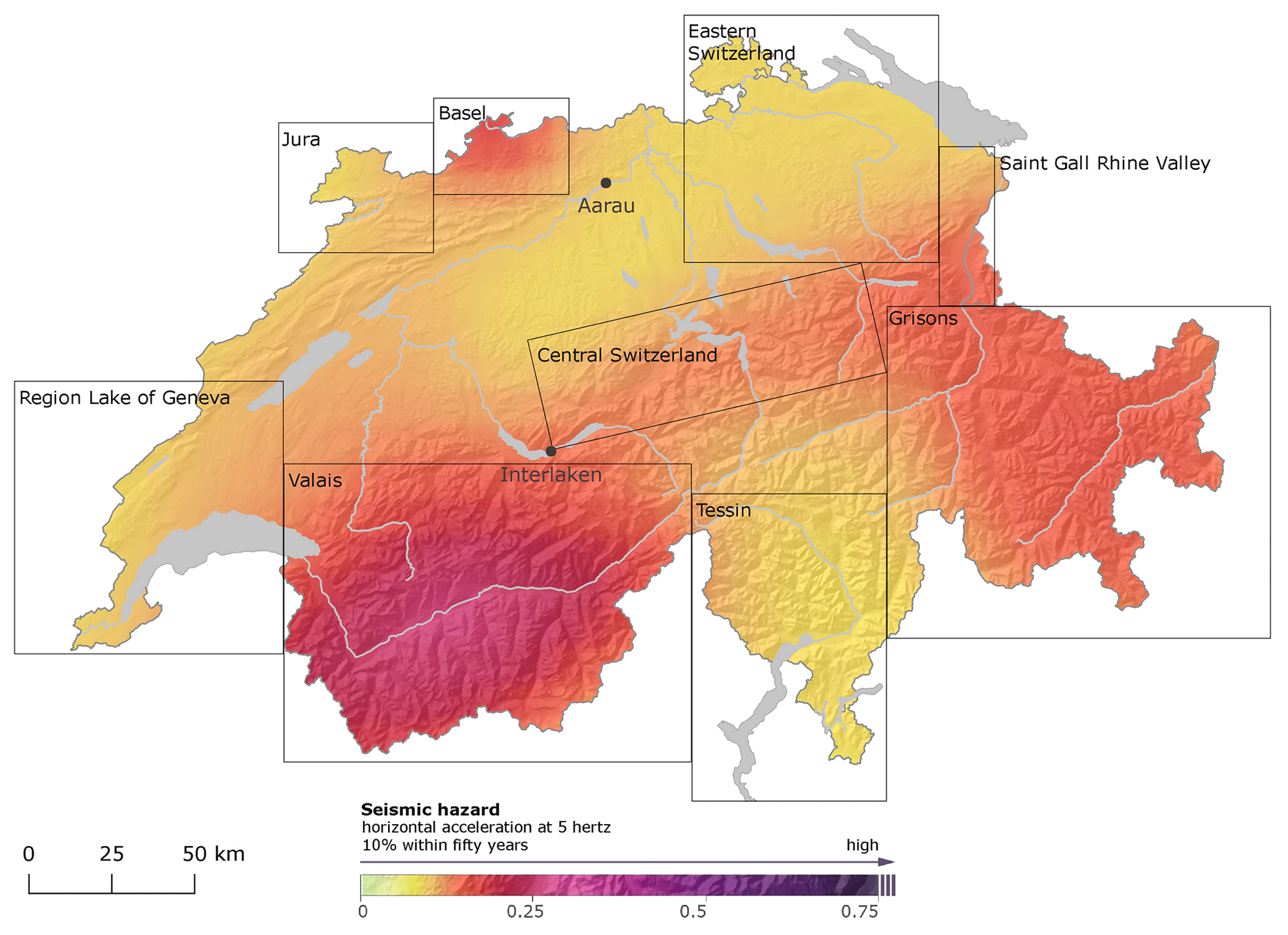
Figure 5Seismic hazard map displaying the probability of a horizontal acceleration at 5 Hz to be experienced with 10 % within 50 years (475 years) on rocky subsoil and the areas in question (Swiss Seismological Service, 2018; http://www.seismo.ethz.ch/knowledge/seismic-hazard-switzerland/maps/hazard/). The map was shown to the participants without the frames highlighting the different areas.
5.1 Understanding seismic hazard maps
Before being confronted with the seismic hazard map for a return period of 475 years, most participants (85.5 %) state that they had not seen it before. With the map displayed, the majority is able to correctly select two to five hazardous areas from a total of nine regions (see Table 4). Most often, participants recognize Valais as an area with an elevated seismic hazard, closely followed by Basel and Grisons. As areas with an objectively lower hazard than the aforementioned regions (though they are still among the most hazardous areas in Switzerland), the Saint Gallen Rhine Valley and central Switzerland are in most cases not recognized as such (see Table 5). Almost all participants (93.5 %) successfully differentiate a city in a less hazardous area (Aarau) from one in a more hazardous area (Interlaken; see Fig. 5); 76.4 % agree to the statement that there are not any areas without seismic hazard in Switzerland.
Table 6Univariate analysis of variance with the numeracy skills index as dependent variable and hazard competence as independent variable as well as the numeracy skills index and age as dependent variables and the areas without seismic hazard as independent variable (N=491). M is mean, and SD is standard deviation.

The numeracy skills of participants and their living situation significantly influence their hazard competence. Participants with advanced numeracy skills and homeowners have a higher hazard competence (χ2=19.28, p=0.004, n=491). Those stating that there are not any areas in Switzerland without seismic hazard also have higher numeracy skills, are younger, and have a third-level qualification (χ2=14.42, p=0.006, n=491; see Table 6).
Table 7Univariate analysis of variance with the index rating of the information presented as dependent variable and hazard competence or the city pair as independent variables (N=491).
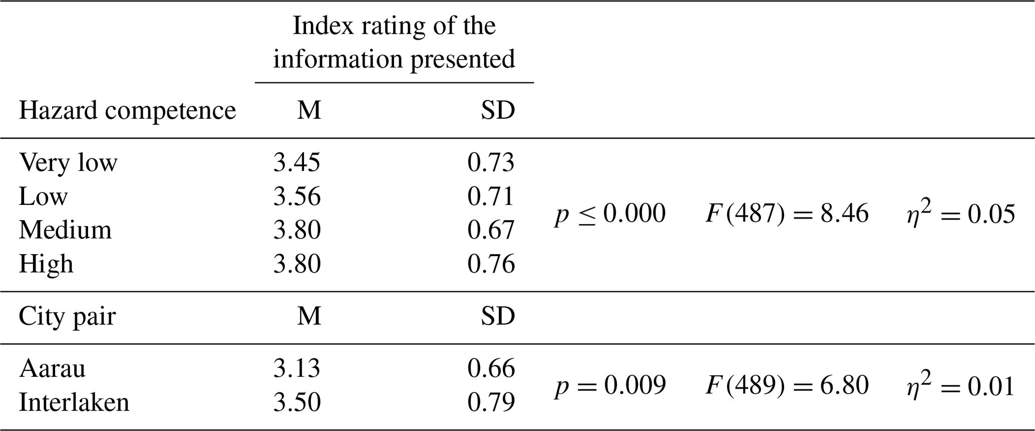
The rating of the information provided using adjectives significantly influences participants' hazard competence as well as the choice of the city with the higher seismic hazard. Those who rate the provided information more favorably have a higher hazard competence and are more inclined to choose Interlaken instead of Aarau (see Table 7).
Gender, age, and risk perception have no significant influence on hazard competence or the ability to adequately select a city with an elevated seismic hazard or correctly assess that there are not any areas without seismic hazard in Switzerland.
In response to the first research question, the majority of participants are able to correctly distinguish regions and a city with a higher seismic hazard from regions and a city with a lower seismic hazard. Furthermore, they generally assess the whole country as potentially being in danger. However, only a few recognize central Switzerland and the Saint Gallen Rhine Valley as being among the areas with an elevated seismic hazard. With respect to the second research question, there is a series of factors influencing participants' understanding of the information provided. Numeracy skills and the rating of the information provided significantly influence participants' ability to accurately identify areas or a city with an elevated seismic hazard in Switzerland. Together with education, age, and the living situation, numeracy also significantly influences whether people are able to correctly deduce that there are not any areas without seismic hazard in Switzerland. The rating of the information provided further affects the choice of the more hazardous city.
5.2 Understanding magnitude and effect maps
Participants had to select the most suitable of three magnitude or effect maps for answering a given question. The results shown in Table 8 indicate that participants make the right choice more often (see highlight) when confronted with magnitude rather than effect maps.
Table 8Selection of the most suitable magnitude or effect map for answering a given question. The correct answers are highlighted in bold font.
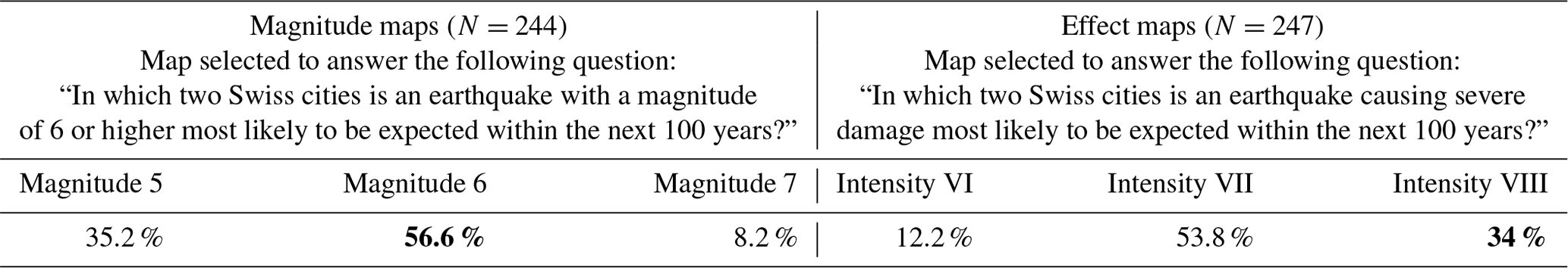
Table 9Percentages of city pairs selected with maps displayed. The correct answers are highlighted in bold font.
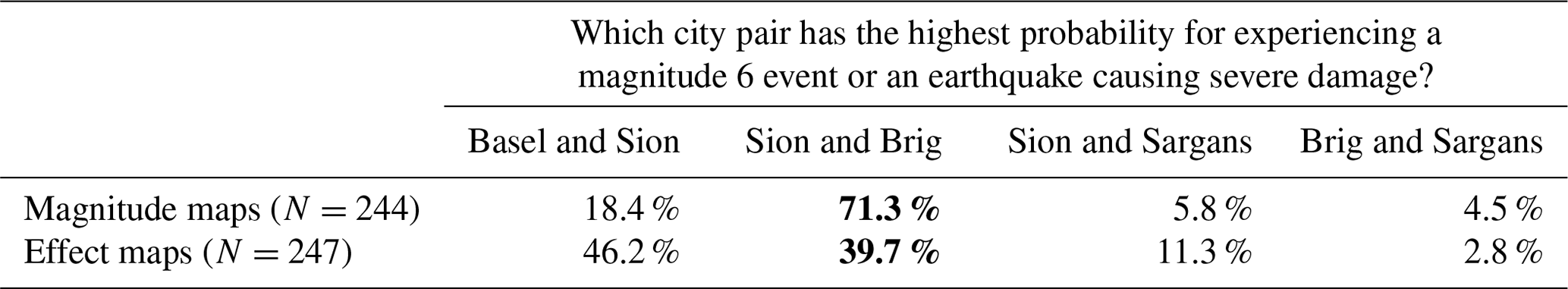
Then, with the correct magnitude or effect map displayed, participants had to select which of the four city pairs has the highest probability of experiencing a magnitude 6 event or an earthquake causing severe damage. Again, they select the correct pair more often when the magnitude map was displayed (χ2(3)=56.72, p<0.001; see highlight in Table 9).
Table 10Percentages of probability ranges selected with maps displayed. The correct answers are highlighted in bold font.
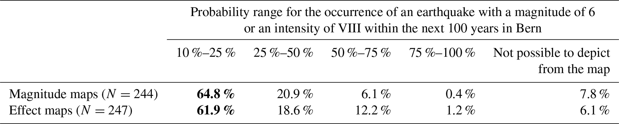
Participants perform similarly well when asked to choose the correct probability range for the occurrence of an earthquake with a magnitude of 6 or an intensity of VIII within the next 100 years in Bern (χ2(4)=7.73, p=0.147; see highlight in Table 10).
With regard to the third research question, the results show that participants struggle to select the most suitable of three maps for answering a given question. Their performance, especially in the case of the magnitude maps, improves when asked to fulfill a task with the right map already displayed. With respect to the fourth research question, results are mixed. Participants increasingly choose the correct city pair with the highest probability of experiencing a certain event with the magnitude map displayed. In contrast, the probability range for a specific event in Bern is assigned equally well on the magnitude and the effect map.
5.3 Interpreting statistical information
Regarding the understanding of textual information describing probabilities, the statement of an event “within” a certain period of time is interpreted as intended by 73.3 % of the participants (N=491). It can be understood as an event that has to be expected on average every 50 years without knowing if it will happen tomorrow or in 70 years. Numeracy skills as well as the change of perceived risk significantly influence the choice of the statement (see Table 11).
Table 11Univariate analysis of variance with numeracy or the change of risk perception as dependent variable and the assessment of a verbal statement about an event within 50 years as independent variable (N=491).
Table 12Univariate analysis of variance with numeracy, the risk perception index, or the change of perceived risk as dependent variable and the assessment of a verbal statement concerning an earthquake in their hometown as independent variable (N=491).
When asked to choose a verbal statement to assess the chance of a damaging earthquake occurring in their hometown within the next 50 years with a probability of 60 %, 72.5 % of the participants rate such an event as quite plausible or almost certain. Participants' numeracy skills, risk perception, and change of perceived risk significantly affect their assessment (see Table 12).
The first hypothesis is clearly confirmed: participants with higher numeracy skills interpret statistical information more accurately. In addition, risk perception and its change are important factors influencing their interpretation. Nevertheless, over two-thirds of the participants interpret the statistical statements as intended. With respect to the fifth research question, we conclude that the statistical information provided is well understood.
5.4 Benefit of interactive access
Only the architects and engineers not specializing in seismic retrofitting worked directly with the web tool provided by the SED to solve the usability tasks.
The results of the observations made at the two workshops reveal that navigation through the website is challenging, at least in a group setting. The choice of the most suitable map type or map version for answering a given question proves very demanding for this group of participants too. Even though additional information was available in the form of descriptions, participants do not usually take much time to read it. They also mention that the amount of information and options to choose from is demanding. In addition, the interpretation of single data points or probability ranges is perceived as difficult. Participants criticize the web interface for not allowing them to zoom in or display specific values.
Despite having interactive access, the architects and engineers not specializing in seismic retrofitting do not differ from the participants filling in the online survey in their ability to understand and interpret the information provided. We therefore have to reject the second hypothesis assuming that an interactive access has a measurable positive influence on the understanding of the content provided.
Although communication of seismic hazard in Switzerland follows many best-practice recommendations, its understanding remains challenging for the public as well as for architects and engineers not specializing in seismic retrofitting. Potential for improvements can mainly be found in the following: amount of information presented, user guidance, coloring of certain maps, and design of interactive access. As such, all elements of the map conceptualization in terms of visuals, texts, and presentation are affected. Furthermore, a complex interplay of personal factors, including risk perception, its change, the rating of the information provided, numeracy skills, age, education, and living situation, influence how hazard information is understood and interpreted.
Looking at the hazard map for a return period of 475 years, participants are generally able to differentiate areas and a city with an elevated seismic hazard from those with a lower seismic hazard. The majority also deduces correctly that there are not any areas in Switzerland without seismic hazard. Participants' competence in handling the maps is influenced by their numeracy skills; the rating of the information provided using adjectives; and their living situation, age, and level of education. The higher their numeracy skills and the better their rating of the information presented, the higher their hazard competence. This is in line with previous findings, highlighting numeracy as an important moderator for the handling of scientific information (Keller, 2011; Peters et al., 2008; Severtson and Myers, 2013) and interpreting graphics (Spiegelhalter et al., 2011). Regarding the effect of the rating, a greater ability to read the maps may have led to a more favorable assessment of the information presented. We conclude that the color hues chosen, the graduation of the coloring, and the conceptualization of the legend, all of which follow best practices (see Sect. 3.1), supported the understanding of this product. Homeowners' comparably higher hazard competence might be explained by the fact that they are more often confronted with questions on how to best protect their building. Therefore, they might have a greater interest and hence a greater capability to process relevant information. Younger participants and those with third-level qualifications more often correctly state that there are not any areas without seismic hazard in Switzerland. It is known that preparedness increases up to a certain age and then drops again (Joffe et al., 2016). Better-prepared individuals are probably also better informed or more used to interpreting available evidence. The same is true for those with a higher education.
By contrast, participants are less successful in understanding and interpreting magnitude and effect maps. These additional map types were introduced to provide an alternative to the ground acceleration values depicted in hazard maps, which are usually unfamiliar to non-primary users. However, many participants struggled to select the most suitable of three maps for answering a given question. Participants would have needed to read three sentences at the bottom of each map explaining its content to make the right choice. The comparatively short average time taken to complete the online survey and the observations made at the workshops indicate that many users did not take this information into account. It is open to speculation whether three sentences already disturb the equilibrium between completeness and comprehensibility (Peters et al., 2007) or whether the caption was just overlooked. A future study using eye tracking could shed light on this, as this method makes it possible to gain a better understanding of the elements taken into account (Keller, 2011). In an eye-tracking analysis of flood maps, it was observed that laypersons have difficulties in focusing on specific aspects of a map. Compared to specialists, they show a rather erratic manner of exploring the content (Fuchs et al., 2011) Furthermore, whereas for the magnitude map, the magnitude value of 6 was directly mentioned in the caption9, the term “very severe damage” had to be autonomously translated into an intensity value of VIII10. Since intensity values are not commonly communicated in Switzerland, people might have struggled to understand and interpret them.
When asked to pick and interpret probability values, participants tend to be more successful when magnitude maps, rather than effect maps, were displayed. However, a considerable amount of participants failed, which is mostly attributed to the color scales used (a criticism often brought up in the comment section and observed at the workshops). Coloring is a very sensitive component of map conceptualization (Thompson et al., 2015). As recommended for depicting continuous data, unclassified maps were compiled, which have the downside of impeding the readability of single data points (Severtson and Myers, 2013). In sum, both map types failed to apply best practices with respect to their coloring, as the shading is not sufficient (Kunz and Hurni, 2011).
The majority of participants interpret statistical information identically and as intended. Using “within” instead of “in” to describe the period for an expected event seemed to have supported the comprehensibility of the statements, as described in previous studies (Doyle et al., 2014; Hudson-Doyle et al., 2011). Two-thirds further describe a damaging event occurring in their hometown with a probability of 60 as quite plausible or almost certain. Due to the semantic similarity of these options, only the differentiation to the third option “very unlikely” is justifiable, which was only chosen by a minority. Confirming previous findings (e.g., Peters et al., 2008), participants with higher numeracy skills more often choose the indented interpretation. In addition, participants' risk perception and its change have, or at least tend to have, an effect on the interpretation of statistical information. McClure et al. (2015) also show, using the example of a potential earthquake in Wellington or Christchurch, that risk perception influences likelihood estimations.
The two workshops conducted with architects and engineers revealed that they are similarly challenged by the tasks assigned. Interactive access had no measurable positive effect on the comprehensibility of the Swiss seismic hazard model. Besides the similar knowledge and awareness levels of engineers and architects not specializing in seismic retrofitting, the amount of information provided and the design of the interactive access may explain the outcome. As stated in other studies, too much information is rather obstructive for transmitting knowledge (Pang, 2008; Peters et al., 2007). As people only invested a little time in going through the content, even shorter texts are advisable. With respect to interactive access, workshop participants mentioned on several occasions that the tool did not meet their expectations, which were established by use of popular commercial mapping tools (e.g., Google Maps). This attitude was also documented by Perry et al. (2016). Being unable to zoom in or display specific values by clicking was seen as a major drawback and disregards best practices (Dransch et al., 2010; Hagemeier-Klose and Wagner, 2009; Kunz and Hurni, 2011). It prevents users from accessing information on different aggregation levels, which is recommended (Kunz et al., 2011). In any case, there is always a trade-off between providing individualized information and offering too many options (Pang, 2008).
Despite some particularities of seismic hazard communication, the results of this study are transferable to any other context in which maps are used to communicate hazard to a wide range of users. The challenges observed are not limited to seismic hazard maps but have also been observed for flood (Hagemeier-Klose and Wagner, 2009; Kjellgren, 2013) or volcanic hazard (Thompson et al., 2015) maps and therefore apply to any other (natural) hazard. However, the results of this study are limited to Switzerland, a country with moderate seismic hazard and a population with low earthquake awareness.
The real-world setting introduces some limitations, as, for example, the material tested already existed. Due to the complexity of updating a hazard model, the data needed for communication materials usually only become available very shortly before the actual release. In addition, the development of communication materials is technically challenging and very resource intensive. However, the study design mirrors adequately the setting in which seismic hazard is communicated not only by the SED but also by many agencies around the world (see Fig. 1). Therefore, it allows for practical insight beyond theoretical considerations or lab experiments.
Seismic hazard maps are the most frequently used output of complex assessments to inform the public about this threat. Knowing and understanding the seismic hazard of a particular area are a requirement for being able to make informed preparedness decisions. Despite the importance of professionals in advancing seismic hazard mitigation through building codes, a knowledgeable public is needed to enforce existing regulations and to fill in reaming preparedness gaps, for example by getting insurance or fixing movable items. We tested based on a real-world case if non-experts understand current approaches of presenting seismic hazard information.
The most frequently requested map of the Swiss seismic hazard model, the one for a return period of 475 years, follows best practices and confirms its usefulness. The map seems to reach its aims by adequately informing non-experts and allowing them to distinguish hazardous from less hazardous areas. We conclude that despite the evidence that many hazard maps are not interpreted correctly (Hagemeier-Klose and Wagner, 2009; Kjellgren, 2013; Perry et al., 2016; Severtson and Vatovec, 2012), when designed very carefully, they have the potential to also inform non-experts in the respective area.
Conversely, the disregard of best practices leads to the weak comprehensibility of magnitude and especially effect maps. Mainly the coloring, the impossibility of reading or accessing single data points, and the assumed unfamiliarity with intensity values impair their understanding. Improving the coloring over a wide range of values without using unappealing colors or color combinations is very challenging. An alternative would be to classify the data (e.g., in five classes) and thus greatly simplify the map design. Further, the needs of people with visual impairments should be taken into account, an aspect not specifically evaluated and considered in the framework of this study. It is also difficult to further educate people about intensity values without increasing the amount of information. By contrast, access to single data points could be implemented easily in an interactive tool allowing users to zoom in and click.
To conclude, the newly introduced map types, magnitude and effect, currently do not fulfill their intended purpose (see Sect. 3.1). They are not offering users a worthwhile alternative to complex ground acceleration values depicted in seismic hazard maps. Despite the assumed value of magnitude and effect maps for a better understanding of the strength and impact an earthquake might have at a specific location, they are less requested and almost never shared by the media. We attribute this mainly to the poor implementation as well as to the unfamiliarity with intensity values. In addition, habit may play a role. Previously, only hazard maps were published, and people might refer to what looks familiar to them without reflecting that another product could be more suitable.
Finding the most appropriate information for answering questions relating to earthquake hazard has proven to be very demanding. Textual information was often not taken into account. This is a very challenging condition for the design of successful communication measures. The most obvious solution would be to improve the texts themselves, namely their positioning and appearance, while another would be to enhance user guidance. Instead of offering all possible options at once, specific, frequently asked questions could be answered by displaying the most suitable map automatically. As an alternative, local scenarios (Perry et al., 2016) could be used to help people realize that such a threat is real and might impact their lives (Mileti et al., 2004; Nathe, 2000). As a result, the total of 45 maps would only be accessible in a next step for users wishing to conduct more in-depth investigations.
The deficient performance of magnitude and effect maps in particular raises the question as to whether maps are the most eligible means of communicating hazard information. A doubt supported by the findings of Dobson et al. (2018) in the context of flood hazard information is the following: in direct comparison with tables and graphics, maps lead to the least accurate decisions. This indicates that despite their extensive use, there might be other, more adequate, and more user-friendly means of processing the information. Infographics are currently trending as a way to communicate complex issues. They aspire to graphically represent data for a lay audience. In spite of their assumed potential, there is currently only limited experimental evidence on their impact (Spiegelhalter et al., 2011). A recent analysis showed that infographics were well received but rated as being less trustworthy (McMahon et al., 2016). Nevertheless, future studies exploring the potential of infographics to communicate seismic hazard could be beneficial.
Besides the characteristics of the information presented, users' personal traits, experiences, and perceptions influence how well they understand and interpret seismic hazard information. Risk perception and its change have proven to be of relevance, conforming previous findings: familiarity with a specific hazard is the very first step towards precautionary intentions and actions (Whitney et al., 2004). Moreover, the effect of the change of perceived risk demonstrates that informing people is pertinent and can have an impact. However, the interplay between the information provided and personal characteristics is very complex. Since every member of a society is needed to strengthen earthquake resilience, the understanding of a regional seismic hazard is crucial for all of society. We strongly recommend assessing actual user needs and taking them into account when developing future products to inform about seismic hazard. An option would be to co-produce seismic hazard information material with relevant users. In any case, seismological services will continue to struggle to meet all users' needs when offering hazard information.
Through our representative study analyzing the way seismic hazard information is currently presented, we set the baseline for improved hazard communication. Our study shows that applying or disregarding best practices in visualization, editing, and presentation significantly impacts the comprehensibility of seismic hazard information. We further discuss numerous possibilities for improvements like revising the coloring, classifying data, amending textual information, reducing complexity, implementing scenarios, improving mapping tools, or using infographics. However, whether these amendments meet users' needs and actually lead to an improved understanding and interpretation of seismic hazard information has to be tested first.
Due to the similarity in communicating other hazard assessments, we are convinced that our results are transferable to any other (natural) hazard context where maps play a central role in making the results of an assessment accessible to a variety of users. We therefore strongly suggest evaluating current natural-hazard communication strategies and empirically testing updated or new products. We also encourage exploring new ways in presenting and communicating seismic hazard to raise awareness and to trigger protective actions. Such efforts would be of particular benefit to the public and non-specialist professionals, who may strongly support precautionary actions.
The data of this study are not publicly available.
The table below depicts the detailed response options and procedure.
MM designed and conducted the study. MS and SW provided helpful feedback and revised the paper.
The authors declare that they have no conflict of interest.
This paper was edited by Maria Ana Baptista and reviewed by Klaus Pukall (né Wagner) and one anonymous referee.
Becker, J. S., Paton, D., Johnston, D. M., and Ronan, K. R.: Salient beliefs about earthquake hazards and household preparedness, Risk Anal., 33, 1710–1727, https://doi.org/10.1111/risa.12014, 2013.
Bodemer, N. and Gaissmaier, W.: Risk Communication in Health, in: Handbook of Risk Theory, edited by: Roeser, S., Hillerbrand, R., Sandin, P., and Peterson, M., Springer-Verlag, Zurich, Switzerland, 623–660, 2012.
Bostrom, A., Anselin, L., and Farris, J.: Visualizing seismic risk and uncertainty: A review of related research, Ann. NY Acad. Sci., 1128, 29–40, https://doi.org/10.1196/annals.1399.005, 2008.
Budescu, D. V., Por, H. H., Broomell, S. B., and Smithson, M.: The interpretation of IPCC probabilistic statements around the world, Nat. Clim. Change, 4, 508–512, https://doi.org/10.1038/nclimate2194, 2014.
Bundesamt für Statisik: Sprachen, available at: https://www.bfs.admin.ch/bfs/de/home/statistiken/bevoelkerung/sprachen-religionen/sprachen.html (last access: 1 January 2017), 2015.
Burningham, K., Fielding, J.. and Thrush, D.: “It'll never happen to me”: understanding public awareness of local flood risk, Disasters, 32, 216–238, https://doi.org/10.1111/j.1467-7717.2007.01036.x, 2008.
Day, R. W.: Geotechnical Earthquake Engineering Handbook: With the 2012 International Building Code, 2nd edn., McGraw-Hill Education, New York, Chicago, San Francisco, Athens, London, Madrid, Mexico City, Milan, New Delhi, Singapore, Sydney, Toronto, 2012.
Dobson, B. A., Miles-Wilson, J. J., Gilchrist, I. D., Leslie, D. S., and Wagener, T.: Effects of flood hazard visualization format on house purchasing decisions, Urban Water J., 15, 671–681, https://doi.org/10.1080/1573062X.2018.1537370, 2018.
Doyle, E., McClure, J., and Johnston, D.: Communicating likelihoods and probabilities in forecasts of volcanic eruptions, J. Volcanol., 272, 1–15, https://doi.org/10.1016/j.jvolgeores.2013.12.006, 2014.
Dransch, D., Rotzoll, H., and Poser, K.: The contribution of maps to the challenges of risk communication to the public, Int. J. Digit. Earth, 3, 292–311, https://doi.org/10.1080/17538941003774668, 2010.
Fagerlin, A., Zikmund-Fisher, B. J., Ubel, P. A., Jankovic, A., Derry, H. A., and Smith, D. M.: Measuring numeracy without a math test: development of the Subjective Numeracy Scale, Med. Decis. Making, 27, 672–80, https://doi.org/10.1177/0272989X07304449, 2007.
Fuchs, S., Sprachinger, K., Dorner, W., Rochman, J., and Serrhini, K.: Evaluating cartographic design in flood risk mapping, Environ. Hazards, 8, 52–70, https://doi.org/10.3763/ehaz.2009.0007, 2011.
Gaspar-Escribano, J. M. and Iturrioz, T.: Communicating earthquake risk: mapped parameters and cartographic representation, Nat. Hazards Earth Syst. Sci., 11, 359–366, https://doi.org/10.5194/nhess-11-359-2011, 2011.
Gigerenzer, G. and Edwards, A.: Simple tools for understanding risks: from innumeracy to insight, BMJ, 327, 741–744, https://doi.org/10.1136/bmj.327.7417.741, 2003.
Hagemeier-Klose, M. and Wagner, K.: Experten-Evaluation von Web-GIS-Lösungen und Internetkartendiensten zur Kommunikation von Hochwasserinformationen, Geogr. Helv., 63, 94–103, https://doi.org/10.5194/gh-63-94-2008, 2008.
Hagemeier-Klose, M. and Wagner, K.: Evaluation of flood hazard maps in print and web mapping services as information tools in flood risk communication, Nat. Hazards Earth Syst. Sci., 9, 563–574, https://doi.org/10.5194/nhess-9-563-2009, 2009.
Haynes, K., Barclay, J., and Pidgeon, N.: Volcanic hazard communication using maps: an evaluation of their effectiveness, B. Volcanol., 70, 123–138, https://doi.org/10.1007/s00445-007-0124-7, 2007.
Hoffrage, U., Lindsey, S., Hertwig, R., and Gigerenzer, G.: Statistical Communicating Information, Science, 290, 2261–2262, 2000.
Hudson-Doyle, E., Johnston, D., McClure, J., and Paton, D.: The communication of uncertain scientific advice during natural hazard events, NZ. J. Psychol., 40, 39–50, available at: http://hdl.handle.net/10179/9492 (last access: 22 November 2019), 2011.
Institute of Geological and Nuclear Sciences Limited: The 2010 National Seismic Hazard Model, available at: https://www.gns.cri.nz/Home/Our-Science/Natural-Hazards-and-Risks/Earthquakes/Earthquake-Forecast-and-Hazard-Modelling/2010-National-Seismic-Hazard-Model (last access: 22 November 2019), 2018.
Istituto Nazionale di Geofisica e Vulcanologia: Pericolosità sismica di riferimento per il territorio nazionale, available at: http://zonesismiche.mi.ingv.it/ (last access: 2 July 2019), 2018.
Joffe, H., Perez-Fuentes, G., Potts, H. W. W., and Rossetto, T.: How to increase earthquake and home fire preparedness: the fix-it intervention, Nat. Hazards, 84, 1943–1965, https://doi.org/10.1007/s11069-016-2528-1, 2016.
Keller, C.: Using a Familiar Risk Comparison Within a Risk Ladder to Improve Risk Understanding by Low Numerates: A Study of Visual Attention, Risk Anal., 31, 1043–1054, https://doi.org/10.1111/j.1539-6924.2010.01577.x, 2011.
Kjellgren, S.: Exploring local risk managers' use of flood hazard maps for risk communication purposes in Baden-Württemberg, Nat. Hazards Earth Syst. Sci., 13, 1857–1872, https://doi.org/10.5194/nhess-13-1857-2013, 2013.
Kostelnick, J. C., McDermott, D., Rowley, R. J., and Bunnyfield, N.: A Cartographic Framework for Visualizing Risk, Cartogr. Int. J. Geogr. Inf. Geovisualization, 48, 200–224, https://doi.org/10.3138/carto.48.3.1531, 2013.
Kunz, M. and Hurni, L.: How to Enhance Cartographic Visualisations of Natural Hazards Assessment Results, Cartogr. J., 48, 60–71, https://doi.org/10.1179/1743277411Y.0000000001, 2011.
Kunz, M., Grêt-Regamey, A., and Hurni, L.: Customized Visualization of Natural Hazards Assessment Results and Associated Uncertainties through Interactive Functionality, Cartogr. Geogr. Inf. Sci., 38, 233–243, https://doi.org/10.1559/15230406382232, 2011.
Lindell, M. K. and Perry, R. W.: Household Adjustment to Earthquake Hazard: A Review of Research, Environ. Behav., 32, 461–501, https://doi.org/10.1177/00139160021972621, 2000.
Lipkus, I. M.: Numeric, verbal, and visual formats of conveying health risks: suggesting best practices and future recommendations, Med. Decis. Mak., 27, 696–713, https://doi.org/10.1177/0272989X07307271, 2007.
McClure, J., H. Doyle, E. E., and Velluppillai, J. M.: A tale of two cities: Judgments about earthquake and aftershock probabilities across time windows, Int. J. Disast. Risk Re., 14, 15–26, https://doi.org/10.1016/j.ijdrr.2014.11.010, 2015.
McIvor, D. and Paton, D.: Preparing for natural hazards: normative and attitudinal influences, Disaster Prev. Manag., 16, 79–88, https://doi.org/10.1108/09653560710729839, 2007.
McMahon, R., Stauffacher, M., and Knutti, R.: The scientific veneer of IPCC visuals, Climatic Change, 138, 369–381, https://doi.org/10.1007/s10584-016-1758-2, 2016.
Meyer, V., Kuhlicke, C., Luther, J., Fuchs, S., Priest, S., Dorner, W., Serrhini, K., Pardoe, J., McCarthy, S., Seidel, J., Palka, G., Unnerstall, H., Viavattene, C., and Scheuer, S.: Recommendations for the user-specific enhancement of flood maps, Nat. Hazards Earth Syst. Sci., 12, 1701–1716, https://doi.org/10.5194/nhess-12-1701-2012, 2012.
Mileti, D., Nathe, S., Gori, P., Greene, M., and Lemersal, E.: Public Hazards Communication and Education: The State of the Art, available at: https://www.researchgate.net/publication/253943459_Public_Hazards_Communication_and_Education_The_State_of_the_Art (last access: 22 November 2019), 2004.
Nathe, S. K.: Public Education for Earthquake Hazards, Nat. Hazards Rev., 1, 191–196, 2000.
Natural Resources Canada: Simplified seismic hazard map for Canada, the provinces and territories, available at: http://www.earthquakescanada.ca/hazard-alea/simphaz-en.php (last access: 2 July 2019), 2018.
OECD: Financial Management of Earthquake Risk, available at: http://www.oecd.org/finance/insurance/Financial-management-of-earthquake-risk.pdf (last access: 29 July 2019), 2018.
Pagani, M., Garcia-Pelaez, R., Gee, R., Johnson, V., Poggi, V., Styron, R., Weatherill, G., Simionato, M., Viganò, D., Danciu, L., and Monelli, D.: Global Earthquake Model (GEM) Seismic Hazard Map (version 2018.1 – December 2018), https://doi.org/10.13117/GEM-GLOBAL-SEISMIC-HAZARD-MAP-2018.1, 2018.
Pang, A.: Visualizing Uncertainty in Natural Hazards, in: Risk Assessment, Modeling and Decision Support, vol. 14, edited by: Bostom, A., French, S., and Gottlieb, S., 261–294, Springer-Verlag, Berlin, Heidelberg, Germany, 2008.
Perry, S. C., Blanpied, M. L., Burkett, E. R., Campbell, N. M., Carlson, A., Cox, D. A., Driedger, C. L., Eisenman, D. P., Fox-Glassman, K. T., Hoffman, S., Hoffman, S. M., Jaiswal, K. S., Jones, L. M., Luco, N., Marx, S. M., McGowan, S. M., Mileti, D. S., Moschetti, M. P., Ozman, D., Pastor, E., Petersen, M. D., Porter, K. A., Ramsey, D. W., Ritchie, L. A., Fitzpatrick, J. K., Rukstales, K. S., Sellnow, T. L., Vaughon, W. L., Wald, D. J., Wald, L. A., Wein, A., and Zarcadoolas, C.: Get Your Science Used – Six Guidelines to Improve Your Products, U.S. Geological Survey, https://doi.org/10.3133/cir1419, 2016.
Pesaresi, M., Ehrlich, D., Siragusa, A., Florczyk, A. J., and Corbane, C.: Atlas of the Human Planet Hazards 2017, European Union, Luxembourg, https://doi.org/10.2760/19837, 2017.
Peters, E.: Numeracy and the perception and communication of risk, Ann. NY Acad. Sci., 1128, 1–7, https://doi.org/10.1196/annals.1399.001, 2008.
Peters, E., Dieckmann, N., Dixon, A., Hibbard, J. H., and Mertz, C. K.: Less is more in presenting quality information to consumers, Med. Care Res. Rev., 64, 169–190, https://doi.org/10.1177/10775587070640020301, 2007.
Peters, E., Bostrom, A., and Cutter, S.: Perspectives on Visualizing Uncertainty in Natural Hazards, in: Risk Assessment, Modeling and Decision Support, edited by: Bostom, A., French, S., and Gottlieb, S., 295–318, Springer-Verlag, Berlin, Heidelberg, Germany, 2008.
Ronan, K. R. and Johnston, D. M.: Promoting Resilience: Readiness and Risk Reduction, in: Promoting Community Resilience in Disasters: The Role for Schools, Youth, and Families, edited by: Ronan, K. R. and Johnston, D. M., 1–210, Springer, New York, USA, 2005.
Severtson, D. J. and Myers, J. D.: The Influence of Uncertain Map Features on Risk Beliefs and Perceived Ambiguity for Maps of Modeled Cancer Risk from Air Pollution, Risk Anal., 33, 818–837, https://doi.org/10.1111/j.1539-6924.2012.01893.x, 2013.
Severtson, D. J. and Vatovec, C.: The Theory-Based Influence of Map Features on Risk Beliefs: Self-Reports of What Is Seen and Understood for Maps Depicting an Environmental Health Hazard, J. Health Commun., 17, 836–856, https://doi.org/10.1080/10810730.2011.650933, 2012.
Shaw, R., Kobayashi, K. S. H., and Kobayashi, M.: Linking experience, education, perception and earthquake preparedness, Disaster Prev. Manag., 13, 39–49, https://doi.org/10.1108/09653560410521689, 2004.
Solberg, C., Rossetto, T., and Joffe, H.: The social psychology of seismic hazard adjustment: re-evaluating the international literature, Nat. Hazards Earth Syst. Sci., 10, 1663–1677, https://doi.org/10.5194/nhess-10-1663-2010, 2010.
Spiegelhalter, D., Pearson, M., and Short, I.: Visualizing uncertainty about the future, Science, 333, 1393–400, https://doi.org/10.1126/science.1191181, 2011.
Swiss Seismological Service: Seismic Hazard Switzerland, available at: http://www.seismo.ethz.ch/knowledge/seismic-hazard-switzerland/ (last access: 2 July 2019), 2018.
Thompson, M. A., Lindsay, J. M., and Gaillard, J.: The influence of probabilistic volcanic hazard map properties on hazard communication, J. Appl. Volcanol., 4, 6, https://doi.org/10.1186/s13617-015-0023-0, 2015.
United States Geological Survey: Seismic Hazard Maps and Site-Specific Data, available at: https://earthquake.usgs.gov/hazards/hazmaps/ (last access: 2 July 2019), 2018.
Whitney, D. J., Lindell, M. K., and Nguyen, H.-H. D.: Earthquake beliefs and adoption of seismic hazard adjustments, Risk Anal., 24, 87–102, https://doi.org/10.1111/j.0272-4332.2004.00414.x, 2004.
Wiemer, S., Danciu, L., Edwards, B., Marti, M., Fäh, D., Hiemer, S., Wössner, J., Cauzzi, C., Kästli, P., and Kremer, K.: Seismic Hazard Model 2015 for Switzerland (SUIhaz2015), Zurich, Switzerland, 2015.
The global seismic hazard map (EMMI-GSHAP) defines areas as hazardous if there is a 10 % chance of exceedance in 50 years for earthquakes with a minimal intensity of V on the Mercalli scale.
For example, the term “probability of exceedance of 10 percent in 50 years (500 years)” used for the seismic hazard maps is explained in connection to the building codes: “Earthquake-resistant residential or office buildings in Switzerland are designed to withstand shaking that is expected to occur where the building is situated once every 500 years on average. The lifetime of a building is approximately fifty years. Within this lifetime, the probability of a residential or office building experiencing the design shaking is ten percent.” (Swiss Seismological Service, 2018; http://www.seismo.ethz.ch/knowledge/seismic-hazard-switzerland/)
Switzerland has three official languages (German, French, and Italian) and four national languages (the aforementioned three languages and Rumansh). The survey looked at the two groups with the most representatives among the total population: German speakers (63 %) and French speakers (22.7 %; Bundesamt für Statisik, 2015).
12.6 % of the Swiss population aged 25 to 64 have only completed compulsory education, 46.2 % hold upper-secondary-level qualifications and 41.2 % hold third-level qualifications.
These include the following statements.“Switzerland has a high earthquake hazard.” “If an earthquake hits Switzerland, major damage is to be expected.” “I do not think that a major earthquake will occur in Switzerland in the near future.” “I believe the earthquakes do not pose a major threat to me.” “I am afraid that the apartment or house I am living in might be destroyed.” “I feel protected against earthquakes at my place of work.” “I feel personally affected by the earthquake hazard in Switzerland.” “Switzerland would recover quickly in the aftermath of a major earthquake.”
The adjectives include the following: “attractive”, “trustworthy”, “helpful”, “instructive”, `complicated”, “nontransparent”, and “confusing”.
“The colors chosen for the maps are cumbersome when trying to understand the information depicted.” “The difference in the content the maps display is clear.” “Color differences in the various maps are not distinct enough to read details.” “The explanations for the individual maps are comprehensive.” “The legends (captions) are helpful in understanding the maps.”
“How good are you at working with fractions?” “How good are you at working with percentages?” “How good are you at calculating a 15 % tip?” “How good are you at figuring out how much a shirt will cost if it is 25 % off?”
“The map below shows the probability of an earthquake with a magnitude of 6 or higher, within a radius of 50 km, occurring within 100 years. In the case of earthquakes with a magnitude of 6, moderate to major damage is likely over a wide area. One-hundred years represents the approximate life expectancy of a human being.”
“This map shows the probability of experiencing shaking in local subsoil with an intensity of VIII or higher within 100 years. In the case of an intensity of VIII, major damage and even the collapse of buildings is likely. One-hundred years represents the approximate life expectancy of a human being.”